With AI still one of the biggest talking points of the present – recently crowned the “word of the year” by Collins Dictionary – many flock to try each new product, whether for a bit of fun or to more seriously assess how it might impact their day-to-day lives.
But the products for which OpenAI is best known – Dall-E and ChatGPT – were not OpenAI’s original focus. When founded in 2015 – by current CEO Sam Altman as well as Elon Musk, Carlos Virella, Greg Brockman, Ilya Sutskever, John Schulman and Wojciech Zaremba – it was a research-focused non-profit, but by 2019 the company transitioned to a for-profit model.
“At some point they realised they needed to raise more money and they created a product arm”, says Mark Jarecke, New York managing director of design agency Area 17, which has been working with the company on its branding and website since December 2021.
Earlier in 2021, OpenAI had released text-to-image generator Dall-E and was gearing up to release ChatGPT in 2022. To match up with the growth in audience these products would bring, Area 17 was tasked “to prepare OpenAI for being a more public-facing company”, Jarecke says.
“It was going to be getting a lot of attention, so this was really a moment for [OpenAI] to define itself”.
Drawing on OpenAI’s original focus on the safe development of AI, the company still wanted to be “strongly defending” this notion, Jarecke says, as well as emphasising “the idea of precision: they had to be the most accurate”, he adds.
Area 17 also conducted desk, interview and qualitative research to understand the new audiences that would interact with OpenAI’s more public-facing incarnation – including corporates, researchers and product users.
The human angle on AI
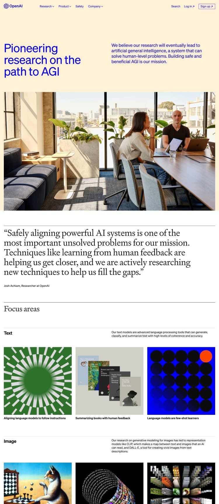
Rather than focusing on “self-proclaimed engineering feats” and associated tropes of “3D-modelling” and “Matrix-type effects” Area17 sought to highlight “the end outcome” of AI products, looking at artificial intelligence “from a human perspective” and the way that it will affect people’s lives, Jarecke explains.
More comfortable than the “scary unknowns” of the future, the design team wanted to use tech nostalgia “as a way of creating this idea of safety”, Jarecke says, grounding the identity in “what was future technology, but a generation ago”.

“Eclectic” art direction sought to establish a sense of “timelessness” and avoid cliche, adds Marius Roosendaal, group design director for Area17.
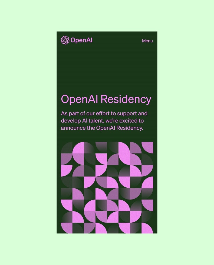
He explains that references ranged from “more retro and brutal 8-bit-inspired computer-generated illustrations” – making use of AI technology – to less expected touches such as a “Bauhaus-influenced colour palette”.

Different elements leaned into variously “brutal” and “humanist” design choices, he explains.
Along with the Bauhaus accents, the colour palette relies heavily on “black and white, inherently communicating the idea of ‘gravitas’”, mixing in “more nuanced tertiary pastels and dark colours”, Roosendaal adds.
In terms of typography, Roosendaal says that Kris Sowersby’s Söhne, chosen for its “clarity, consistency and efficiency”, acts as a “workhouse sans serif for interface elements, code snippets and data visualisations”. This is paired with Sowersby’s Signifier typeface: “a reinterpretation of serif classics like Garamond, with angled and wedged terminals”, he adds.
Iconography and interface elements “lean into the principle of precision, embracing the sometimes rigid and precise tone of technology” using 1px strokes and right angles, Roosendaal adds.
Photography, meanwhile, is “warm” and “people-focused”, using “grain, soft-focus and light leaks”.
An idea of magic
The final ingredient, Jarecke explains, “is this idea of magic”.
Even within black-and-white research index within the website, “micro interactions”, such as changing graphics when hovering the cursor over index elements, bring in a “playful” approach to discovery and represent “the wonder and awe in the technology”, Roosendaal adds.
While the mix of associations is apt given the wide gamut of responses prompted by AI, overall, the humanist side of the design wins out. This helps to underline “the idea that its products are meant to empower people”, Roosendaal says.
In line with the open-access ethos, meanwhile, is the fact that the website, also built by Area 17, uses the agency’s open-source CMS framework called Twill, which Jarecke describes as “very friendly for engineers, content creators and designers”.
Jarecke adds that he believes in projects such as this, design has an important role to play for science-focused clients in helping to “translate” important work that may be seen as niche, intimidating or impenetrable, to make it accessible and tangible on the level of “what it means to global audiences”.

- Design disciplines in this article
- Industries in this article
- Brands in this article


One response to “How design helped OpenAI transition from niche to mainstream”
Wonder if the designer team fought (and lost) a battle to use a different moniker, not “chatgpt.” Terrible name that’s stuck now, opportunity lost.