Pentagram’s Harry Pearce has created a visual identity and name for Manchester’s new science and innovation district.
A collaboration between the University of Manchester and Bruntwood SciTech, Sister is a four million square foot area which sits between the university and the city’s main train station.
It promises to bring together “science, technology, and community” to create a district that will include offices, labs, homes, shops, restaurants and creative spaces, like a new arts centre.
The name was created by The Draft, whose team took inspiration from the Robbins Report, which in 1963 laid out the blueprint for the UK’s higher education system.
All of the report’s suggestions were implemented, apart from the creation of three Special Institutions for Scientific and Technological Education and Research (SISTERs) earmarked for London, Glasgow and, fittingly, Manchester.
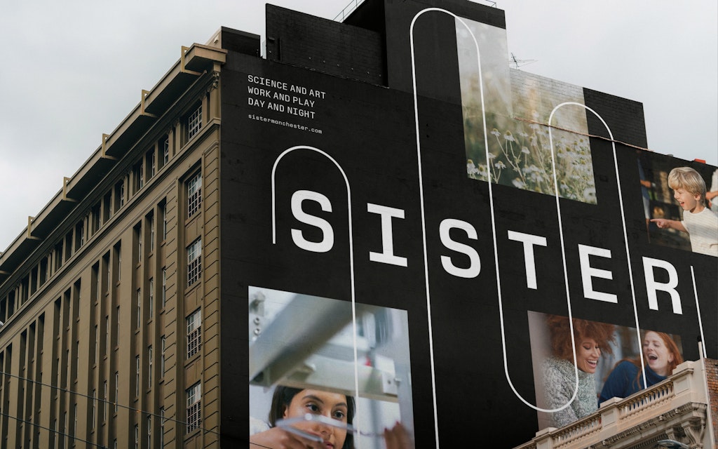
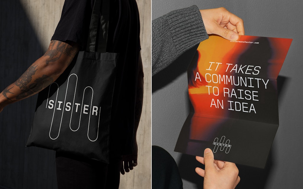
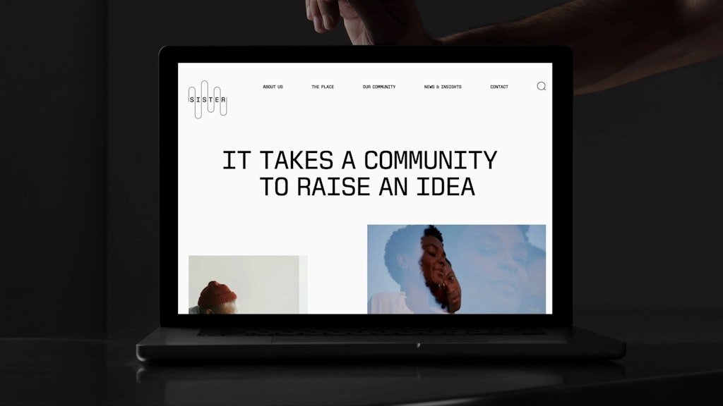
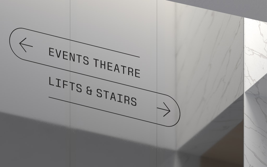
Alongside the new name, Pearce and his team created a new typeface, logotype, set of icons and signage to bring the site to life.
“This was a complex project that had to be faithful to the place, the people and institutions it contained,” Pearce says. “It needed to draw together complex narratives of its own, and ultimately connect with many others.”
Pearce said his approach focused on “research and listening,” a process of discovery as much as creation. “We found the answers everywhere, from archival documents, to interviews and architectural future visions to the historical landscape.”
Key decisions
A name drawn from history
Pearce says The Draft played a “special part” in the process, immersing themselves in the research and unearthing many insights that informed the design process.
Pearce especially likes that the name comes from an idea previously rejected by the powers-that-be, creating a neat irony that fits with Manchester’s rebellious spirit.
“It’s a brilliant name – an idea refused by the government then, now inspiring a name for a new district in Manchester today.”
A new typeface inspired by one of the city’s scientific heroes
When it came to designing the new typeface, the team looked to Alan Turing, the father of modern computing and the man who famously cracked the Nazis’ Enigma code. Turing had a long association with Manchester University, and the new typeface, Sister Mono, is inspired by letterforms found on code-breaking machines and first generation computers.
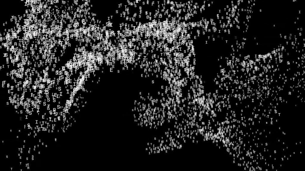
“The forms are not taken directly from any one machine, but rather by blending stylistic idiosyncrasies from a number of sources,” Pearce explains.The team also created a set of “typographic patterns” for static and animated treatments, a creative manifestation of Pearce’s longstanding obsession with language and letters.
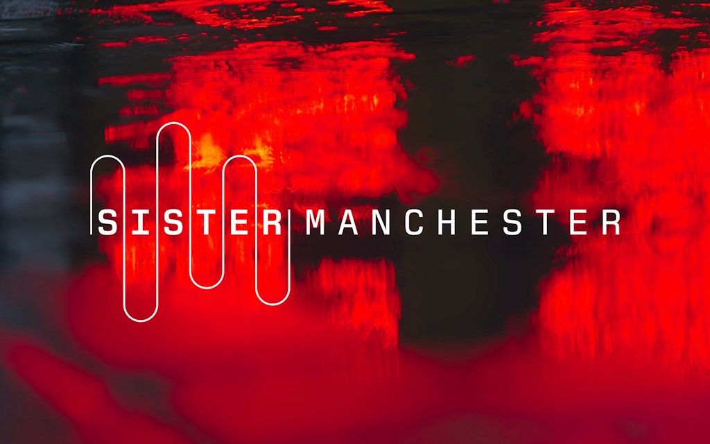
The modulating line of the logotype
“One of the most inspiring and fundamental ambitions of the Sister site are its porous boundaries,” Pearce says. “It will blend into the greater city-scape, and encourage the migration of people, ideas, and events in and around the district. It recognises how all these exchanges bring to life new ideas.”
That fluidity, he explains, inspired the undulating line in the logotype, as did the river Medlock that flows through the site. Another dive into the archives informed the shape of the line – a diagram for the Manchester Code, a 1940s computer system.
Practically, the line is also used to create coherence between different visual assets, and it forms the Sister symbol, “a linear version of the logotype and a shorthand expression of the visual identity.”
- Design disciplines in this article
- Brands in this article


