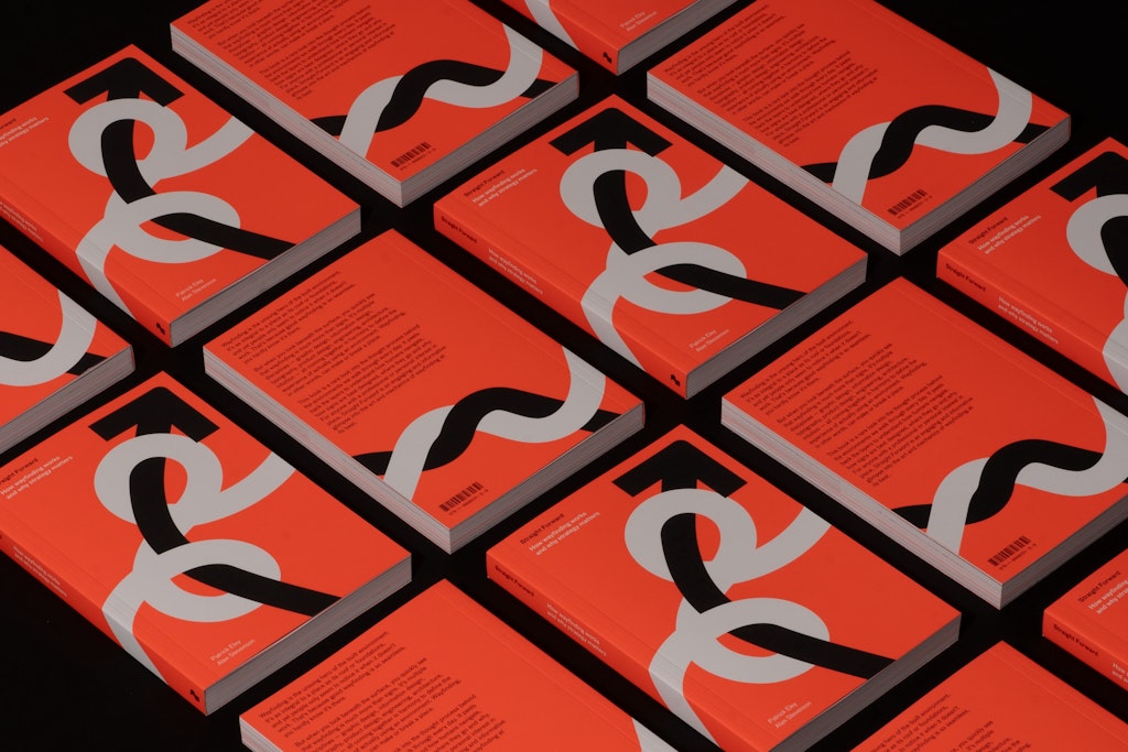
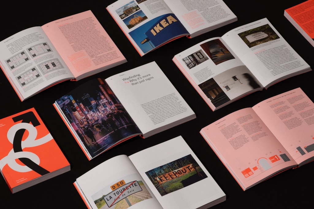
Patrick Eley and Alan Stevenson believe wayfinding is one of design’s most black-and-white disciplines – it either works, or it doesn’t. In their new book, Straight Forward: How wayfinding works and why strategy matters, the DNCO experts draw on 50 years of combined experience to share their insights.
It’s a nuanced and wide-ranging read, which combines deep questions about how we interact with the world, and practical insights around materials and processes. We spoke them to find out more.

Why do you call wayfinding “the unsung hero of the public realm”?
Patrick Eley (PE): It’s one of those things that people only notice when it doesn’t work – when you get lost, when you can’t find your way.
People get incredibly frustrated. There is some interesting research about how people find their way when they get lost, and the absolute absence of any sort of logic when that happens.
But when wayfinding works, people take it for granted.
It feels like one of the misconceptions the book is trying to correct is that wayfinding essentially means signs?
Alan Stevenson (AS): We’re trying to open people’s minds to the fact that it’s not just about signs, although signs are critically important. It’s a broad field, and there are more tools available than just putting a sign up, and if that doesn’t work, putting a bigger sign next to it.
There are intuitive things in architecture that help you find your way around. If there’s a building with a portico, and a big set of double doors with stairs up to them, that’s probably the entrance. The issue comes when it’s not the entrance. That’s one of the challenges in wayfinding, to try and play to people’s intuitions.
How do you balance the what and the how in a wayfinding project – what information is needed and how is it presented?
PE: The ‘what’ is definitely very important. But how you help somebody find their way is the nuance that makes wayfinding really specific to a place, and contributing to the sense of that place.
That’s our interest – how do you affect the way somebody feels about a place? How do you play to the story they’re trying to tell? How do you amplify one thing and quiet something else by using what you’re saying, and how you’re saying it, in the right form?

Are there any types of spaces that are really hard to work on?
PE: Hospitals tend to be quite tricky to find your way around because, in this country, they are often places that have accreted over time – this bit has been bolted onto that bit, which has been bolted onto that bit. There is no architectural coherence and the cues keep on changing. What feels like an exit door over here, is now somebody’s office, or the broom cupboard.
Spaces that get continually adapted and reused are quite hard. Whereas those spaces that get considered from the beginning – how are we going to get people to interact with this space? – are better.
AS: Hospitals are particularly difficult because nobody wants to be there, whether you’re going for treatment, or to visit someone. So it’s a high pressure environment and there’s a lot of information to put across.
How do you create a scheme for a place that doesn’t exist yet, when you don’t have any data on how people actually use the space?
AS: I think if wayfinding designers have got one superpower, it’s the ability to step into a drawing and walk through it, looking at it from a visitor’s perspective. You’re looking for the decision-making points, the vertical circulation space, and the horizontal circulation space, and where there are interchanges.
You’re recording those and mapping the journey until you’ve got a mesh of routes, and that fundamentally tells you where people need information. And then you look at what type of information they need at that particular point. A lot of it is common sense, but some people don’t have that ability to imagine what a space is going to look like.
PE: I think it’s also important to say that you’re putting yourself in somebody else’s shoes. As we say in the book, not everybody is going to be walking, not everybody will be seeing the same way you do.
So you’ve got to have a very open mind about accessibility requirements – what people will be able to distinguish, what height somebody will be able to look at. You have to ask, who’s using the building? And where might those people need to make decisions? There’s a lot of projecting that you do in order to get that strategy correct.
In the book, you explain that strategy in these projects isn’t as simple as getting people from A to B…
PE: You need to figure out who’s using the space and then determine where they need to go, but also how they might need to get there.
What’s your approach going to be to take people around that space? There are lots of interesting decisions, like what’s your approach to taking somebody to the toilet? Do you take them to the nearest toilet? Do you take them to the biggest toilet? Do you take them to the toilet in the centre of the building or the one that they only have to walk up five steps to get to?
AS: Thinking about corporate offices, if it’s a new building, then everyone’s going to know where everything is in a couple of weeks. But it’s really more complicated than that, because there might be temp staff coming in, and they need to know certain bits of information. People coming in to fix a photocopier, they need different sorts of information.
You might want to encourage certain routes, or discourage certain routes. “We don’t want clients to walk that way because it passes the kitchens, so want them to go this less obvious route.” Different people need different information at different times, and it’s getting the balance right.
How do wayfinding designers create reassurance in people?
PE: Clear, coherent, consistent. Those three words, that we often use, create reassurance. You want to make sure the wayfinding is clearly legible, it’s coherent in the sense that you can understand it in its environment, and it’s consistently positioned, so it’s in the place you expect it to be.
Street signs are a great example of that. You expect them to be at the corner of the street, mounted in a particular position.
AS: Going back to hospitals again, I’m going to contradict myself, because I said earlier on that we look for nodes where people require information.
But you get a lot of long corridors in hospitals, and it’s reassuring for people if you don’t wait until you get to the next corner before you say, “You’re still going the right way. There’s nowhere else to go, but you’re still on the right route.”
How has digital technology changed wayfinding work?
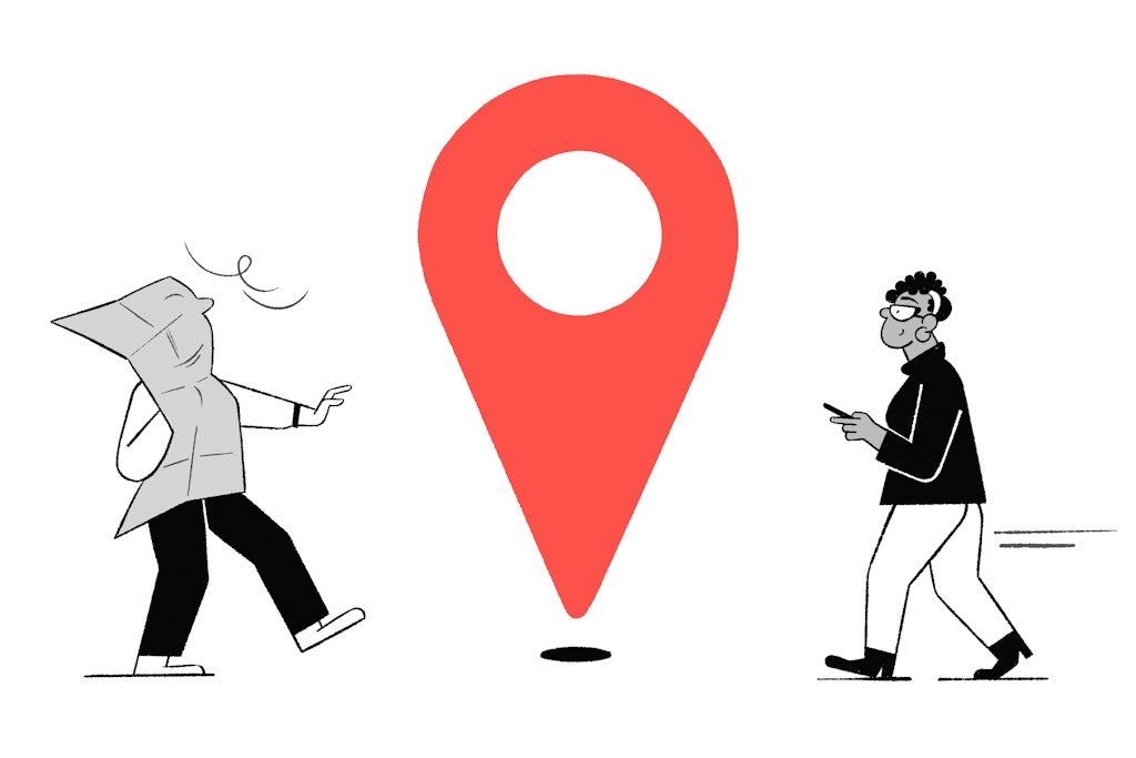
PE: Everybody has a map in their pocket. And phone technology is phenomenally good, but I think digital navigation gives us a false sense of security. It’s never going to be accurate everywhere, all the time, so you can’t 100% rely on it.
AS: A few years ago, we all thought digital wayfinding inside buildings was going to be the future. But if you’re anything like me, I can only remember about three or four directions, and then I’ve forgotten what the next target is. And only one person can interact with it at a time. If you’re busy, you’re not going to queue up to use the digital map.
Handheld devices are a lot more exciting because you can have multiple languages on a map. And you can tailor something like a museum, you can tailor it for a 12-year-old or a PhD student.
PE: To take it back to the original thesis, for us, wayfinding is about how you can contribute to the sense of place. And if everybody’s looking at their own phone, then you’re not. It may be very useful, but it may not enhance that place in any way. Traditional wayfinding gives you that opportunity.
Maybe AR, Apple Vision Pro and the AI influence could change the way you feel about a place. But we’re just at the beginning of that.

- Design disciplines in this article


