The AA has revealed a refreshed visual and verbal identity created in partnership with design consultancy Elmwood, looking to build awareness of an expanded customer offer.
The AA was founded in 1905, and today has 14 million members. While known for roadside services, its driving offer encompasses insurance, breakdown, driving school, service and repair, buy and finance, and non-driving areas include home insurance, travel insurance and personal loans.
Elmwood was approached to create a new brand world that reflected this wider offer, as well as counter perceptions of The AA being “quite traditional, perhaps a bit dusty, quite male, and combines the mechanical expertise with a modern world of driving, and a modern driver”, says The AA’s group brand director Will Harrison.

He explains that the strategy was based around the idea of Always Ahead, which the company has used since the 1920s. Beyond having two A’s in it, he says, “it’s about forward momentum”, explaining that the company is able to “create confidence in The AA” by anticipating customer needs “across your driving life”.
Elmwood senior account director Paul Waters, who led the project, says that an important element of the brief was “recognising that The AA is a British institution”.
“It is iconic. It is recognisable, and it is distinctive for its yellow and black”, he says.

“But beyond that, I think the brand assets arguably lacked some depth and meaning beyond the core roadside offer”.
To create a brand in line with The AA’s wider ambitions, at the start of the project, Elmwood and The AA began with “creative ambition setting”, as well as going out to “speak to as many people as we could across the organisation”, using this to “build out” the visual and verbal identity, Waters says.
Elmwood looked to “evolve” elements of the brand without impacting “the integrity of the heritage of the mark and the identity system,” Waters says.

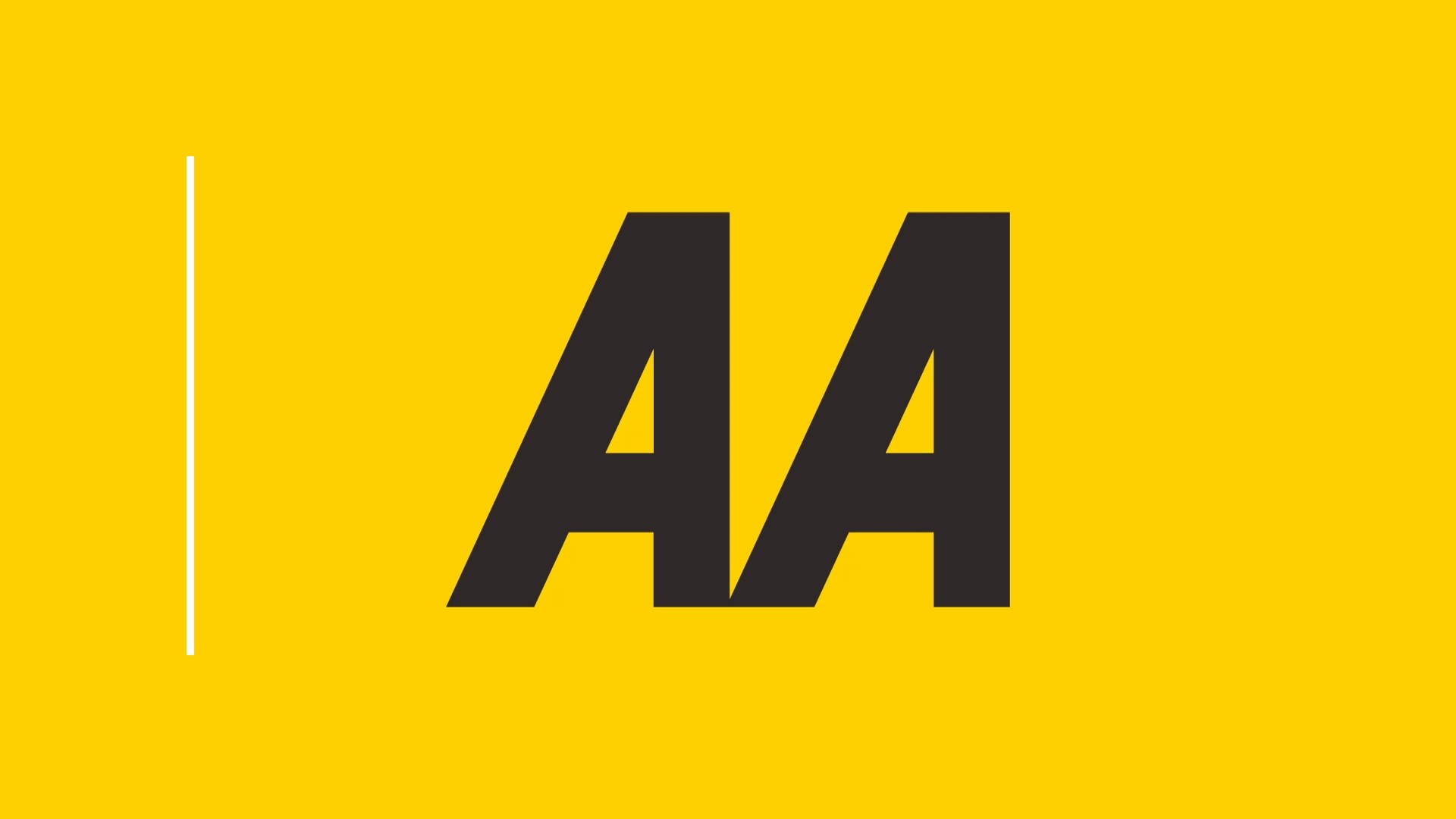
The brandmark was updated, with the two A’s “more connected for a more connected AA”, with its edges softened “to support a more digital-first approach to identity development”.
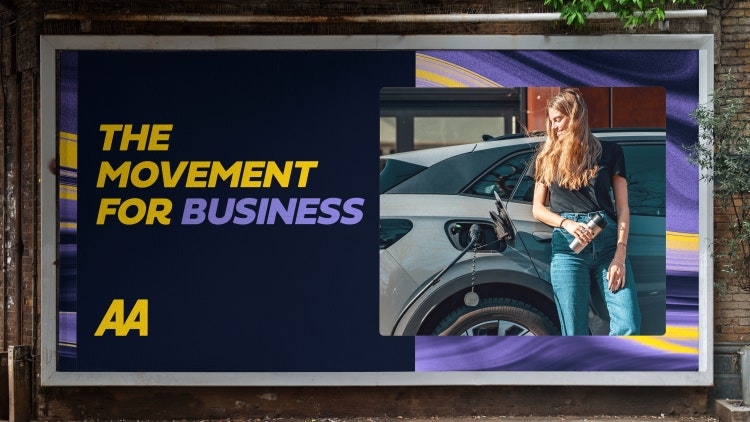
Both the wordmark and the phrase “Always Ahead” have been introduced in a new bespoke font called AA Sans, which introduces “quirks and quips and a sense of movement” to a base font, he adds.
Elmwood London creative director Kyle Whybrow describes how the yellow and black is tied in with the reputation of The AA as “a very functional brand”.
In order to deliver an identity that reflected The AA’s wider offer, “we knew we had to create assets that could talk to a diverse group of audiences across every stage of the driving cycle, from passing your driving test to owning your first car and everything that comes in between.”
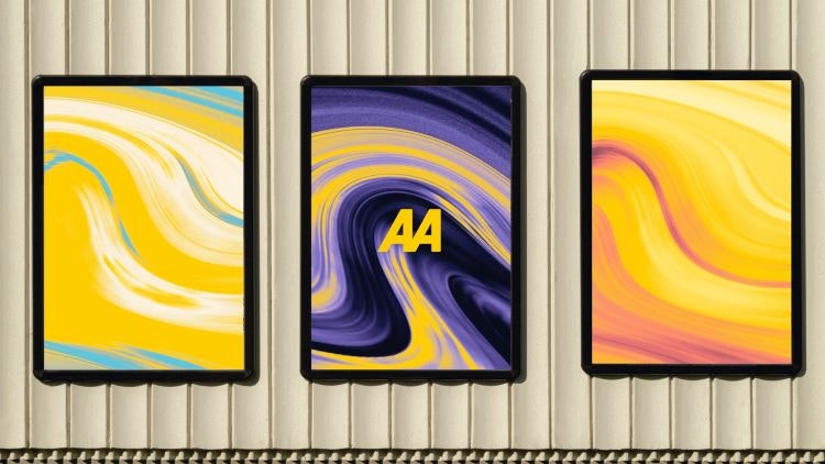
A new extended colour palette has been introduced, with colours drawn from “the perfect driving day palette”, Waters says, including “a gorgeous sky blue, a sunset and the sunrise”.

These colours are used in new “swishing effect” patterns introduced into the identity by Elmwood, which was “built from this idea of watching the world go by when you’re in a car moving at speed”, Waters says.
Many of the brand assets, from the patterns, photography, a custom suite of icons and potentially illustrations – which are currently in development – were designed “to capture this idea of always moving, and never standing still – expressing the inherent spirit of life in movement and forward momentum that defined The AA’s new brand platform,” adds Whybrow.

“We wanted to ensure the brand could progress to be distinctive, full of depth and convey a human touch, but which also echoed the sense of confidence you can expect with being able to rely on The AA”, he says.

- Design disciplines in this article
- Industries in this article
- Brands in this article


2 responses to “Elmwood designs new identity for The AA built around service proposition”
I get that big agencies like to use clever words and statements to justify some of the rational for some of the brand cues but to say the swishing effect is “built from this idea of watching the world go by when you’re in a car moving at speed”, that’s an unbelievable amount of nonsense.
I think it’s pretty good. The AA mark has been improved subtly but effectively. Now a unified icon as opposed to two A’s. Nicely done. New typography has new life and a funky colour palette, presumably to resonate with Gen Z’s. A controlled injection of energy has been a long time coming. I’m not as damming as Dan re ‘swishing effect…’ as BS goes, this is one of the more reasonable and understandable examples. I look forward to more roll-out and see how the AA fairs against the RAC et al. Remember the RAC rebrand from a million years ago? I’d love to hear the rationale for that at the time.
Baby Boomer.