New children’s circular fashion brand Talou was founded by fashion industry veteran Ellie Whitehead, who brought in The Yard Creative to create the brand’s identity – one which celebrates “the joy, creativity, and exploration of childhood” while also reflecting the planet-friendly credentials of a retail model that “takes responsibility for its own waste”.
Talou products are made from 100% wool – a natural, recyclable, and biodegradable fibre. Its sustainable production process sees yarns sourced from UK factories and its knitwear made in small batches to minimise waste and support local craftsmanship. The brand’s ‘buy back’ model means that its range will soon comprise both new and pre-loved items.
 Collaborating closely with Whitehead, The Yard Creative initially worked on secondary research, brand positioning and naming, having been briefed to the eight-week project in May this year. “It was a project we really wanted to be part of, as it really aligns with our brand values,” says The Yard Creative CEO Tom Edington.
The agency was briefed to create an “exciting” brand narrative and visual identity that embraced ideas around childhood, play, and imagination. “‘Let’s make a difference! Tell a story, start a movement!’ – became the brand’s mantra,” says Edington.

Prior to the agency’s appointment, the brand was working under the name Maree Knits, born of the fact that Whitehead’s husband is French, with ‘maree’ translating as ‘tide’ to symbolise the aims of the brand as “changing the tide in fashion,” says Edington.
During the research phase of the project, The Yard Creative and Whitehead found that the original name wasn’t resonating with focus groups; and there was a concern that it might be restrictive should the brand want to extend its product range beyond knitwear in the future.
“It’s always sensitive explaining to a founder that the original name wasn’t resonating: naming is always a really tricky exercise, but we have formulas which are really successful,” says Edington. The word ‘Talou’ means ‘tales’ in Middle English (spoken between around 1150 AD and 1500 AD) and so was “perfect for the brand as every product has a story to tell, and its mission is to wrap children in tales that nurture their journey towards a brighter future,” he continues. “Ellie was so open and respectful of our opinion and trusted us to come up with a name that would represent her vision.”
During the brand positioning phase, The Yard Creative came up with some key customer personas which it felt were the main audience for Talou – namely “conscious creatives,” as Edington puts it. “We pinpointed the target audience as ‘Mindful à la Mode Mums and Dapper & Deliberate Dads’: stylish and fashionable mums and confident, dapper and purposeful dads who want to dress their children in unique and fun clothes, without compromising on sustainability. They are bursting with personality, hobbies and dreams – and seek brands who do the same.” A third group, Grandparents and Gifters looking for unique but guilt-free gifts was also identified.
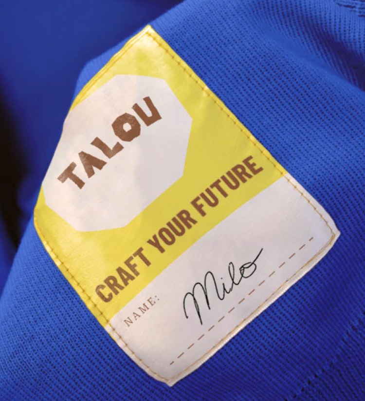
The Yard Creative went on to formulate the overarching concept for Talou, summarising the “brand essence as ‘Crafters of imagination’,” Edington explains. This guided the development of the brand identity across Talou’s logo, colour palette, typography, and patterning; labels; stickers; social media templates; and the brand’s expression on the Talou website. It also created comprehensive brand guidelines for the identity’s application in future.

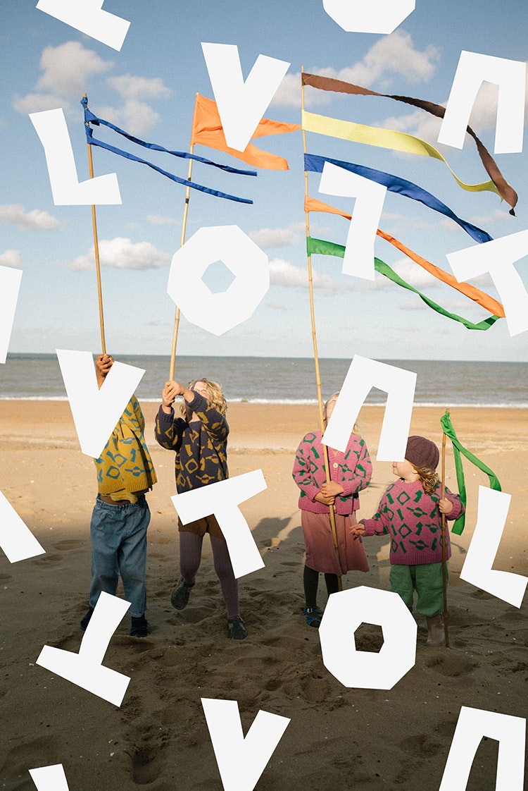
The word mark uses custom-designed typography that looks like paper cut-outs – a theme that carries throughout the brand across the products themselves, labelling, art direction and more. “The playful word mark embodies the spirit of the brand, inspired by the joyous creativity of children,” says Edington. The cut-out feel looked to evoke a sense of warmth and imagination, as well as “reinforcing the brands’ energy” through its use in patterning across branding applications.
The wordmark is supported by headline typeface Barlow Condensed Bold, a low-contrast Grotesk chosen for its bold, confident look; as well as Roboto Serif, used for slightly longer stretches of copy. The main brand colour is a vibrant, but not shouty blue; supported by a range of eartheir tones from bright orange to more muted yellows and browns. “Colour palettes tell you so much about a brand,” says Edington. “Our core colours are picked from the earth and supplemented with radiant accents that add a lovely punch.”
Talou is on sale now through the brand’s website.

- Design disciplines in this article
- Industries in this article
- Brands in this article


