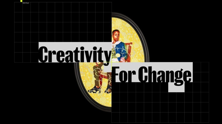
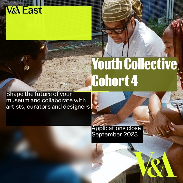
V&A East has unveiled its new visual identity, which features a plus device designed to organise content and communications in an accessible way while representing “multiplicity”.
The museum has six locations across the UK: V&A Dundee and V&A Wedgwood Collection, and the London locations, V&A South Kensington, Young V&A, V&A East, and V&A East Storehouse. It has recently undergone a four-year project to take the V&A masterbrand – which V&A head of integrated marketing and insight Sophie Rouse says was “very much spinning around the orbit of South Kensington” – and change it structurally so there is a V&A that “has meaning imbued in it for all audiences”.
Under this new direction, each venue now offers its own “unique experience and ethos”, represented through new brand identities. The “power of creativity” is the thread that runs through all the brands, but each location interprets this differently, says Rouse. She describes the V&A brand as “a universe we’ve had to re-stitch”, reflecting on how the museum is “investing more in the V&A brand as a whole”.
The main challenge is trying to achieve “consistency and difference”, says Rouse.
“A distinct and ownable space”
While V&A East is inclusive of all audiences, it focuses especially on Gen Z (16-25-year-olds), picking up from where Young V&A ends. It will also look to attract visitors from its four local boroughs: Waltham Forest, Hackney, Tower Hamlets and Newham as well as “those historically underrepresented in museum and gallery audiences”, according to V&A East senior brand and campaign manager Robyn Kasozi.
She reveals that the concept behind the V&A East brand is that it represents “no single story”, it is “locally routed with a global outlook”, and “exists in the real world” by making abstract concepts accessible to young adult audiences.
Read more: V&A East reveals new “relaxed and inclusive” museum and research centre

In a bid to “carve out a distinct and ownable space” for V&A East, Kasozi says the V&A team came up with the idea of “creativity for change” as its driving force. V&A East’s visual identity incorporates assets from the existing V&A masterbrand, such as the V&A Spiller font, Alan Fletcher’s 1989 logo drawn by Quentin Newark, and venue wordmarks.
On top of these pre-determined assets, the team had a decade of work and research on what the V&A East would be, so didn’t need a design studio to come in and “reinvent the wheel”, Kasozi explains. V&A worked with Wasted Talent to focus more on “brand behaviours and attitudes rather than traditional spaces for branding because youth culture brands don’t operate in traditional spaces”, she adds.
Wasted Talent is the in-house agency for Kerrang, The Face, and Mixmag, and is also the publisher of these magazine titles. Designer Alfie Allen and strategist Leo Robbins led the visual identity project alongside the V&A’s internal teams.
Kasozi describes how the agency is “so embedded in creative culture from a youth and pop culture perspective” which is “exactly the space that V&A East needed to be in”. Wasted Talent designed a plus device to hold digital and physical brand activations and PR “in a way that fits with the 175-year-old institution, drawing on the rich cultural heritage that came before”, she says.
Read more: V&A launches interactive website in a bid to engage Generation Alpha

The plus acts as “central anchoring device”, Kasozi adds, and was inspired by a spread in Fletcher’s 2001 book, The Art of Looking Sideways, that says 1 + 1 = 3 encircled by some of his favourite quotes from scientists, poets, and designers. It is primarily used to organise content and communications in an accessible way.
It also represents “multiplicity” and a variety of perspectives, says Kasozi, and can be used to create a layering effect, which “speaks to the idea of having multiple stories” by adding context to object photography, using “local photos, found footage and user generated photography”.
A new ambassador programme
The museum has also launched the V&A East Culture Council, which is a group of ambassadors that will seek to open up access to the arts and facilitate new creative opportunities. Ambassadors announced today include fashion label SR_A and A-Cold-Wall* founder and designer Samuel Ross, presenter and content creator Klaudia Fior, and Tito Mogaji and Soji Sonibare who co-founded east London-based community group Nourishment, which celebrates Black British creativity, art, ideas and culture.
The ambassador role will involve collaborating on a series of initiatives devised through partnerships with creatives and local communities as well as supporting V&A East’s community engagement and outreach programmes, co-creation projects and gallery displays. They will also be responsible for creating content for V&A East’s digital and social media channels and participating in mentoring and skills-sharing initiatives, in a bid to increase access and representation within the arts and highlight the opportunities available in the creative industries, according to the V&A. The museum expects the roster of ambassadors to grow every year.
Celebrating Black British music
V&A East has also announced its first exhibition – The Music is Black: A British Story – which is due to open in 2025. Spanning from 1900 to the present day, the exhibition will focus on how Black British music has shaped British culture, “from Carnival to club nights, recording studios and record shops, MC battles, festivals, and more”, says the V&A.
The Music is Black: A British Story will also look to address the social, historical, and cultural context behind Black music in Britain, shedding light on a variety of music genres, from Brit Funk to Lovers Rock, 2 Tone, Jungle, Ragga, Drum & Bass, Trip Hop, UK Garage, and Grime. Visitors can expect to see paintings, prints, playbills, and posters, sculpture, TV, fashion and textiles, photography and film, as the exhibition will aim to “tell a broader story of Black British music and its cultural impact beyond sound”, says the museum.

- Design disciplines in this article
- Industries in this article
- Brands in this article


One response to “V&A East reveals new visual identity ahead of 2025 opening”
Is the GCSE art and design student look intentional?