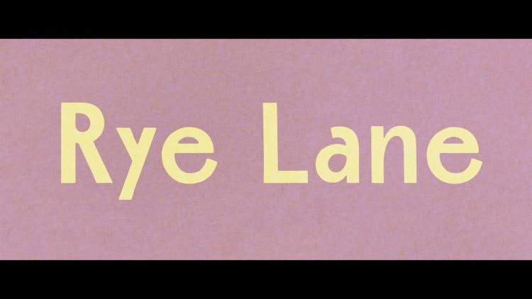
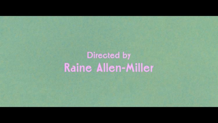
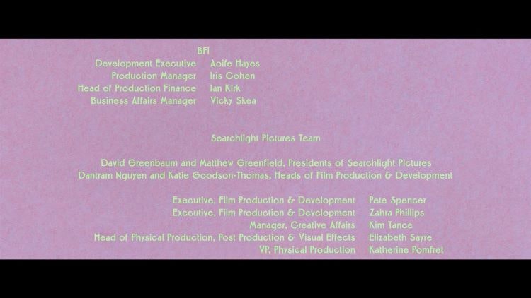
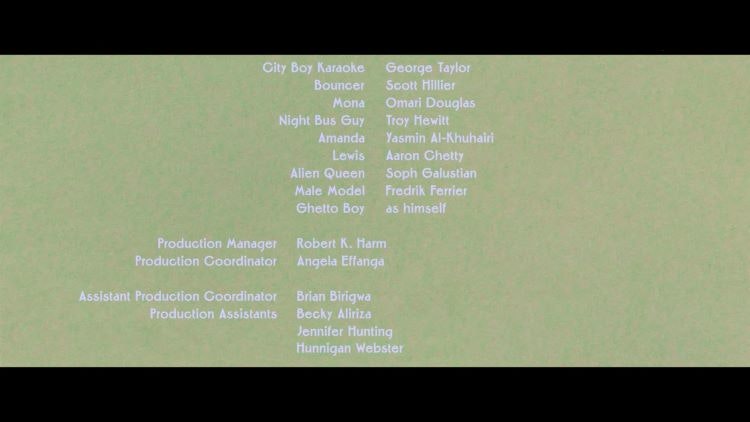
Fraser Muggeridge studio has designed the title and credit sequences for the recently released rom-com film Rye Lane.
The film follows two young people as they embark on a vinyl record rescue mission on a sunny, eventful day in South London. Fraser Muggeridge studio was appointed on credentials having previouslyworked with Rye Lane director Raine Allen-Miller’s production company Somesuch. It has also worked on other film titles in the past, such as Familiar Phantoms by Larissa Sansour & Søren Lind.

The studio’s founder Fraser Muggeridge says that there is a “great history” behind typography and film titles, referencing the work of Saul Bass as well as the “iconic James Bond titles”. Muggeridge feels that a lot of that history has been lost and that “design sometimes feels like an afterthought” in film.
Allen-Miller was very keen for the design of the title sequence and credits to be in tune with the film from the outset, according to Muggeridge. She said that she did not want the typography to reference the physical location of Rye Lane, says Muggeridge, and instead wanted something “fresh and bold”.

After watching an early cut of the film to get a sense of it, the studio started to design the typeface which Muggeridge describes as “a visual graphic translation of the film” that is intentionally “amateur-ish”.
Fraser Muggeridge studio worked with a typeface designed by New Zealand typographer Joseph Churchwood, who designed around 690 original typefaces in his lifetime. Muggeridge says the studio carried out a “half-revival” of it, modifying it slightly and making it suitable for digital application.

He explains how the “homemade version” of Churchwood’s typeface “plays on the idea of photo lettering”. In the typography timeline, photo lettering sits somewhere between lead and wood type, and digital type. Phototype is “quite niche”, has “blurred edges” and “escapes the metal type world”, says Muggeridge.
The Rye Lane typeface bares similarities to the “rubbed down lettering of the Letraset era”, he adds. Letraset was a company best known for manufacturing sheets of typefaces and other artwork elements using the dry transfer method.

Rather than positioning the credit sequence in the middle of the screen, as is usual, the studio opted for an alternative layout which moves between centred, left aligned and right aligned positions. Muggeridge says that they did explore animation and working in Adobe After Effects but decided on a simpler “fruity” approach.
Though there are no animation effects on the end scroll, the studio used a background in which one colour fades into the next, which Muggeridge says “makes it look as if it is animated”. While most title sequences are “white text on black background”, he says that the colourful approach makes it “stand out immediately”.
The green and pink hues take influence from the “colour aesthetic” of the outfits that the main characters wear throughout the film, Muggeridge adds.
Fraser Muggeridge studio did not work on the physical posters, but Muggeridge says that the physical assets interpret the “colour set and vibe” of their titles very well.

- Design disciplines in this article
- Industries in this article


One response to “Fraser Muggeridge designs Letraset-inspired titles for Rye Lane film”
Sorry but have to say this article is rubbish. I used Letraset from 1974-1982 and it had to look as immaculate as typesetting and be crisp and accurate. I never saw any fonts like the one used in the film and much of my Letraset work involved using sheets produced for brand identities such as Lucas Automotive or typefaces like Helvetica, Bodoni and Avant Garde etc. I did produce posters and personal items using quirky typefaces like Arnold Bocklin (!) but there were no ‘blurred edges’. Did the originators of the article think there is nobody left out there who remembers using the product? The only thing that might have referenced Letraset was so leave some feint pencil lines under the type!