In the space of ten years, Dan Perri went from painting signs for ground beef and potatoes for local LA market stalls, to a career that would eventually see him designing movie title sequences for some of the world’s best-known and best-loved films.
If you’ve seen a few movies made in the last 50 years, chances are you’ll be familiar with his work. Perri is the brain behind iconic sci-fi classics like Star Wars and Close Encounters of the Third Kind; seminal horror films like The Exorcist and A Nightmare on Elm Street; and all manner of cult hits from The Warriors to Taxi Driver. His filmography is a list of some 300 films, and crosses just about every genre Hollywood has to offer.
With more than five decades of work behind him, the Los Angelino designer has now turned his attention to writing. The self-published and self-designed A Life In Film is a 144-page collection of advice, anecdotes and insight into Perri’s career, as told through the logos and titles he brought into the world.

“I’ve always been in love with letters”
Perri’s journey into design began with the aforementioned lucrative business, selling hand-painted signs to markets. He’d charge a few dollars for each of them, earning himself a weekly wage that was “certainly a lot of money for a teenager”.
“As I did them, I grew to appreciate typography even more – but as I remember it, I’ve always been in love with letters,” Perri tells Design Week.
After graduating high school, he was accepted into the ArtCenter College of Design in California. At the time, the institution was a graduate school for those already with four years of university under their belts, he explains.
“I was so much younger than the other students – I was a teenager competing with adults, but fortunately I think I had the talent to back it up,” says Perri. He credits the college with teaching him “all the basics and principles, as well as some discipline”.

“I liked to give a film what I thought it needed, rather than what I necessarily wanted”
After finishing his education completely, Perri was mentored for a period under the wing of graphic designer Saul Bass. His early career was spent in several places, mostly advertising agencies and smaller studios, including his own, working on low-budget television features and documentaries. There was even a stint in the US Navy.
But the big work began in earnest when Perri was commissioned by Billy Friedkin to produce the main titles for The Exorcist, his first solo project, in 1973. With one blockbuster film behind him, the rest followed.
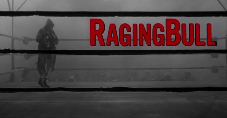
Around 55 of these films are included in his new book, and about 28 make it onto the cover. Perhaps the most notable thing about the titles featured are their variety. No two wordmarks, typefaces or sequences look remotely alike.
“People have told me before that I am like a chameleon and I tend to agree,” says Perri. “Some of my competitors, you could always tell their work because they had a particular style. I liked to give a film what I thought it needed, rather than what I necessarily wanted.”
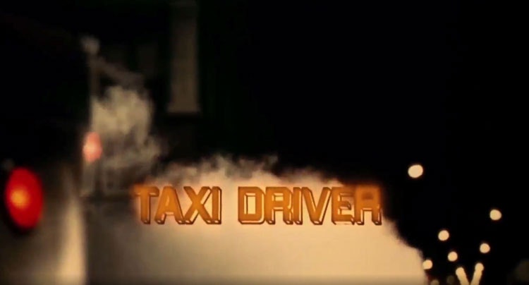
“Every film is different, so is the design solution for its titles”
So how exactly did Perri come up with a different idea more than 300 times in a row?
“I am driven by my emotions as I respond to a film – since every film is different, so is the design solution for its titles,” he says, explaining that nothing else is able to provoke ideas as well as actually watching a film. “I’m often given scripts and I’ll read them, but they don’t tend to give me what I need.”
What Perri needs to begin his design process is a good understanding of “how the director has interpreted their own thoughts”, he says.

“After that, I’ll find there are creative ideas in my mind’s eye, sometimes its fully formed and others it’s an element, like a motion or a typeface,” Perri says. All aspects of a film have the potential to influence the titles, he explains, from the era and setting of a film, to the colour of a car the main character drives.
After so many years and so many films, Perri describes this exercise as “opening the hinges on my head and emptying out the ideas”.
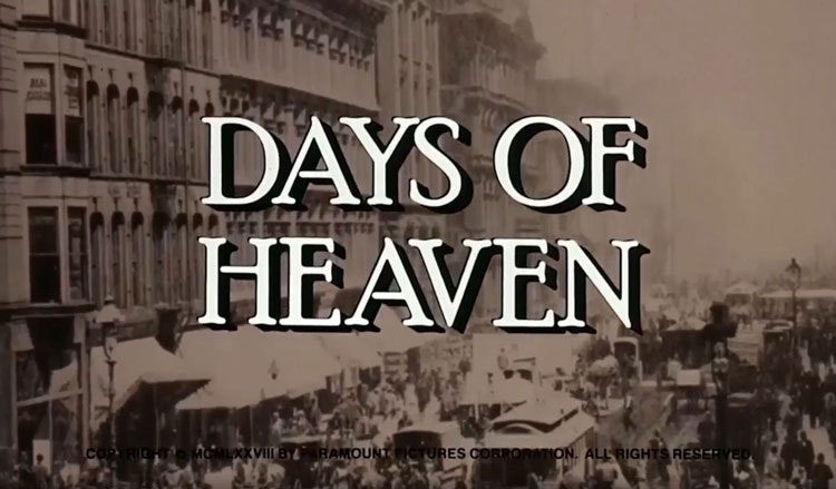
“I always try to do my work ‘real’ first of all”
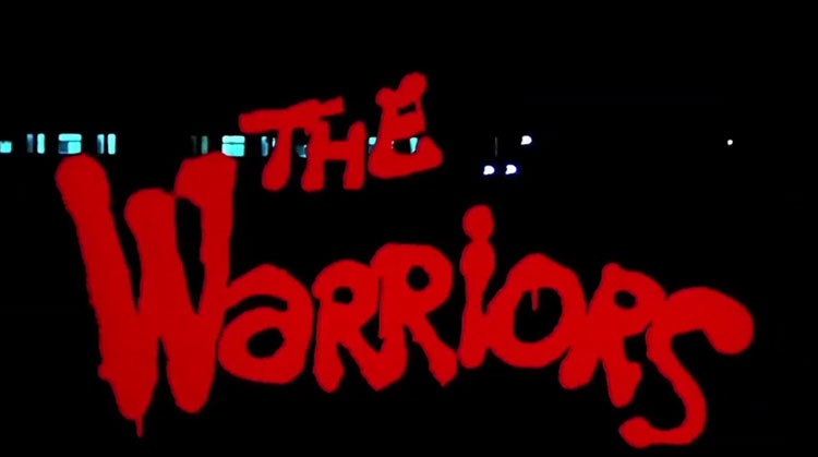
In practice, Perri’s process often include hands-on experiments. The graffiti-style red lettering for 1979 Walter Hill action thriller The Warriors was designed using spray paint, while the big block letters for Martin Scorsese’s 2002 historic crime movie Gangs of New York were real wooden blocks found in a type setting studio, which were then worn down and aged to “match the characters and the city itself in the movie”.
“I always try to do my work ‘real’ first of all, instead of creating something digitally to begin with,” he says. That’s not to say Perri is anti-technology. His career has successfully stretched both pre- and post-computers. Digital working is “just another tool” to help him realise ideas, he says, just the same as film and splicing equipment.
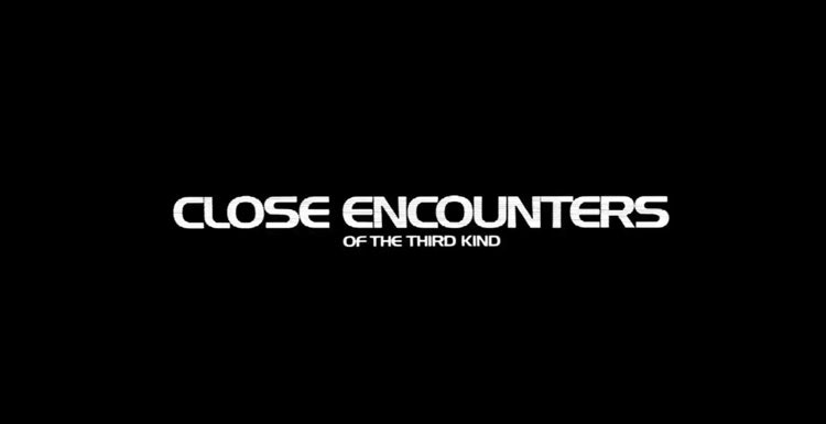
When working with physical materials however, Perri says attention needs to be paid so that the title sequences don’t end up being “so over-designed you can’t read it”. Not only does that mean he’s not done his job right, but as he also points out, it’s a legal requirement for titles to look a certain way.
This is because everyone involved in a film, including producers, studios and directors, will sign a contract stipulating details of their title cards, such as the size of their name onscreen. Unreadable title sequences would be a violation of that contract.
“You’ve got to pay attention to yourself first”
Looking over all of the films he’s been a part of, Perri says those he made with Martin Scorsese were his favourite. In total, he worked on 10 of the director’s movies, from 1976’s Taxi Driver to 2004’s The Aviator.
“I’m proud of every one of those movies and it’s partly because of his willingness to truly collaborate with his creative people,” he says. “He gives you the space to do what you think is best and out of that environment comes my best work.”
In more recent years, barring of course those affected by the coronavirus pandemic, Perri has focused much of his time talking to students. In 2019, he toured universities in the UK and while in lockdown has conducted virtual sessions.
What’s his best advice for those looking to get into the business? Perri says the greatest lesson film title design hopefuls can learn is how to be in touch with and best out of themselves.
“It sounds trivial, but I like to think of it as listening to myself,” he says. “If you want other people to listen to you and take notice of your work, you’ve got to pay attention to yourself first.”
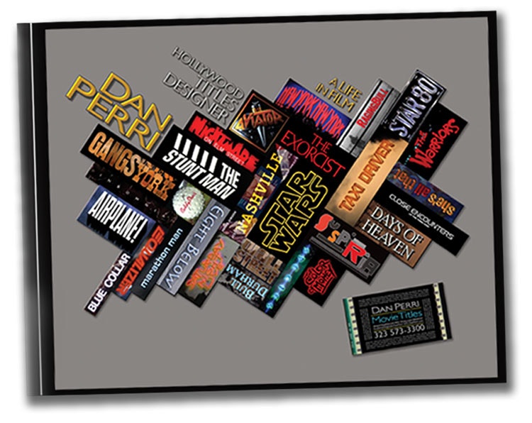
Dan Perri – Hollywood Titles Designer A Life in Film is available to pre-order now. Head to danperri.com for more details.

- Design disciplines in this article
- Industries in this article


One response to “Dan Perri: the designer behind your favourite film”
Thought that was a very interesting article. I went to the Saul Bass retrospective many years ago at the design museum and had always noticed the movie title sequences that had been well designed and showed empathy with the films that followed. Wasn’t surprised to learn that Dan Perri was mentored by Saul Bass and until I read this article thought SB had designed the titles for Taxi Driver. Might have been because the music was by Bernard Herrman who worked with both designers.