Drama vs Reality videogame, from Uncommon

Uncommon has designed a desktop game for ITV’s latest Drama vs Reality campaign. It’s inspired by classic ‘90s beat ‘em up arcade games and features characters from ITV shows. On the drama side are actors like Anna Friel, while The Only Way Is Essex star Ferne McCann is part of the reality team. The game’s details are all inspired by a 16-bit style, from the backdrops for the fight scenes to a period-authentic soundtrack. The game launched in partnership with gaming platform Twitch.
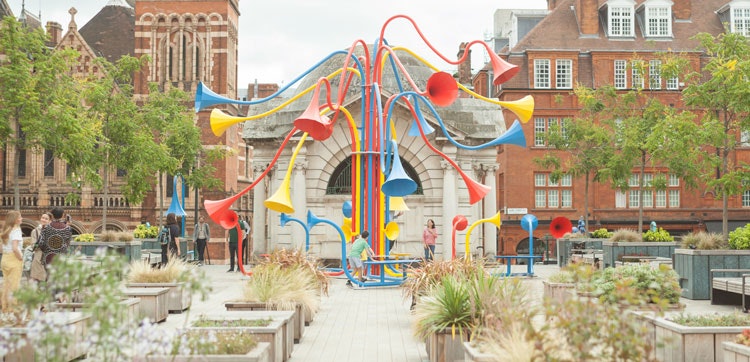
Sonic Bloom installation, from Yuri Suzuki and Alter-Projects

Yuri Suzuki’s latest sound installation has opened in London’s Mayfair. Sonic Bloom, part public artwork part communication tool, comprises a network of brightly-coloured horn-shaped elements. Together they form an abstract, interactive flower shape. It’s been curated by Alter-Projects. According to the design team, the project aims to “enhance the music of the city that often goes unnoticed”. That may include birdsong, rustling leaves, as well as the sound of passers by going about the city. The “playground of sound” is also community-focused: visitors will be able to record their own voices, and they emerge on the other side of the tubes. “These temporary connections create an incentive to form a closer, more intimate human connection where a friendship could flourish,” says Suzuki.
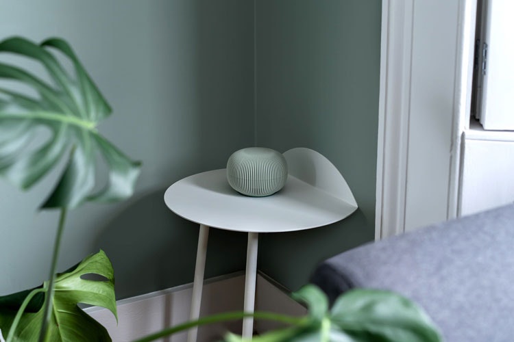
Hedgehog smart home device, by Blond

There has been a wave of thoughtfully-designed smart home devices of late, including Layer’s Capsula Mini assistant. London design studio Blond has now unveiled Hedgehog, a device that protects against WiFi cyber-attacks, and is inspired by the woodland creature. Like a hedgehog, the product appears small and friendly, explains the studio, but its “deeply ridged surface” is a reference to the animal’s defensive spikes. When it recognises an attack, Hedgehog’s LED light ring flashes red. It’s made from recycled plastic, and is available in four pastel colours. “The technology in our home shouldn’t have to be hidden away,” Blond founder James Melia says. “Tech in our home is here to stay and we believe that everything that surrounds us should feel natural in our environment.”
Hoxton Campus visual identity, from Anagram
Design studio Anagram has crafted the visual identity for new London-based work space Hoxton Campus. Previously a base for Aviva, the reimagined space now offers space for businesses of all shapes and sizes, according to Anagram. “This is a Hoxton only brand and Hoxton has a rebellious unconforming history,” say studio co-founders Mark Whiteway and Matt Partis. They created a series of characters based on the different shapes throughout the three distinct buildings – one was an old garage, another a warehouse, and the third a music studio. The team then brought these shapes to life with eyes and legs. The colour palette has been inspired by tones found on-site, such as brown and reds, while the logomark is based on type foundry 205TF’s Maax Regular. The ‘o’s in Hoxton were adapted to be perfect circles, as a nod to the characters’ eyes.
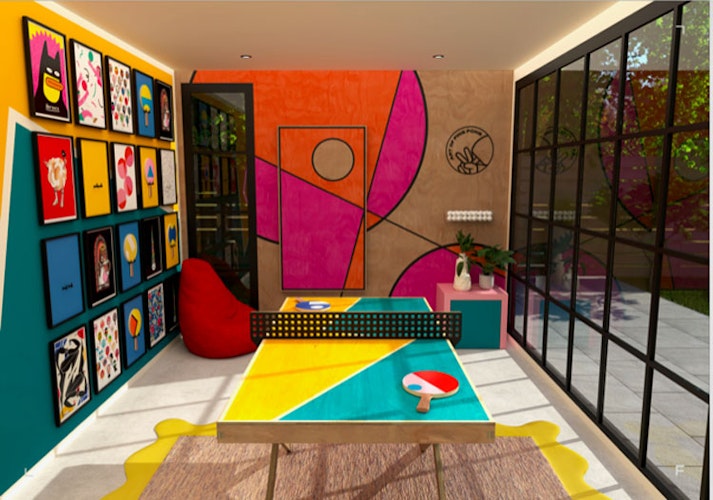
Garden Games Room, from The Art of Ping Pong and Fokus

Garden room design company Fokus has collaborated with The Art of Ping Pong on a series of play rooms “where ping pong subculture meets bursts of colours and revels in the enjoyment of art”. Fokus offers custom-built garden rooms, which can be used for socialising or working from home – especially relevant given changing work patterns post-2020, according to the company. This new collaboration adds a ping pong twist to the mix. One option allows for a multi-purpose office space that can be adapted into a more playful setting in non-working hours with the specially-designed ping pong tables, while the other choice is for a more straightforward play room. The Art of Ping Pong recently unveiled an AR-based exhibition at London’s Islington Square and for this collaboration, limited-edition tables will be available that will span no more than runs of ten at a time.
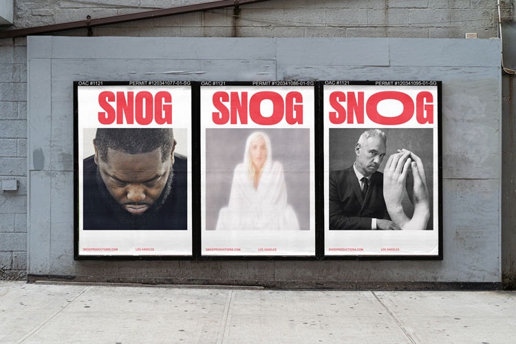
Snog visual identity, from A Line

A Line design studio has created the identity for Snog Productions, a Los Angeles-based video production company. Taking inspiration from the company’s name, A Line has created an identity that aims to be both cheeky and passionate, explain studio co-founders James Trump and Nick Monkhouse. The “playfully approachable” logo hopes to clarify the British slang meaning of snog as kiss to American audiences, with an ‘o’ that can be animated to suggest the shape of lips. The designers used two typefaces, Druk and GT Zirkon, for the new look and paired it with a vibrant red “to dial up the sense of passion”.

- Design disciplines in this article
- Industries in this article
- Brands in this article


