Manchester design studio MERó has created the brand identity and campaign materials for the BBC Children’s new gaming app, Nightfall.
Nightfall is an online multiplayer game which immerses players into a dream world as soon as they go to sleep, and the first of its kind produced by the BBC. Players become Nightfallers who have to navigate increasingly difficult dreamscapes and defeat Knags, the game’s villains.
It aims to foster a sense of teamwork – and align with the BBC vision to inform, educate and entertainment – as players unite to stop Knags turning dreams into nightmares. It is also a safe online space for children to “vocalise” their fears, MERó says.
The art of unboxing
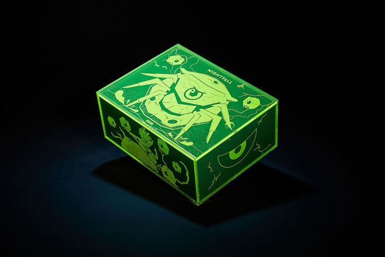
To promote the game’s launch, MERó has created a 17-piece box which has been sent out to gaming influencers. MERó’s co-founder Andy Culbert tells Design Week that all the items in the box are “inspired around the game and world of dreams and nightmares”.
The items include a personalised invite with matching symbolic key to enter the game, a sleeping mask to represent the sleep aspect of the game, a journal for jotting down thoughts, lanyard, stickers and glow-in-the-dark tote bag. The bag is emblazoned with a key message from the game: ‘Face your fears’.
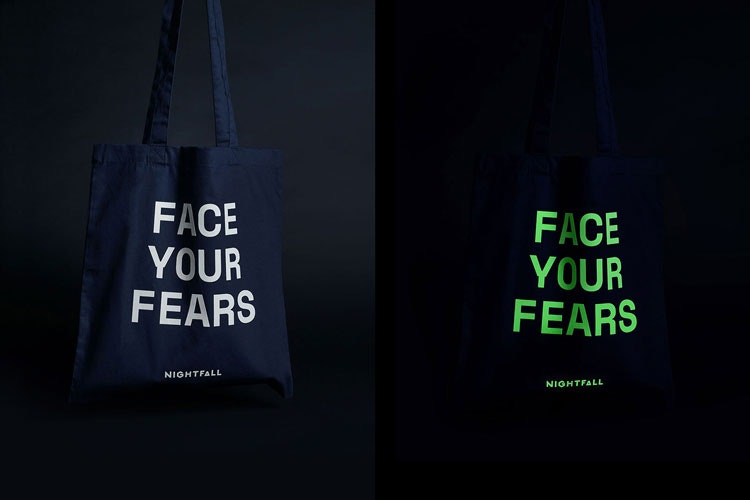
The studio says it is the first time the BBC has promoted a product by contacting influencers directly; 20 of the boxes have been sent out. “Gamers do a lot of unboxing as part of their content creation,” Culbert says. “It is also a way of getting the brand and the game in the video, rather than influencers just telling their audiences to go play a game,” he adds.
As part of the research process Culbert says that the studio watched gamers’ channels and became “immersed” in the that world. “We looked at other gaming unboxing to see what the influencers were most excited about but then brought it back in-line with Nightfall,” he says.
Visual identity
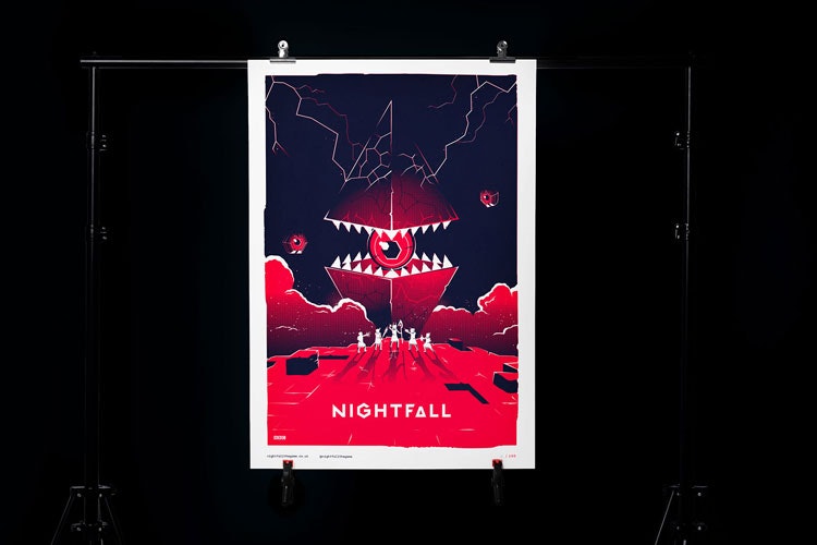
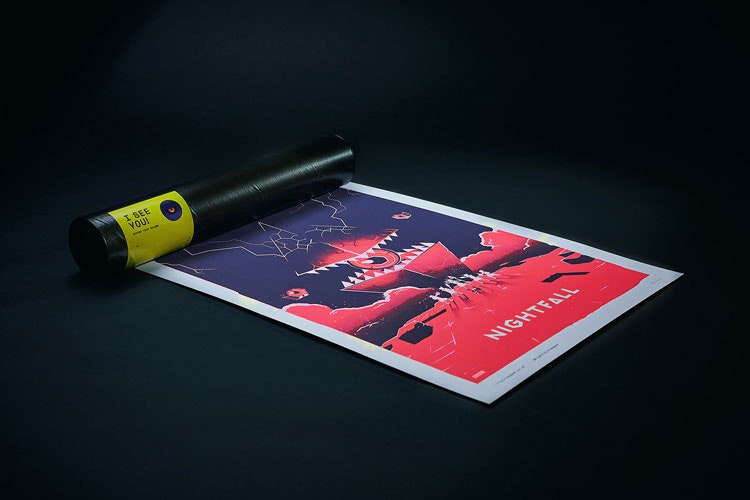
MERó was also responsible for creating Nightfall’s visual identity. Inspiration for this came from diverse fields, Culbert says, including horror films, optical illusions and neurological patterns. Working closely with the BBC, the team came up with a brand direction based on the relationship between light and dark.
The colour palette features dark shades of purple, pink and contrasting tones of yellow. MERó also created brand guidelines for the app.
While creating other brand assets, MERó incorporated other aspects of the game such as brain scans of people in dream states. “We wanted an identity to be completely flexible both in the game and when it was being used above the game,” Culbert says. “The box is a perfect example of this approach.”
What’s in the box?
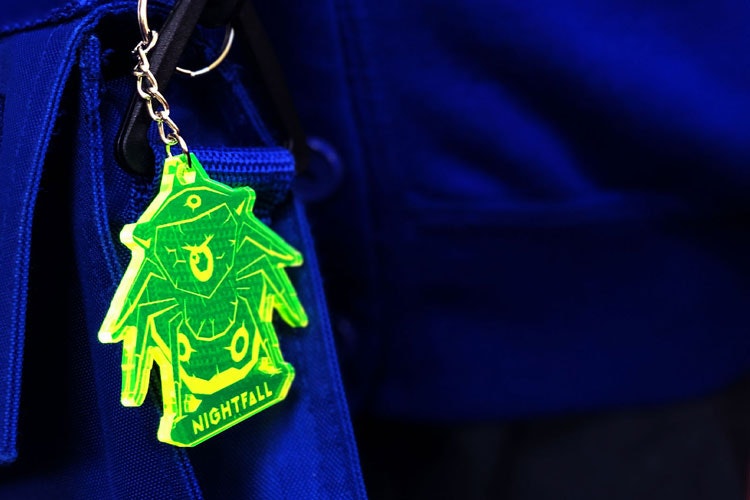
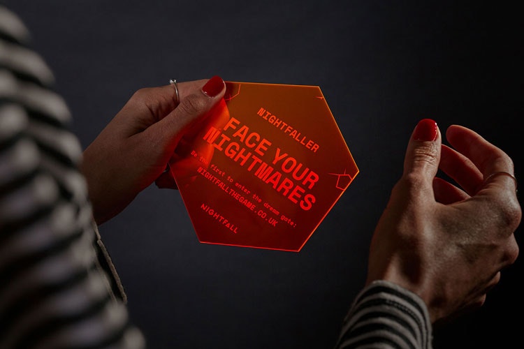
The Perspex key that is included in the box, for example, is a result of the studio’s familiarity with the game. It was designed to represent a tool that opens the gate at the start of the game. “But at the same time, it “represents unlocking your fears and entering the game world”, Culbert adds.
The invitation to play the game is a hexagonal shape, which mimics the game play controller buttons. The dream journals that are also included in the box come enclosed with a bright green hexagonal sticker too.
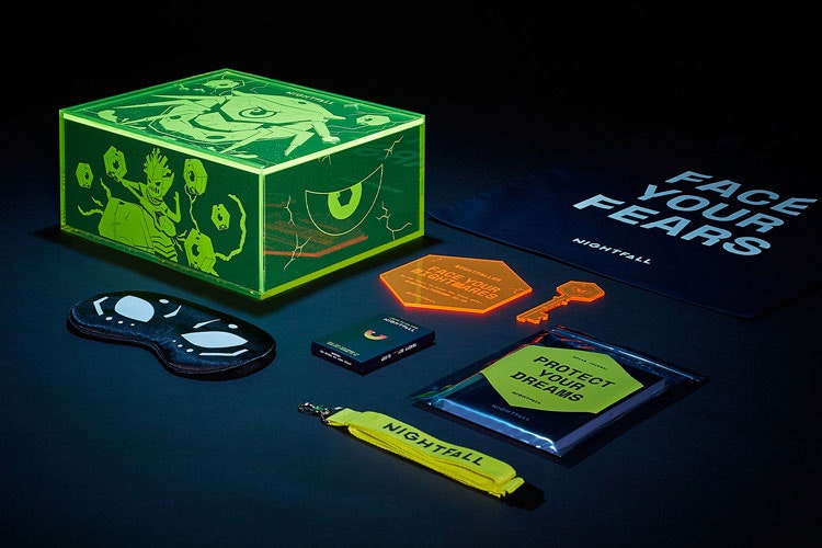
The sleep mask – which features an illustration of one of Nightfall’s characters – was the first product to be decided upon. It was inspired by how the game starts; the user drifts off to sleep and closes their eyes.
The box itself is finished with neon illustrations, which give the product a luminescent look, highlighted by the neon yellows and orange Perspex of its contents.
“Just the right side of scary”
Culbert says that one consideration was striking a balance for tone of voice between what is “age appropriate” while also keeping in mind that “children won’t engage with a game that appears too young”.
Culbert says: “We realised the need to design characters with an older player in mind – probably leaning towards the ages of 16.” The target audience – eight to 11 years old – is “hugely influenced” by what their older peers are playing.
“We needed it to be just the right side of scary,” he says. During the research stage, MERó focused on the “bad guys” as a way to keep an “edgy” tone and as the characters that “are ready to be taken on”.
The aim was to “motivate kids with a tone that would excite them” and to create characters that are “bold and badass, but work together as a team”.

- Design disciplines in this article
- Industries in this article
- Brands in this article


