When most of us consider video game visuals, we might think of graphics — how realistically an alien world, race track or war zone can be replicated. We might not immediately think of fonts. But a new book aims to draw attention to the importance of typography’s role in immersing players in games. Arcade Game Typography focuses on arcade games from the 1970s through to the 1990s, as Tetris and Space Invaders exploded in popularity — a time when fonts were crucial in communicating messages and attracting potential players.
There were limitations to this design; letters had to be shaped on an 8×8 pixel grid. But as the book’s author, Toshi Omagari, a typeface designer at Monotype UK, explains, “limitation is great driver of creativity”. The breadth of examples in the book, which has lesser known gems as well as familiar favourites, highlights that sense of creativity even if it was not always a successful font — something Omagari is quick to point out.
We spoke to Omagari about what modern day video game designers could learn from vintage gaming, the legacy of arcade game typography and his favourite font from the book.
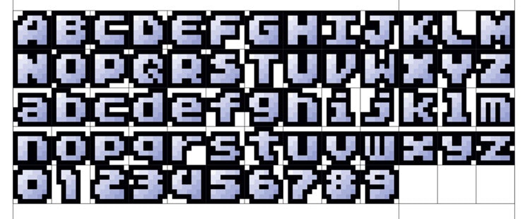
Design Week: Designing within an 8×8 pixel framework might sound tight. Do you think people will be surprised by how many different typefaces have emerged from that?
Toshi Omagari: I am totally expecting that! Variety is indeed the most surprising aspect of the book, and the whole reason why I started collecting the fonts. The 8×8 pixel grid is very limiting at first, but what makes game fonts so diverse is the use of colours for the sake of entertainment. After all, these were not made for computers which just needed to display legible letters. When you try making one yourself, it will become apparent that it’s actually quite easy to make a totally new typeface even today.
DW: The book stresses how creativity comes from limitation, especially the 8×8 framework. With technical developments in video games so advanced, do you think current-day video game designers could learn from this creativity?
TO: Absolutely. While I understand that modern home games are far more complex than arcade games and do not require such decorative typefaces to convey information or attract paying customers, I wish developers were more creative with type.
In their defence, video game engines generally do not support cutting edge font technologies like colour fonts or variable fonts, let alone OpenType — a format for scaling computer fonts — so they do not have the same toolkit as graphic designers. The font technology in games needs to evolve in order to give the developers more creative freedom.
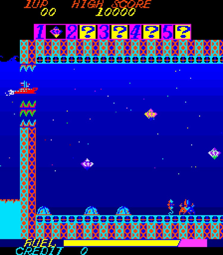
DW: You explain that typeface is an underappreciated design detail of videogames, especially when it conveys vital information, like the scoreboard in Pong. How has its importance changed as video games evolved?
TO: Early days of video games were simpler times and not as much information needed to be conveyed, which also applies to arcades. When you describe something as ‘arcade-like’, it means it’s quick, exaggerated and direct, definitely not subtle or nuanced. In the PC and home consoles, games can be more complex and have a whole bunch of data and statistics, which is more prominent in role playing, strategy, and sports games. User Interface (UI) text for these kinds of games needed to behave more like regular text and simply work. Nowadays, accessibility is becoming a hot topic in video game development and I feel that typography is being taken more seriously.
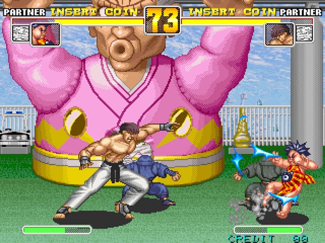
DW: Some of these fonts were used loosely in-house, like with Sega, or with the recognisable Atari font. What was the value in creating a uniform font for videogame companies?
TO: Sometimes you could identify a company from its visual alone; Sega used to have a strong footing in arcade, and its big and flashy typography could be seen in almost all games. It was almost un-Sega-like when its typography was simple and minimal. Namco’s use of the Atari font was so prominent to a point we call it Namco font in Japan. I think that has become the company’s branding tool just like Pac-Man.
Nowadays, it seems to make more sense to have a typeface for each title rather than trying to get away with only one typeface for all the new releases. I think the same thought process of branding typeface applies to video games too, which I would argue is more of the case in each franchise rather than for a company. Taking recent examples, Nintendo has made a custom typeface for its Splatoon series. EA’s FIFA series also consistently uses FF DIN for UI and has had the same logo typeface for several years.
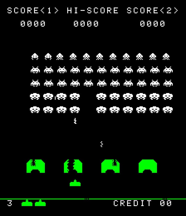
DW: This book is the first to catalogue this kind of typeface design, and it is “only a very small portion of the treasure trove of videogame typefaces” that you found. Apart from your book, what do you think the legacy of these typefaces is?
TO: I think people are noticing that these fonts look a lot more fun than usual pixel fonts. This is a kind of people familiar with retro gaming, and I see their takes of colour fonts in pixel-art indie games, retro game merchandises, YouTube videos and elsewhere. I think mainstream attention to the topic has not caught up yet, which my book tries to accelerate.
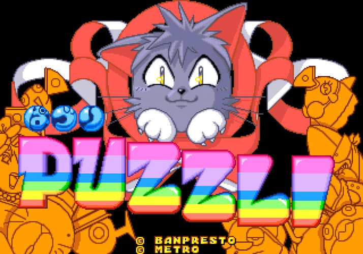
DW: What is your favourite typeface from the book?
TO: One of my favourites is from Legend, not because of the design but the context. You are a fantasy hero for hire, and the weapons are bags of money. You throw them at the enemy to bribe them and fight against their former brethren on your behalf, so finance is the central game mechanic. The typeface used is nicely coloured in white, blue and red, which made me think it was a subtle hint at a certain country (also the currency of the game world is dollars). Moreover, the typeface has no lowercase. You could say that’s ‘capitalism’.
Arcade Game Typography by Toshi Omagari is out 31 October 2019 and costs £19.95. It is published by Thames & Hudson.

- Design disciplines in this article
- Industries in this article


