At the M&M’s flagship store in Berlin, visitors can create a virtual version of themselves made up on hundreds of lentils (the brand’s name for the sweet’s distinctive shape). It’s a surreal step for even the most ardent M&M’s fan, but the projecting mapping tool is a way for the brand to surprise visitors at the new location. “We wanted to make sure we were making the brand connection in both the literal and figurative way,” Landor & Fitch senior 3D designer Ashley Randolph says.
Berlin’s store opened in October 2021, bringing the total number of M&M’s stores worldwide to seven. It might seem counter-intuitive to increase retail spaces as the pandemic has not been kind to the long-suffering high-street. But expanding a brand’s physical presence, if designed well, can provide opportunities for unexpected engagement.
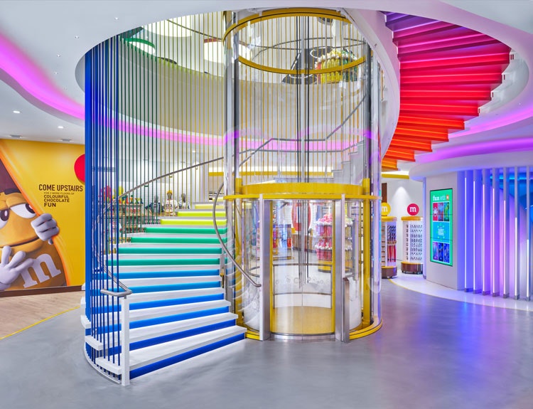
Randolph, who has worked on M&M’s stores stateside, visited the German capital before embarking on this latest project. This was integral to the Berlin store – a way to differentiate it from its counterparts in America, London and Shanghai – and also to recreate something of the city in the space (which was previously a theatre). “Berlin has this really beautiful, self-expressive culture,” she says. “And we really want to make sure that we were taking part in that as well.”
Some of these are aesthetic influences, such as a street art display inspired by Berlin’s East Side Gallery (visitors can also have a go at creating their own). One of the store’s most eye-catching features is a recreation of an M-Bhan train car which appears to be breaking out of a wall. There’s also an emphasis on digital interactive experiences, Randolph explains, such as clubbing pods which draw on Berlin’s underground night club scene. As the designer says: “We tried to get as artful as we could in the store.”
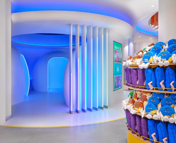
More literal connections include a rainbow-coloured staircase, evocative of the sweet’s wide-ranging colour palette, as well as a colour-changing light that guides visitors through the store. Throughout the project, the key was developing an identity bespoke to Berlin. Compared with the American stores, the Berlin outpost is “very artistic”, Randolph says.
Mixing Berlin’s counterculture and a brand like M&M’s may raise eyebrows, particularly among those who view the stores as a tourist trap – a far cry from a city’s galleries and museums. Landor & Fitch has tried to implement the branding in a playful way, according to Randolph. The MBahn model is stamped with the date M&M’s was founded, while a ticker tells visitors how far they are from other M&M’s stores around the world. If you’re a fan of the sweet – and given the rising number of M&M’s stores worldwide, it appears many people are – it’s likely you will get a kick out of such features.
Bringing an Italian experience to London
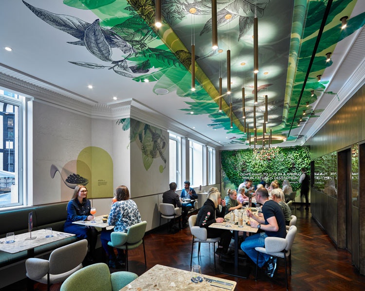
Lavazza’s flagship store in London was designed to tell a different story. When it opened last summer, it became the brand’s first store outside of Italy and only its second flagship store (Milan is home to its first). Inspired by the idea of italianità (a concept which evokes a sense of Italy), the store aims to bring the storied coffee brand to new audiences and bridge British and Italian coffee culture, explains Ralph Appelbaum Associates (RAA) creative director Mirko Cerami. “They wanted to reflect the local market,” he says, “but also give you a sense of the Italian experience of coffee in London.”
The location is split into various sections, aiming to provide a variety of experiences. A cafeteria on the ground floor, designed by Italian architect Carlo Ratti, is inspired by the shape of a coffee bean and made from a combination of brass and re-used coffee powder. This is intended for a more leisurely experience, while a takeaway counter lets people come and go quickly (Cerami suggests this is more in line with British coffee culture). Coffee beans abound, of course, including a chandelier comprising 700 beans hangs from the ceiling.
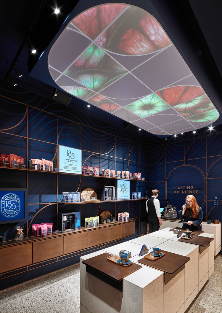
But how do you take the experience beyond beans? Cerami points to the interactive features. The store launched with an AR game where Londoners had to hunt for coffee cups hidden throughout the city in return for free coffee. A more permanent feature is the immersive tasting area, designed to give visitors a fully-caffeinated experience. A “coffelier” – the equivalent of the wine world’s sommelier – provides a guide for the tasting experience and insight into the drink’s preparation. The aromatic notes of each blend – such as jasmine – are projected onto the ceiling.
The immersive experience is a highlight for Cerami, and inspired by RAA’s work on the Lavazza Museum in Turin. RAA has worked with Lavazza – on the Turin museum and the design of a factory tour for the launch of Lavazza Casa 1895 (which was shortlisted for a Design Week award last year). This knowledge of the 127-year-old brand and its values was essential throughout the most recent project, according to Cerami. The legacy alone distinguishes the store from Britain’s many coffee chains, the designer explains, though he hopes that Lavazza’s story connects in London’s competitive market.
Interiors that “show” as well as “tell”
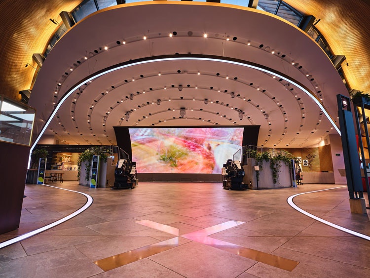
It’s not just food brands innovating around flagship spaces. Samsung KX opened in London’s Coal Drops Yard. Its name refers to King’s Cross, the district where the venue is located. Launched for the brand’s 50th anniversary, the space aims to provide “local culture, face-to-face learning and innovation”. People can browse Samsung products, but also attend workshop and try out new tech. Samsung head of premium retail Andrea Ferrara-Forbes, who headed up the project’s design, says the goal was to make the brand ethos “fun and tangible”.
One of the key elements was finding a way to include branded details but not overwhelm visitors, according to Ferrara-Forbes. “We wanted to ‘show’, not just ‘tell’,” she explains. “If you enter any retail space, there’s a plethora of messaging; we wanted to make space that people walked into and felt comfortable.” That means a careful use of any overt branding; Forbes says the team has used traditional details (such as logos) only when “absolutely needed”.
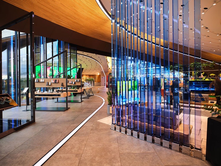
KX is housed within Heatherwick Studio’s site redesign; two Victorian warehouses have been joined by a pair of signature “kissing” rooftops. The Samsung design team has worked with interior designers Brinkworth throuhgout the space, often incorporating London-orientated details. The fabric in-store has been especially designed as a nod to the London public transport system, for example.
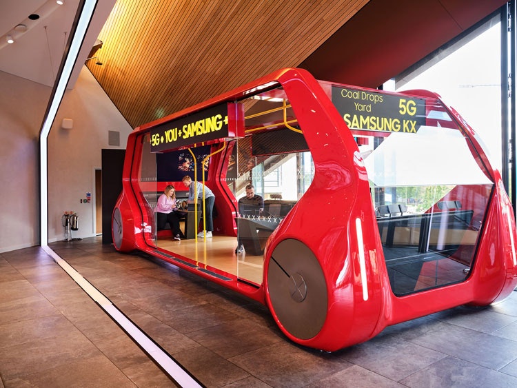
Less subtle is the 5G bus – a model of a London bus which showcases Samsung’s 5G technology on the go. Like Randolph and Cerami, Ferrara-Forbes stresses the importance of designing with a local significance. “What works in our New York or Tokyo space may or may not work in London,” she says.
Lavazza’s new store has a few pandemic-era touches – such as disinfecting lights – but it was more dramatic for KX. When the space opened it was also intended as an events venue for community networks and charities, such as Age UK and Mind in Camden. Meanwhile it has an area where office or home workers can sit and work. Although the pandemic has curtailed Samsung’s vision for its flagship, now customers can dial into the space virtually, where a manager will consult or walk them through the space, Ferrara-Forbes explains. A degree of modularity then is crucial. She adds: “We’ve pivoted everything.”

- Design disciplines in this article
- Industries in this article


One response to “Designers are bringing retail innovation and interaction to new flagship spaces”
-Since when nonsene is called innovation?
-From NOW on…