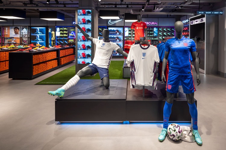
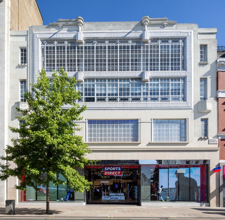
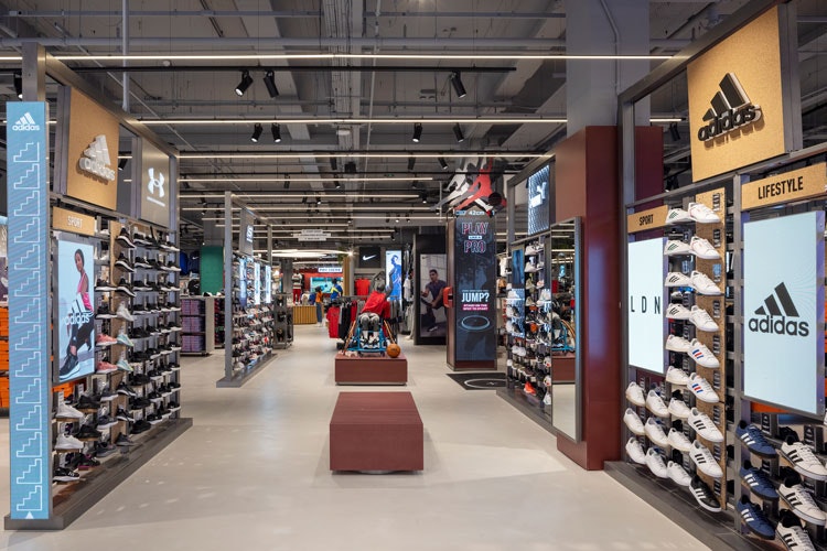
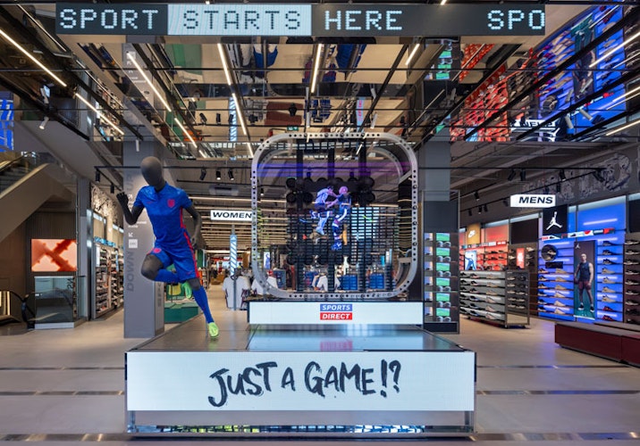
Retail design studio The One Off has redesigned Sports Direct’s flagship Oxford Street store with a “grass roots” approach.
It is the first time that one of the stores has incorporated Sports Direct’s recent rebrand, which was created by Venturethree.
The project began with conversations with consumers about their frustrations with Sports Direct stores, according to The One Off creative director Richard Collier. The studio has also worked to refresh regional branches in the past three years.
“A lot of it was around getting to the product and finding what they were looking for,” he says. “For example, the women’s area wasn’t very visible within stores.”
With the focus on customer-led experience rather than brands or categories, Collier says that the aim was to create a “much more inviting, exciting place to visit” over the store’s three floors.
AR and recycled mannequins

Two features of the store incorporate AR technology as a way to drive engagement, according to the designer. A selfie mirror for children allows kids to choose from a selection of masks in a frame – from sporting figures like John McEnroe to fantastical creatures like unicorns – and then download pictures of themselves and share them on social media.
A basketball experience uses similar technology to see how high people can jump, designed in collaboration with We Are Interact. The installation maps points on the face and shoulders and encourages people to jump to touch a basketball.
Inspired by old arcades, users can then add their initials to the store leader board. These experiences link back to products in-store, Collier explains. For example, the height is measured in pairs of Nike Jordan trainers.

Sustainability has been another focus in the redesign. Unused or damaged Sports Direct mannequins have been recycled into a resin-like material called Thrive and used on displays, countertops and furniture.
A few varieties have been incorporated in-store which feature varying colourways and textures as a result of recycling different mannequin types. Display mannequins also now have “more universal body shapes” as a way to present a more accurate portrayal of the sports kits on sale.
The Bra Studio
The One Off has also designed a section dedicated to helping women finding the right sports bra. “The sports bra is a foundation element – something that’s really important to your workout,” Collier says.
The “semi-private” area is removed from the customer flow as privacy was preferred when browsing for the accessory, according to the designer.
The studio has built an accompanying digital bra selection tool, which customers can access through dedicated screens or on mobile devices through a QR code.
It takes women through a series of questions about the kind of sports they do and their body shapes. At the end of the process, it provides a recommendation.
This kind of guidance may be a part of future updates for the store, according to Collier. A digital version of the bra studio is available online.
More design details

In the shop windows, multiple rotating video screens have been installed. Mobile pay systems have also been designed in an attempt to make checking out and finding products smoother.
An entire floor is dedicated to football, while the store also has a dedicated section for the growing world of esports. Sports Direct is managed by Frasers Group, which also owns the videogame outlet Game. This is a natural crossover for the brand, according to Collier.
A circular area, known as the Heroes area, has been designed “to launch different stories” relating to trends and events, Collier adds.

The One Off has paid special attention to sound and lighting, Collier says. Key areas feature category-specific lighting. For example in the football section, “stadium-like” lighting is in use, Collier says, while a more “urban” streetlight-inspired selection is used for the running section.
Payment points are marked out in a red lighting, which matches the rebrand’s colour palette. These design details have been helpful for the flagship store’s wayfinding, according to Collier.
“In the past, it’s always been five speakers turned up really loud,” Collier says of the sound design. Now, more speakers have been put in which can play at differing volumes to create a “more comforting environment”, he adds.
Two further flagship stores are set to be redesigned in Manchester and Birmingham.

- Design disciplines in this article
- Industries in this article
- Brands in this article


