As historians and anthropologists the world over will attest to, humans using cannabis is no new phenomenon. The history of the plant can be traced as far back as 2000 BC, and in the millennia that have followed, it has been cultivated extensively for its medicinal and nutritional qualities, its material potential, and perhaps most infamously, for its psychoactive properties.
It is for this reason the cannabis plant has been marred in political controversy for centuries. Vast sections of the planet continue to uphold bans on its usage that were established as early as the 1800s. This in turn led to a widespread mistrust of the drug – and often its users.
But efforts to rehabilitate the reputation of cannabis have proved fruitful in recent years. There are a growing number of countries which have or are looking to legalise the plant for recreation, and an even more substantial number for its medicinal properties. And arguably the biggest success story throughout the conversation has been cannabidiol (CBD).
For those who swear by it, CBD is the treatment that can ease ailments as diverse as anxiety, acne, seizures and the menopause. Derived from the cannabis plant, the extract has earned high acclaim across the world, with the value of the UK’s CBD market alone set to reach nearly £1 billion by 2025.

“Getting away from the ‘stoner’ stigma”
But while perceived as a “miracle cure” by some, legitimising CBD products to sceptics is a pressing issue for the industry. “For us the mission isn’t about fighting other brands for the attention of people who are already into cannabis products,” says Clemens Böninger, co-founder of London-based CBD retailer The Drug Store.
“It’s really about creating a brand, both online and offline, that can welcome people in that might still be hesitant.”
For Böninger and many others in the industry, attracting new customers relies on a stern rejection of stereotype. Iconography once used as industry shorthand for cannabis products – cannabis leaves, paraphernalia like pipes and bongs, oversimplified depictions of Rastafarianism – are seen as unhelpful in the mission to distinguish CBD as an entity in and of itself.
“We want to get away from the ‘stoner’ stigma, and product and retail design is really the best way we can legitimise CBD,” he adds.
This is further emphasised by Kristina Spionjak, marketing director of the London Canna Group, a dedicated branding and marketing consultancy for the cannabis industry. “The ‘stoner’ look really feeds into the negative perception of the plant.”

“Visually appealing, but also associated with health”
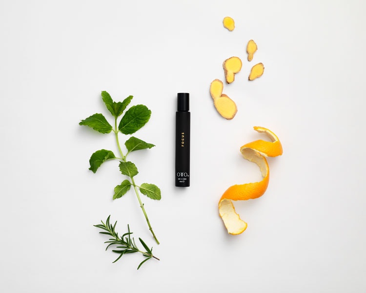
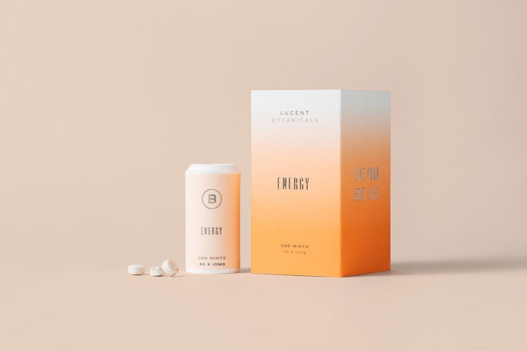
In place of these stereotypes, new brands are increasingly opting for simple, understated designs that look to position CBD as the health-orientated product it purports to be. Böninger says “clean typography and pastel colours” are favourable, while Spionjak says she recommends Canna Club clients go for “abstract” designs.
From these trends, a noticeable “CBD design aesthetic” has started to emerge. Böninger says it’s a case of “being visually appealing, but also associated with health”.
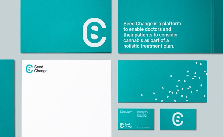
It’s a similar sentiment that underpins the recently adopted visual identity of medical cannabis campaign group Seed Change. As a movement, Seed Change is dedicated to reducing the stigma of cannabis so that it might be more confidently prescribed and used by UK doctors and patients to treat illness.
The updated Seed Change brand has been designed by London-based consultancy Ascend Studio, and boasts a cool-toned colour palette, clean sans-serif fonts and a strong, health-oriented message.
“Our task really became about reframing the association of cannabis as a negative drug to something with a positive impact on health and wellbeing,” says Paul Croxton, creative director at Ascend Studio. The rebrand – which also included a new name – was designed to give Seed Change an air of authority in the industry, moving away from stereotypes and toward a more serious endeavour.
“They originally came to us with the name Cannabis Worx, but after conducting market research we found it didn’t champion the effectiveness of cannabis well enough,” he says, adding the team landed on Seed Change because it felt “emblematic of the paradigm shift we’re seeing right now”.

“Design needs to be part of the solution”
Notably present throughout the Seed Change branding is the word cannabis itself. Croxton says this was deliberately done to keep messaging clear. “CBD brands rarely mention cannabis because of the negative associations, which is how CBD has become a brand in its own right,” he says.
“But a lot of these bandwagon brands actually just add to the confusion by playing on the obscurity of CBD, clear messaging and design is a huge part of the solution.”
Part of this confusion is owing to the fact many CBD products are white labelled. Though this is increasingly not the case as the market diversifies, deliberately confusing or misleading claims have in the past have been made by CBD brands in a bid to distinguish products that are often, in all likelihood, the same.
But as Spionjak points out, deliberately confusing claims aren’t just an instance of sneaky marketing, they’re also be legally questionable: “There are limitations as to how CBD can be marketed legally in the UK.
“You can’t outrightly boast the medicinal benefits of your products unless you have a medical licence, which no one in the UK has. Instead, you have to be honest with people and earn their trust.”
Like Croxton, Spionjak advocates for transparent branding. She encourages brands to incorporate the science and journey into the design of their products, pointing out that the Canna Club’s own small store won’t stock any product that doesn’t provide an on-package method for customers to trace the origins of each product back to the seed.

“Places need to feel aligned with what customers want”
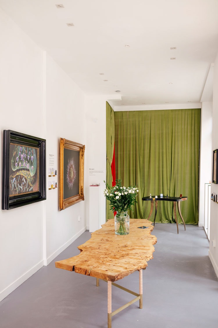
Beyond a clear message on the product, there’s also huge emphasis on the need for a well-designed shopping experience. Shops selling CDB products are rarely a place where customers want to be in and out quickly, Spionjak says, so store design is crucial. “What we’re seeing is that when people are going into these stores, they aren’t going there with any particular brand in mind.
“People just want advice and information and they’ll usually spend between 20-30 minutes talking to shop assistants before buying a product.”
Böninger, who last week opened another branch of The Drug Store in the City of London, echoes this: “[The store] has to feel aligned with what people want to get out the product.
“In the same way it needs to be easy to understand, with products grouped by application or by type, so that we can help customers become educated.”
Ultimately, Böninger says the experience needs to be designed for normality. “If we want the industry to be seen as a legitimate one, we need to make people feel comfortable.
“That means making people feel confident to walk into a shop and learn, but it also means empowering them to keep their CBD product on the bathroom or kitchen shelf, not hidden away from guests.”


- Design disciplines in this article
- Industries in this article
- Brands in this article


