As we head back into our archives, here’s a gem from March 1990. Jane Lewis looks at the creative ways design firms promoted their services through mail-outs — from knotted handkerchiefs to boxed chocolates. Today, much of this marketing has shifted to digital platforms like email campaigns and social media, reflecting the evolving landscape of self-promotion. We invite you to share your thoughts on these past strategies and how design promotion has changed over the years.
Each day, designers keen to promote their services send a cascade of mail-shots through the post — but how many of these offerings are consigned to the bin? Jane Lewis finds that pictures often speak louder than words in the battle to catch the attention of those with the power to put business your way.
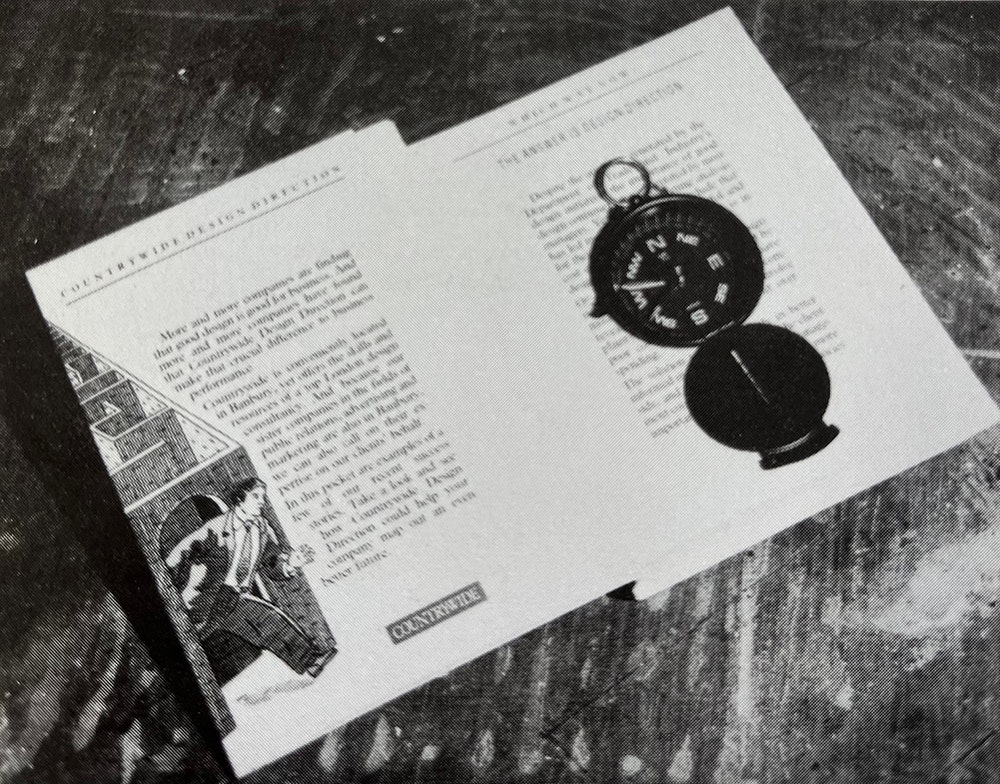
Imagine ploughing through the daily post and discovering a knotted handkerchief wishing you a happy new year, a single boxed chocolate, or even a compass encased in a mock Penguin
paperback pack.
Impressed? These items are just some examples of the hundreds, if not thousands of mail-outs despatched by design groups intent on promoting their services.
And yet, despite the efforts that go into these corporate offerings, and however prettily packaged they may be, John Banham, director general of the Confederation of British Industry, is on record as slating British design firms for being ‘very bad at selling themselves (DW 15 September 1989).
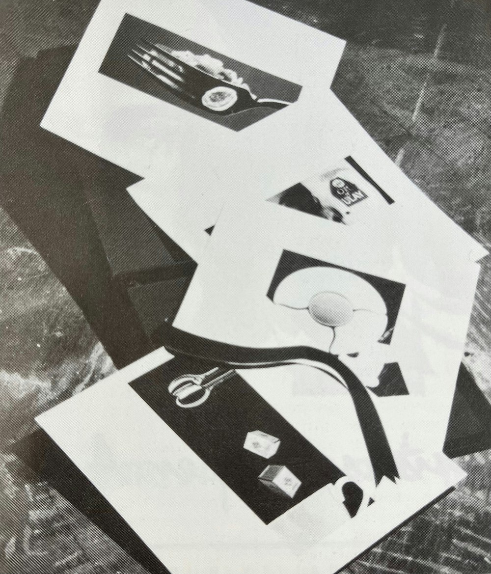
Surely, the multitude of boxed postcards, giant-size posters, audio cassettes, carefully ribboned packs and even handkerchiefs are not just self-indulgent ego trips which waste money and resources without generating new business.

At the end of the day, however, the success or failure of such items seems to depend very much upon whose desk they land.
While some design buyers may consider such promotions to be a gimmick, they can nonetheless provoke more reaction than the conventional company brochure.
For Berkshire consultancy Splash of Paint mailing out a miniature box containing a single chocolate has resulted in commissions for actual promotional work. “We’re quite small and wanted to do something different that would be noticed and not just filed away,” explains a
consultancy spokesman.
Of course, Splash of Paint is not the only design group to eschew the traditional A4-size glossy corporate brochure in the quest to stand out from the crowd.
Shan Preddy, independent consultant and former managing director of The Tyrrell Company has been collecting design brochures for years and notes: “They vary hugely
from the enormously large and glossy to an A4 sheet of folded paper. And the big consultancies don’t necessarily have the biggest
brochures.”
Black, although said to be passé, is still a favourite with several firms. Nettle Design has adopted a little black folder containing a Collection of postcards, and packaging Innovation has just finished producing a square-shaped black box complete with individual project sheets.
Last year, Giant sent out suitably large posters to plug its talents, while Light and Coley opted for the purely visual, with a large sheet of paper featuring an illustration and little else. Sampson Tyrrell, however, has chosen an audio approach, by producing cassette tapes to push its audit communications division.
Even those that go for brochures try to incorporate a touch of wackiness, from Newell and Sorrell ‘s magazine-style brochures which feature high-quality editorial-style photography, to The Hugo Organisation’s personally-signed, illustrated cardboard fold which has a definite handmade air about it.
The variation is endless. But what tickles some clients may annoy others. And some design buyers may not even bother to take a second look. It is an unfortunate fact that the destination of many a mail-shot is not the filing cabinet or the top drawer, but the bin.
Mark Brown, brand manager at Brooke Bond Foods, tends to pay little attention to what he receives through the post when it comes to commissioning design work. Instead, he relies on “personal recommendation”. “I have a policy of looking through it and reading the covering letter. Then I’ll throw it away unless it’s a name from the past. Anything that comes in blind I’ll discard, confesses Brown.
But not all potential clients are impulsive. Brochures and mailouts are an important source for Angela Kemp, trade marketing controller at Safeway. And Ross Marks, managing director and chairman at consumer electronics group Ross Electronics, uses brochures to gain a ‘first impression’.

Geoffrey Bourne, managing director of women’s fashion chain Jules, takes them very seriously indeed.
When the design world got wind of the fact that he was looking for a consultancy to work on future outlets, he was besieged with envelopes and packages in every shape, form and size.
Unperturbed by the sheer number of items he received (well over 50), Bourne stuck by his word and ploughed through the entire bulging pile before coming to a decision — he eventually plumped for Din Associates which had worked on former Boules outlets.
But enticing a potential client to take a closer look is just the start. A brochure or mail-out will then have to meet certain criteria, which of course vary according to the reader. Some like pictures, some like words, some like it plain and simple, and some like a tease.
“I’m looking for creativity, ingenuity, innovation, but I don’t want gobbledegook. I want to see a track record. I also want to see how they approach a job and research the market,” declares Kemp.
For Bourne, though, words do not hold as much clout. “I go straight for the pictures,” he says. “I can’t be doing with the script at all. That’s what it’s all about — visual packaging, seeing the work they’ve done.”
Marks agrees: “What impresses me most is past work, particularly before-and-after illustrations. I don’t like too many words, it’s the pictures that are important.” And awkward-sized items bother him. “If it’s A3 or a scroll, it may be academically interesting but it can also be annoying,” he says.
Whatever the size or style of publicity material, none of it comes cheap. Sampson Tyrrell’s audio cassette mail-shot, which, the consultancy claims, has proved ”cost-effective”, worked out at almost £10 per tape and not every design buyer has a personal stereo to hand when the post arrives.
Preddy points out that few consultancies take into account the amount of time spent on producing their own material. All in all, it can work out rather costly. Her advice is not to get enmeshed in “essays on the role of design”, and “don’t mail out brochures haphazardly — because it costs a fortune”.
A final word of warning comes from Kemp: “It’s the old classic — if
you see a terribly glossy, over-the-top brochure you can’t help but think that the costs are going to be high.”
Header image source: FooTToo/Shutterstock.com
- Design disciplines in this article
- Industries in this article
- Brands in this article


