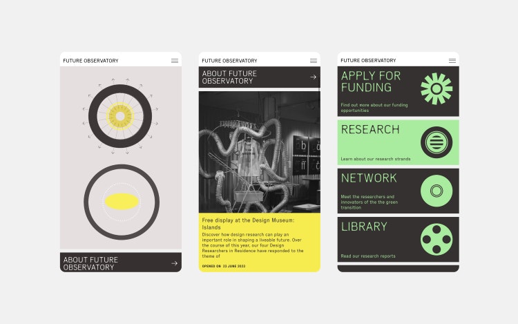
Design studio Spin has overhauled the branding for the Design Museum’s Future Observatory research programme around a graphic double circle icon that represents its visionary status.
Launched in 2021, in partnership with the Arts and Humanities Research Council, the programme’s research investigates how design can respond to the challenges of the climate crisis.

Spin was approached by Future Observatory director Justin McGuirk, says Spin co-founder and creative director Tony Brook. The studio had previously worked with McGuirk on the Design Museum’s Waste Age exhibition, he adds.
A key challenge of the project, Brook explains, was “to reflect the vision and huge ambition of the organisation and its programme”, which encompasses exhibitions, events and research.
“What they do is both hugely varied and often conceptually new, and the identity had to support that,” Brook adds.
He describes the programme’s “dynamic, active and involved nature”, which the identity sought to communicate, adding that it needed a “level of complexity and ambition to reflect what they wanted to achieve”.

According to Brook, the “double circle”, binocular-like motif that anchors the identity came about when the studio asked itself “what do the eyes that see a new vision of the future look like?”
“As we developed the identity we saw that circles also connected with other ideas that seemed relevant to Future Observatory’s work: the circular economy, targets, and so on”, he adds.
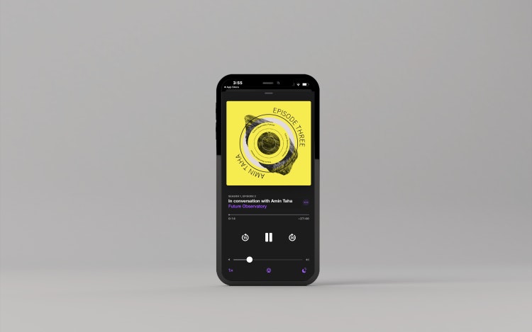
The circles are layered with “graphic, abstract and organic imagery” made by the studio, inspired by “science, nature or growth”, he explains.
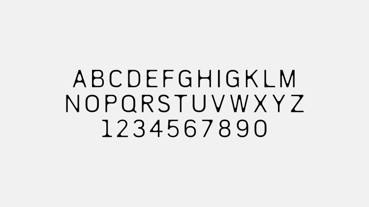
The studio also created a bespoke display typeface for Future Observatory. This started “with the idea of creating something organic, referencing the way tree branches break away from the main trunk, or the way bamboo grows, to create rounded connections between stems and crossbars”, Brook says.

Brook describes its tall, narrow form as “economical”, allowing for an increased number of words per line, while maintaining legibility.
Spin extended it into a variable typeface, Brook adds, “where the rounded corners increase in size to make a heavier weight”. This detail, which appears when your cursor hovers over it on the website, is “a nice way to express the idea of growth and change”, he says.
Colour is used in a “functional” way, Brook says, to help “structure and define content on the website.
Updating the more monochrome palette of the old identity, Brook notes the new colours provide “ reinforce the idea of a combination of the natural and digital worlds”.
According to Brook, the animations helped “grab people’s attention” when dealing with the amount of information to be displayed on the website. The circle device provided a lot of variety, he says, with much of the animation “based on dilating pupils and blinking eyes”.

Brook adds that the website also needed to have “the potential to grow built into it”, and to appear approachable to the programme’s different audiences of “scholars, students and the public”.
Its overall aim, the studio says, was to “elevate their profile and match the quality of their visual communications to the significance of their research”.

- Design disciplines in this article
- Industries in this article
- Brands in this article


