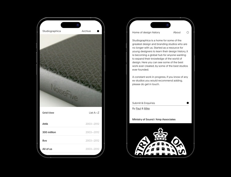
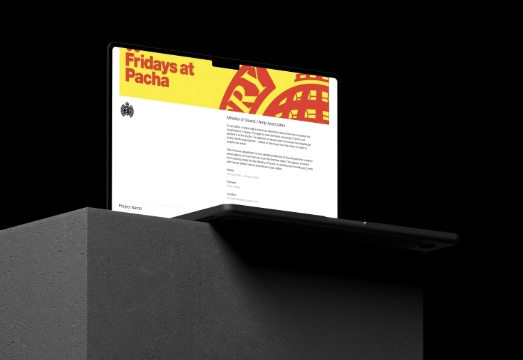
Paul Bailey and Mike Sullivan have launched Studiographica, a website to archive the work of leading agencies after they close.
According to Bailey, previously a designer but now working as a brand strategy director at Bristol-based design agency Halo, the idea for the project was sparked by a conversation with younger designers at the agency.
“I was talking about all these agencies that were around in the 90s, like CDT, HGV, Cartlidge Levene and all those lot… we started banging out all these names and could just see the blank looks on the designers’ faces”, he says.
As to why there might be this particular gap in design history, Bailey believes the era’s technological shift from print to digital and the early days of the internet may be to blame.

“Previously, agencies may well have had more call to produce a book or other printed material of their work. So, when the agency goes bust, or when the agency closes, that work is still around”, he says. “In the early Noughties, agencies built websites themselves, but when the agency closes the website is taken down”.
Nor does this work get the attention it deserves in design education, he suggests: “It is amazing that students go through design education, and they are not being told about old agencies”.
An open call for contributions
Being quite active on Twitter, Bailey explains that he put out a call to find out which agencies’ work he should be looking to preserve. “I got loads of responses – although some of them I had to message to tell them the agency was still around”, he says.
“We got in touch with about 6 to 10 people and got three of them to initially agree to share their work”. The first to be featured on Studiographica was 300million; “since then we’ve had the Ministry of Sound send us their stuff and HGV, but we’ve also heard from Attik, McFaul and about five or six more”, he adds.

Bailey says that although many of the suggested agencies were familiar, “because Twitter isn’t geographically specific, there were also agencies I hadn’t heard of”.
He is hoping these wider contributions will continue to come in: “Currently it’s too UK-focused… basically it’s people around my peer group at the minute, but the hope is that that will give it enough traction to spread a bit further”.
While he initially conceived as the project being an educational resource for students, “to make the best work of the best agencies visible” from a particular slice of design history – as the scope of responses continues to grow, Bailey feels the project is becoming relevant to a far wider demographic.
He is clear that it will still need to remain curated: “I’m not going to turn it into a home for any design studio who’s ever done anything; it’s not supposed to be that”.
As further agencies continue to be recommended “in different geographies, or from different eras”, he may need additional curatorial help, he adds.
A time and a place
“I’ve known many people who’ve run a design agency and they close for creative differences between the partners, or they close because the cash flow is not very good, and they’re not getting the money in when they need to. There are a million reasons why the agencies close”, he says.
He feels that the sometimes-vocational nature of design businesses can also be a factor. “Design businesses are set up because the designers are passionate about design; they’re not often set up by people who are good with money… I think that’s why design businesses close”, he says.
But rather than this narrative, the focus for the website remains on the work. “The thing I was keen to pull up with this website was the legacy of the agency, and to have some kind of resource for this amazing body of work that these amazing designers have done”, says Bailey.

But in referencing these agencies, he adds, “what we were really getting at was: ‘Do you know this approach to design?” He suggests that with different agencies showing “quite different takes on the same problems”, it is their design thinking that he is looking to make visible to students and younger designers: “I don’t think there’s anyone out there at the moment who approaches work like Tomato does”.
“A jumping-off point”
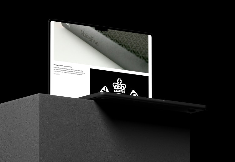
The website was built by Halo and designed by Mister Studio creative director Mike Sullivan. The design approach is “really simple, really clean”, Bailey says, to allow different styles of work to sit side-by-side.
The entry for each agency is limited to the same outline structure. “Otherwise, I know what some designers are like, and they’ll send us 50 projects”, he says. “All we need is the name of the studio, who the founders were, where you worked from and your logo. Then we just want five projects that you think could define the studio’s output”.
The website is conceived of as a starting point, from which designers will embark on their own research. “You’ll have to go off and do some more research into that agency, that thinking, or you’ll have a look at who the founders were and go and find them to see whether they’re doing anything else now. It’s really intended as the first point of call for the research, the jumping-off point”, he explains.
For now, most of the agencies contacted “tend to have the work or tend to say I’ve got the work somewhere”, he says, but he anticipates additional challenges with older work, which may have been stored in an obsolete format or not have been digitised at all.
“I think that something like this needed to be out there, and I couldn’t find anything, so we started it” he adds. “I don’t want it just sitting on hard drives in their lofts; I want to make it visible to people”.

- Design disciplines in this article
- Industries in this article
- Brands in this article


One response to “Studiographica preserves the legacy of shuttered design agencies”
Damn. It was all for clout in the end.