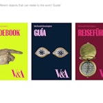
Designers often say they like limitations, that the best creative thinking happens within set parameters. But some projects come with more limitations than others.
Planning Unit jumped at the chance to design the new guidebook for the V&A, having worked on three previous books for the museum. But for this project, there was limited room for manoeuvre, as the page size, page count, typography and content were all pre-determined.
“It came down to making the most of what we were asked to do,” says Planning Unit founder Nick Hard.
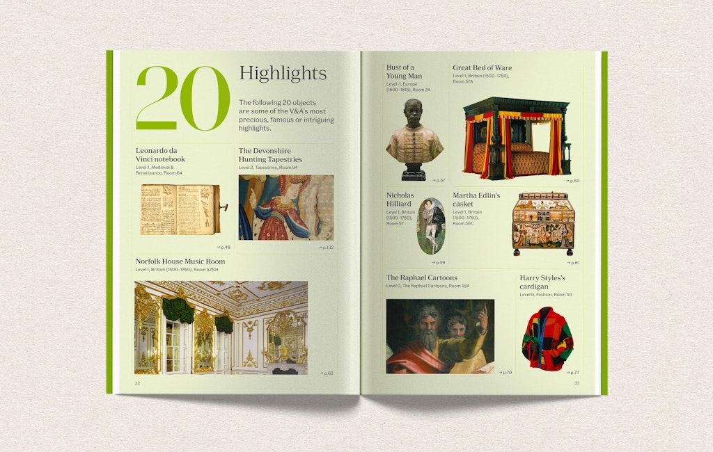
With 2.7 million people visiting the museum last year, and a permanent collection of nearly three million pieces, the guidebook plays a vital role in helping visitors tick off many of the highlights. It also helps people navigate the famously confusing space.
Hard says one of the most interesting challenges was to create something that would appeal to, and help, the wide range of people who come through the V&A’s doors. “It had to work for everybody, including lots of people who don’t speak English as a first language,” he says.
The book features 265 objects across 38 galleries, which range from Buddhism to Ceramics. “Our role was to work alongside the V&A team to ensure everything worked clearly and hierarchically together,” Hard says. “We had to make the guide a really hard-working piece of information design, functional, as well as beautiful.”
Key decisions
Choosing the right cover
“We did loads of different versions of the cover,” Hard says. “Every Tuesday we’d have a cover review, and every week it wasn’t right.” The Planning Unit team explored using pieces from the V&A collection that involved or suggested pointing, in obvious and more subtle ways. But the V&A worried using a single piece was too specific for such a wide-ranging book.
In the end they chose a cross-section illustration of the museum, by Stuart Smith-Gordon, which the V&A uses elsewhere in its marketing materials.
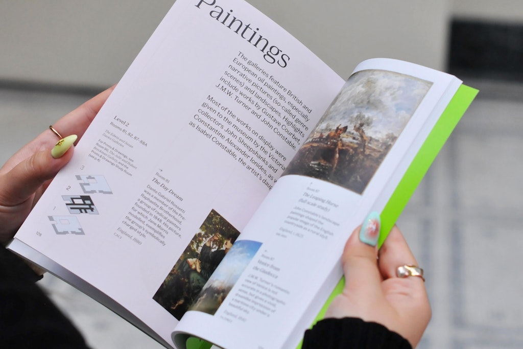
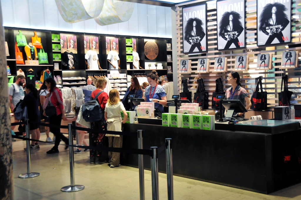
The light green colour was chosen to make the book stand out amid the visually rich surroundings. As well as being available in the shop and the museum’s cafes, volunteers around the museum use the book to help visitors find their way around, so they wanted people to be able to spot it very quickly.
Bringing order to the lay-outs
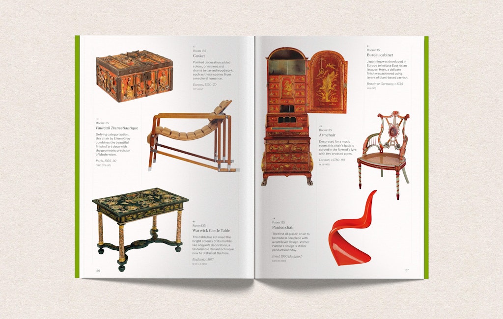
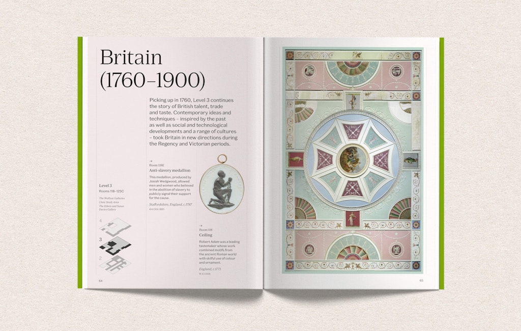
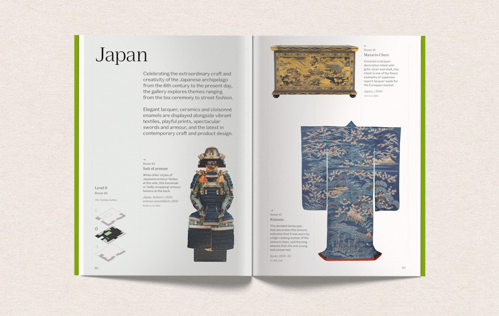
With a lot of objects to feature on every page, and a need to represent scale and relative place within each room, Planning Unit needed devices that would be clear and consistent, without feeling repetitive.
The first decision was to use cut-out images, “which gave everything as much space as possible and let it all breathe,” Hard explains.
“The danger was that everything was getting a little bit floaty, with no design structure. We needed something that held it together,” he says. They introduced thin guidelines to anchor the objects and the text on every spread, and create consistency across such diverse material.
Finding subtle ways to break up the sections
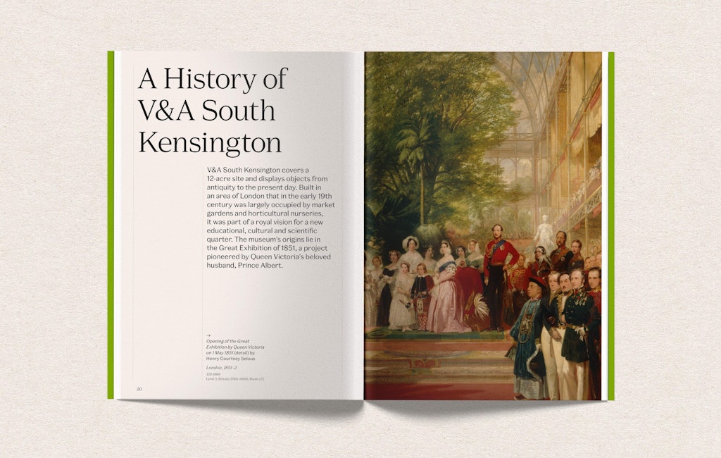
While broader plans to colour code different sections and the corresponding parts of the maps in the book were dropped, they did need to create some differentiation. Hard and his team used subtle tints for each gallery’s opening spread to create, “a visual cue that you were moving into a new space.”
- Design disciplines in this article
- Industries in this article
- Brands in this article


