Margaret Calvert has designed a new customised typeface in collaboration with Network Rail, which is set to roll out across wayfinding systems at its stations.
The Rail Alphabet 2 typeface has been created in collaboration with type designer Henrik Kubel and is part of a wayfinding system devised and executed by London-based experiential design consultancy Spaceagency, which also worked on strategy around the project.
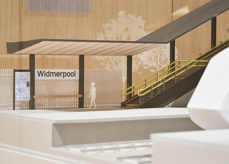
The typeface dovetails with a wayfinding system for stations featuring updated pictograms, including a Wi-Fi symbol and a gender-neutral toilet sign, designed by Spaceagency which created a design language to transform National Rail signs from dark blue to monochrome in a bid to simplify and declutter. This was extended to a full suite of pictograms.
Spaceagency director Sarah Manning says Calvert and Kubel’s work informed “a coherent, visually consistent graphic vocabulary where typeface and pictograms merge into a single graphic language”.
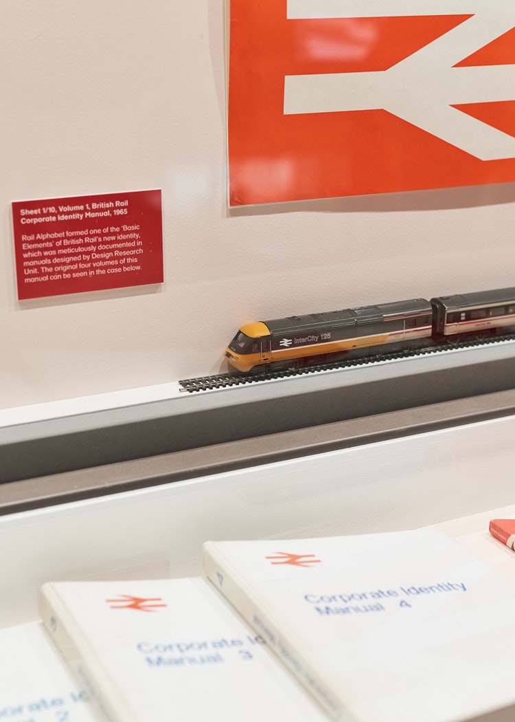
The design principles and implemented strategy will be published in a Network Rail wayfinding manual developed by Spaceagency. These have been put on display for the first time as part of the Margaret Calvert: Woman at Work exhibition at the Design Museum.
Anthony Dewar, Network Rail’s head of buildings and architecture, tells Design Week that the project has been in the works for two years. When Spaceagency was appointed in 2018 it worked up three different design routes, which sat on a spectrum of what Dewar called “evolution to revolution” he says.
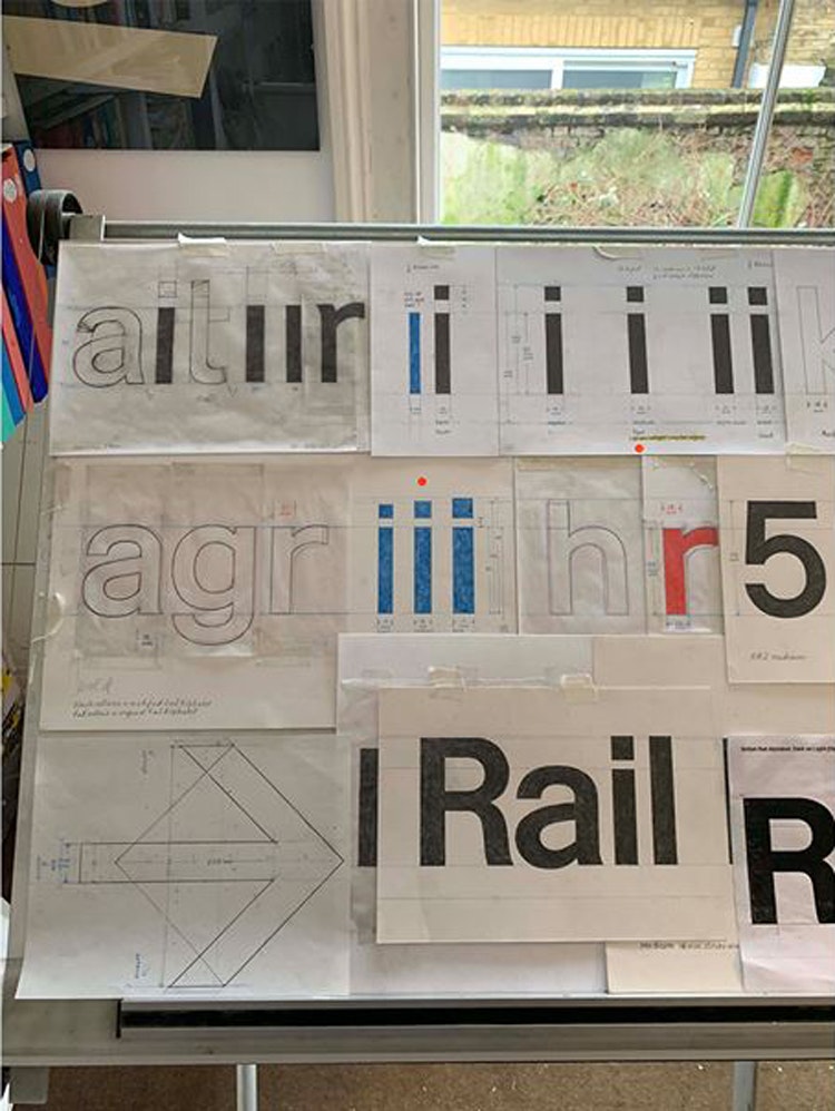
Following a private stakeholder event with nearly 100 reviewers in attendance, the more revolutionary approach was taken. This was the Calvert and Kubel-designed typeface New Rail Alphabet, later revised as Rail Alphabet 2.
The intention was to create a system that would improve “clarification” at stations, Dewar says, as well as adapt to more modern needs (like showing where passengers can charge their phones).
The typeface is a condensed and lighter version of Calvert’s 1960s typeface Rail Alphabet, which was used as the “starting point”, according to the designer.
The original Rail Alphabet was designed by Calvert and Jock Kinneir for British Railways with “slow-moving pedestrians” in mind. It also incorporated Gerry Barney’s “double arrow” symbol, which has become closely associated with Network Rail stations.
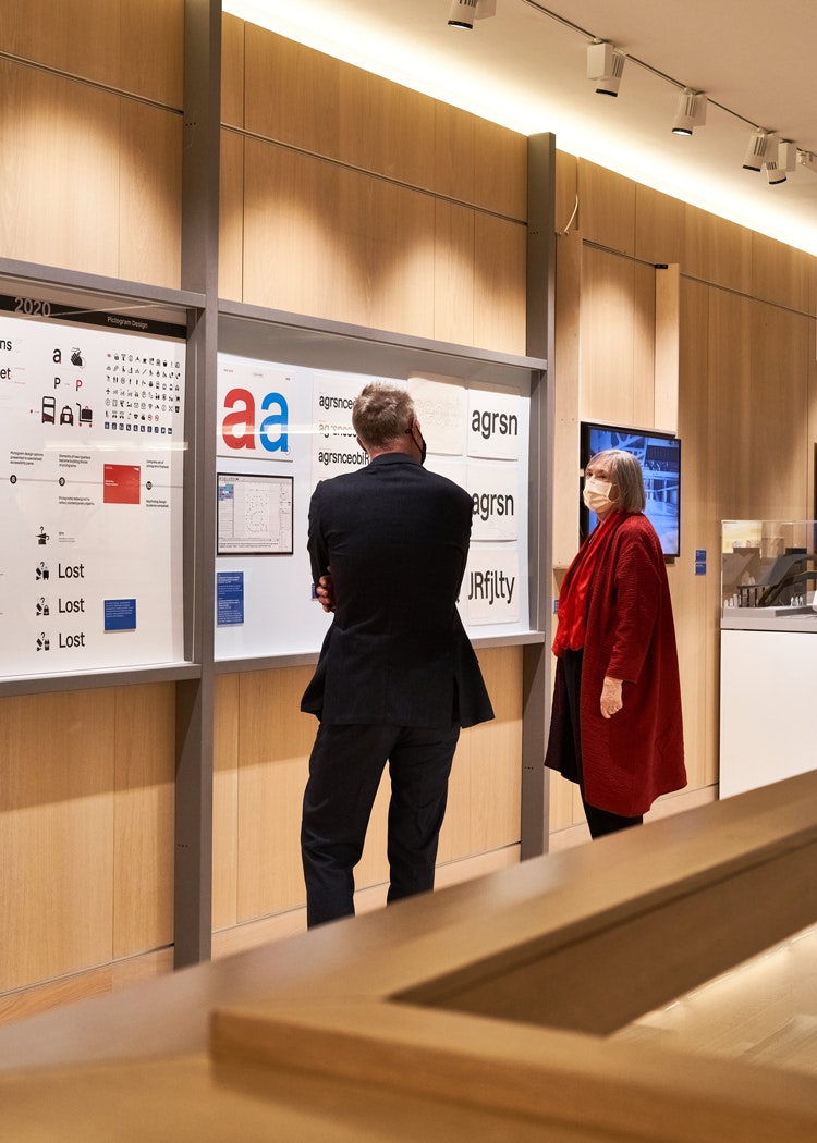
Of Rail Alphabet 2, Calvert says the main challenge was approaching a typeface that would be used for “both wayfinding and text” and would also “relate but be distinct from” her original design of Rail Alphabet.
“Drawing by hand, despite being a lengthy process, was my way of injecting a personal touch, avoiding any eccentric mannerisms that might easily date,” she says of the design.
As well as the typeface, new pictograms have been designed for the wayfinding system. A takeaway food sign has been updated to show a croissant and to-go cup of coffee, for example.
Meanwhile, a vape has been added to differentiate areas where you can vape and where you can smoke cigarettes (or where you cannot use either).
While the wayfinding system has been launched and the guide will be made available to read later this year, rolling it out on physical signage is still in a discussion stage, according to Dewar.
At the exhibition, there is a 3-D visualisation by Spaceagency showing the new wayfinding at London’s Liverpool Street station.
He says that there is an “enormous untapped potential” for design at Network Rail locations. Earlier this year, Network Rail and the Design Council teamed up on a report entitled ThinkStation, which explored the role of design in future train stations.
Margaret Calvert: Woman at Work
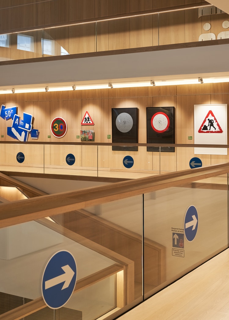
Margaret Calvert: Woman at Work explores the designer’s career (which spans over six decades) through three of her best-known typefaces: Transport, Calvert and Rail Alphabet.
Transport is her earliest work and was designed for Britain’s first full-length motorway the M1, which opened in 1959.
Calvert worked with fellow designer Jock Kinneir from 1958 to 1965 on replacing the “dangerous existing signs” with ones that were “clear, logical and consistent”, according to the Design Museum.
They ended up redesigning the entire road sign system for the UK, including for example the pictogram-based signs warning road users of elderly people crossing or ‘men at work’.
Transport was designed especially for the project – with special consideration of legibility and “reflectivity to colour”. The resulting road signs were three times larger than the previous versions.
Her eponymous typeface Calvert was designed by Kinneir and Calvert for the visual identity of new French town St-Quentin-en-Yvelines.
The typeface was rejected however for being “too English” and has instead been used for Newcastle’s Tyne and Wear Metro. It is also used by the Royal College of Art for its visual identity, where Calvert herself taught.
A final section, named Play, displays Calvery’s more playful projects where she subverts her signage work. This includes a commemorative logo she created for the Design Museum’s 30th birthday last year.
Margaret Calvert: Women at Work runs from 21 October 2020 – 10 January 2021 at the Design Museum, 224-238 Kensington High St, Kensington W8 6AG.
Admission is free but tickets have to be booked in advance. For more information, visit the Design Museum’s website.

- Design disciplines in this article
- Industries in this article
- Brands in this article


4 responses to “Margaret Calvert designs new typeface for Network Rail wayfinding system”
Margaret is a ‘graphic’ national treasure. And long may she continue.
How good is it to see the genius that is Margaret Calvert creating a new typeface? Timeless as ever.
I think it’s a shame (almost derogatory) referring to her retrospective exhibition as ‘woman at work’ she is an exceptional designer with men included. She is one of the few that stepped through despite potential female induced set backs and still even back in the 60s excelled. To use her status as a woman to drive extra interest in a modern context is to belittle her merit on its own.
In response to Tramp Design – I think you’ve missed the point. Part of the original signage she helped design included the triangular ‘men at work’ sign. It’s a play on that…