
Girlguiding’s biggest rebrand for 113 years launches
Landor & Fitch (now just known as Landor) has overhauled the identity of Girlguiding, the UK’s largest youth organisation dedicated to empowering girls.
Covering Rainbows, Brownies, Guides and Rangers, the new Girlguiding identity was launched to coincide with International Women’s Day 2023. According to Landor, it was designed to help the organisation reach the next generations of girls and volunteers, and support its mission of helping girls “know they can do anything”.
The rebrand is the culmination of several years of change for the organisation. In 2018, Girlguiding sought to modernise with an overhauled programme of badges and activities – covering subjects such as coding, human rights and inventing, with new badges designed by branding studio Red Stone.
Twitter rebrands to X with “good enough” logo
In one of the biggest branding stories of the year, in July Elon Musk announced the rebranding of Twitter to X, replacing its familiar blue bird logo with an “art-deco” X, following a brief call-out for a new design on Twitter. The rebrand saw the new crowd-sourced logo co-existing with old elements.
We went to designers for their thoughts, including James Greenfield, Koto CEO and co-founder, who said that the new name “doesn’t lend itself to being very useable”. Greenfield suggested Musk and his team have “massively underestimated” what a rebrand will take.
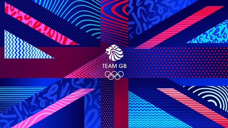
Team GB unveils new identity ahead of Paris 2024 Olympics
Thisaway devised a new brand strategy and identity for Team GB, positioning the brand around the diversity of Team GB athletes through an extensive suite of graphic illustrations in a bid to keep it relevant when the games are not being held.
The new designs are based on a brand idea that “goes beyond sport” to make it more relevant between Olympic games events, according to the team.
Having won the project via a tender at the end of 2021, Thisaway founder and creative director Graeme Cook says Team GB’s previous guidelines focused mainly on “the use of the logo and how to lock it up with commercial partners”, with few other visual assets.
Inside Wolff Olins’ global brand refresh of LG Electronics
Following “a teaser” launch in April 2023, in August LG Electronics unveiled its full brand identity. Designed by Wolff Olins, the new look nods to LG’s Korean heritage; while animated characters aim to bring life to the brand with fun dance moves.
Wolff Olins was brought in to reinvent the whole digital, physical and social experience and better align it with LG’s character, according to senior creative director Tom Carey. Instead of being perceived as “a traditional family brand that parents would buy their fridge from”, Carey says that LG wanted to “shift perceptions” and “put people first, not tech”.
The consultancy introduced a new face logo and a sector-defying serif typeface.
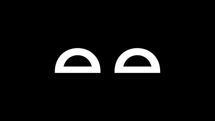
Landor & Fitch rebrands Eurotunnel Le Shuttle
Another project from Landor here: this time its work for Le Shuttle, formerly known as the Eurotunnel.
Landor was brought in to help Le Shuttle present itself as an easier, greener alternative to air travel and attract new travellers with a new “progressive” logo and monochrome colour palette.
The change came about as part of a wider strategy to rethink the Channel Tunnel experience over the next decade, according to Landor & Fitch.
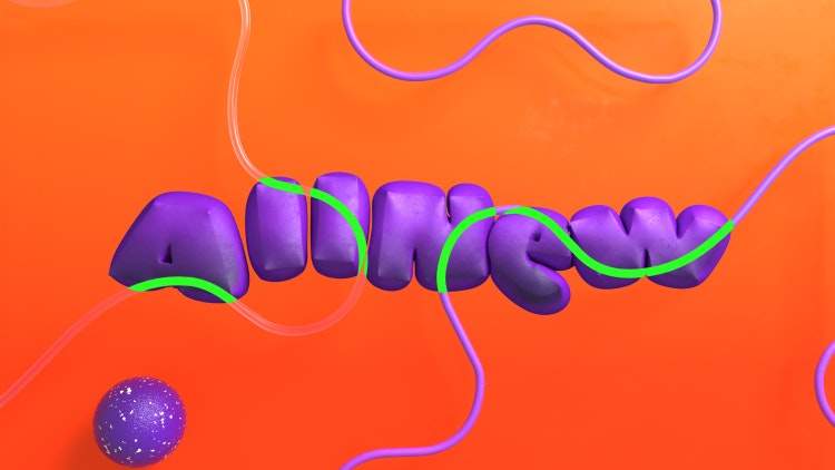
Nickelodeon rebrands for the first time in 14 years
LA-based branding and design agency Roger worked with Nickelodeon on its first rebrand in 14 years, featuring a new version of its signature “Splat” logo that aims to unify its on-air, digital, and social brand identity.
Roger has been working with the children’s television channel since its early days as a studio. For this most recent project, Roger worked with Nickelodeon’s in-house design team on the core brand identity; which features a contrasting type family and updated colour palette as well as the new Splat logo. The aim was to make the brand more cohesive.
Calling back to Nickelodeon’s “classic animated style”, the motion design combines “traditional cell animation and modern 3D design”. By layering the “bold and clean typography” on top, Roger looked to create a “contemporary look and feel” that pays homage to the network’s legacy.
Facebook unveils refreshed brand identity
Another huge story for another social media giant this year as Meta’s in-house team revealed the first phase of a larger brand refresh for Facebook, redrawing its logo and wordmark and helping its signature blue stand out.
The refreshed identity aimed to unifying Facebook’s brand and improve accessibility, featuring a redrawn logo and wordmark and an expanded colour palette.
The identity followed a number of other changes at the brand, with Facebook’s parent company Meta also unveiling its Twitter-rival Threads.
The project was led by Meta’s in-house design team. According to Tagu Kato, VP head of design at Facebook, it is the “first phase of a refreshed identity system for Facebook, with a focus on fostering effortless, self-initiated exploration and connection across every touchpoint”.

DesignStudio gives Center Parcs Europe nature-inspired identity
In a bid to appeal to a new audience, Center Parcs Europe looked to its roots for its rebrand by DesignStudio, embracing the relationship between nature and humans through its new identity.
The project was part of Center Parcs Europe’s broader strategy to reinvent itself as a holiday destination for all, not just families with young children.
DesignStudio devised a new brand story as well as Center Parcs Europe’s visual and sonic identities. According to executive creative director Vinay Mistry, the key aim was to “change perceptions and evolve the brand” to suit existing Center Parcs Europe visitors as well as travellers who might not have considered visiting before.
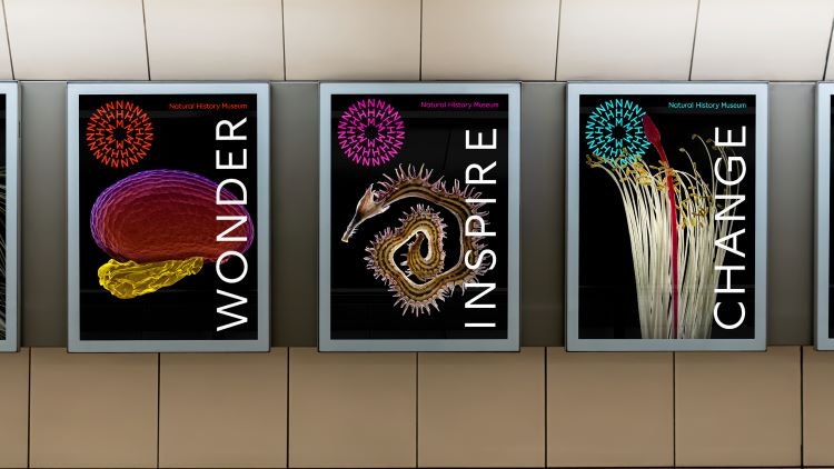
“From passive catalogue to active catalyst”: Natural History Museum’s new identity
Pentagram and Nomad designed a new identity for the Natural History Museum, with a graphic system that can be continually evolved using a generative tool.
The museum’s ambiguous new circular logo means it can be interpreted as anything from “a dandelion or a fossil to a collective of people or a school of fish”.
The studios worked on the project for two years following a creative pitch process that around 270 other agencies entered. According to Pentagram partner Marina Willer and Nomad founder Stuart Watson, the Natural History Museum has “a team of world class scientists in-house” so the studios were held to “a very high standard across the board” when creating the identity.
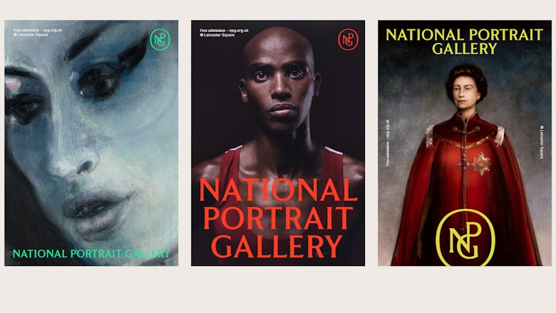
“Beauty, longevity, flexibility”: the National Portrait Gallery’s new visual identity
The National Portrait Gallery launched a new visual identity designed by Edit Brand Studio ahead of its reopening in June 2023.
The rebrand of the gallery features graphic and digital applications of the Grade I listed building’s physical characteristics and contents.
Edit Brand Studio won the project via an open public tender process. According to the studio’s managing director Khadija Kapacee, it has also had a long-standing relationship with The National Portrait Gallery, working with the institution to produce brand and exhibition campaigns as well as a number of project identities for their national programme.
The identity came about as part of the National Portrait Gallery’s reopening following a £41 million regeneration project, for which Nissen Richards undertook the interpretation design, Jamie Fobert Architects carried out the architectural changes and Holmes Wood designed the wayfinding system.

- Design disciplines in this article
- Industries in this article


