DesignStudio has refreshed Trivago’s brand identity with “witty and characterful” illustrations and a shorthand logo designed to reflect the positive customer experience.
The aim was to create a “more defined and memorable” experience for the hotel comparison website, according to DesignStudio. Its strategy director Chloe Jensen says the studio did this by “clarifying the brand proposition and messaging”, to ensure that people were choosing and returning to the site.
This involved reintroducing some of the “unique and charming spirit of the brand that had been lost over time”, she adds. Devising a “warm and inviting” tone of voice was crucial to the brand refresh, Jensen explains, noting how the new “key voice principles” centre on Trivago reading as an “assured and upbeat, unfussy and uncomplicated, and witty and relatable” brand.
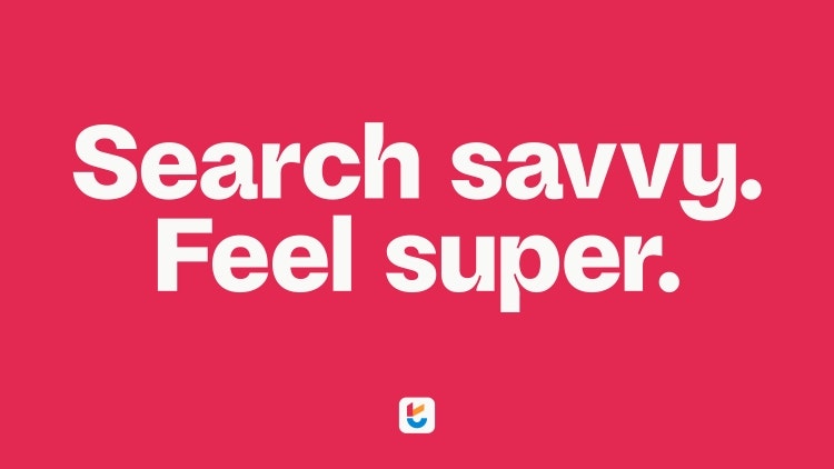
As well as the main logo, the brand now has a shorthand symbol, comprising a checkmark and a smile that make up the lowercase letter t. The checkmark was chosen to represent Trivago being “search savvy” while the smile reflects the trivago experience making travellers “feel super”, says the studio.

Supporting the logotype is a customised font named Savvy Grotesk designed in collaboration with Studio Feixen. DesignStudio executive creative director Vinay Mistry describes it as “a contemporary and characterful typeface” that supports several hundred languages, enabling Trivago to reach a global audience.
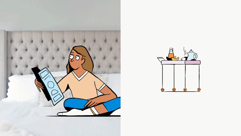
A suite of “witty and characterful” hand-drawn illustrations have been implemented into the identity, created in partnership with Barcelona-based animation and design studio Niceshit. Illustrative scenes often depict the Trivago mascot – a door-hanger character Hank – created by DesignStudio.
Mistry explains how Hank “adds further personality into the experience” by welcoming, guiding, and informing users through the Trivago experience.

Trivago’s new photography looks to “capture the feeling of finding a great deal” while complimenting the illustrations, and is used to “tell stories, inspire travellers and highlight Trivago’s benefits”, says Mistry. It works across three levels – hotel lifestyle, memory details and destinations.
“Vibrant and expressive” hues have been added to Trivago’s colour palette, Mistry adds, inspired by a variety of holiday destinations. He outlines DesignStudio’s goal as “redefining the essence of Trivago” in order to “make it a brand that people not only recognise but connect with on a personal level and return to time and again”.
The rollout of Trivago’s new visual has started across TV ads and Trivago’s online platforms.

- Design disciplines in this article
- Industries in this article
- Brands in this article


