Cornwall-based Happy Ending Agency has worked with BBC Creative to design a new visual identity and design system for BBC cricket, combining traditional cricket iconography with bright, bold colours.
According to Happy Ending creative director Ross Popejoy, the fairly “tricky” brief required the new identity to connect with both a younger audience and the “passionate traditionalists” of the current audience, which tends to be a “white, male, and older gentleman”.
While the identity will be applied across all coverage including men’s and women’s tournaments, Tests, One Day Internationals and T20, it ties into a wider effort to modernise the sport, where its newer formats are endeavouring to make it “more vibrant, more exiting” he says.
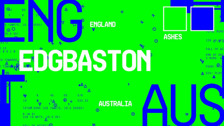
Popejoy explains that Happy Ending has worked with the BBC since designing posters for 2016’s Planet Earth II.
Early work was focused on advertising creative, Popejoy says, before having “slowly been introduced to the teams up in Manchester”, including BBC Sport and Kids.
Happy Ending has created the Six Nations rugby campaign for the past two years, which as a joint campaign for the men’s and women’s game was the start of more equitable coverage for the broadcaster. This approach has since carried over into the cricket work.
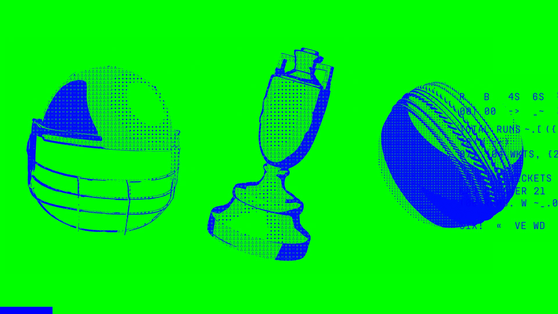
To appeal to new and traditional audiences , Happy Ending created a foundation “DNA”, as it does for every project, Popejoy says. Here, the agency decided to use the cricket scoring system, with its “quite complicated” – but appealingly graphic – language of icons, as the “grounding” for the new identity.
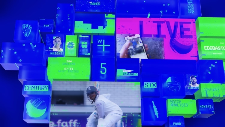
Incorporating the icons throughout, he says means that the “the people who know, know”, and can feel an immediate affinity with the programming, while the graphic nature of the icons – comprising triangles, dots and crosses – could be transformed into something more engaging to the non-traditional fan through their “modern execution”.
In the manner of ASCII art, which uses simple icons to create graphics, Happy Ending created both 2D and 3D models, including designs for particular events, such as the men’s and women’s Ashes trophies.
For the colours, “we went big and bold, right to the top-right-hand corner of the RGB spectrum”, says Popejoy. The colour palette includes blues, greens, pinks and yellows, which are often used in pairs, tailored to the different cricket events.
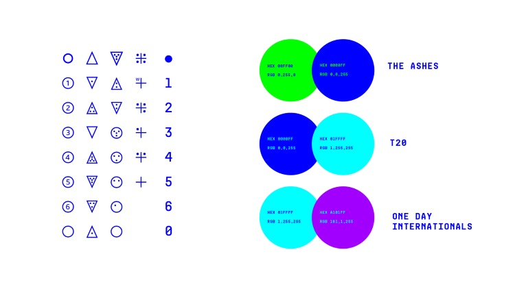
The combinations look to be “typically gender neutral”, to avoid any gendered stereotypes and cater to the fact that the broadcaster is now offering dual coverage with more equal status for men’s and women’s coverage, he adds.
A challenge of the project was that the identity needed to work for TV, iPlayer, online and social media, and to be used both in pre-planned content such as TV ads, as well as being applied to live reporting.
Happy Ending created “hundreds” of individual assets within the changeable design system, which the BBC Creative and BBC Sport marketing teams can use.
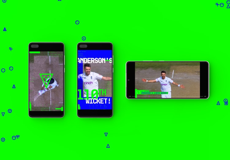
Having worked with the BBC teams to establish their technical needs for the identity’s applications, Happy Ending ensured all the assets were “pretty lightweight”, so that they didn’t need to “download [Adobe] AfterEffects and render loads of heavy motion graphics”, Popejoy says.
The identity is also able to “react” – although pre-programmed, rather than in real-time – to movements and sound from the footage. Happy Ending decided to “utilise the way the umpires move” to inform motion design, where “for a six, all of the iconography flows up; if it’s a wide, they’ll separate like parting the seas”, Popejoy says.
Throughout the process, Popejoy says the agency was able to test the identity’s many applications and is concurrently working on specific applications like TV ads, where the agency is able to “use the full language”, as well as creating the wider design assets and guidelines, which the BBC teams will use and adapt as needed going forward.

- Design disciplines in this article
- Industries in this article
- Brands in this article


2 responses to “Happy Ending Agency designs colourful, retro identity for BBC cricket”
Perfect use of license fee money. ????♂️
This is the perfect identity for the BBC Cricket. I love it!
It’s a nostalgia trip going down memory lane on Teletext. Maybe that wasn’t their intention but it gave me happy feels.