German car manufacturer Opel has unveiled a “young-minded” rebrand which incorporates a neon yellow colour to match its electric ambitions.
The new identity is a collaboration between Opel and Velocity McCann, a McCann-run agency that works on Vauxhall’s marketing.
In the UK, Opel vehicles are sold under the Vauxhall brand (which also unveiled a new flat design logo recently).
Opel was owned by General Motors until 2017 when it was sold to French automobile manufacturer PSA Group, which also owns Peugeot, Citroën and Vauxhall.
“Confident, young-minded and inclusive”
Opel managing director of marketing Xavier Duchemin says that the rebrand is “confident, young-minded and inclusive”.
“In this new era Opel is taking inspiration from progressive, ‘cold to cool’ modern German culture,” he adds. The new look ties in with the upcoming range of Opel vehicles, according to Duchemin.
The previous bevelled logo has been replaced by a flat design, which will roll out across models in spring 2021 including the Opel Crossland and Mokka. It is already in use for communications.
Dubbed the “Opel Blitz” (blitz is German for lightning), the updated logo first appeared on the electric concept car Opel GT X Experimental.
Opel says that the logo is now “more finely drawn” – the roundel capturing the lightening bolt is thinner, for example. The wordmark has also been redrawn.
The logo is part of a plan to dispense of “frills and distracting elements”, Opel says. “It thus reflects the precise German design philosophy of the brand – bold and pure.”
An “electrifying” colour scheme
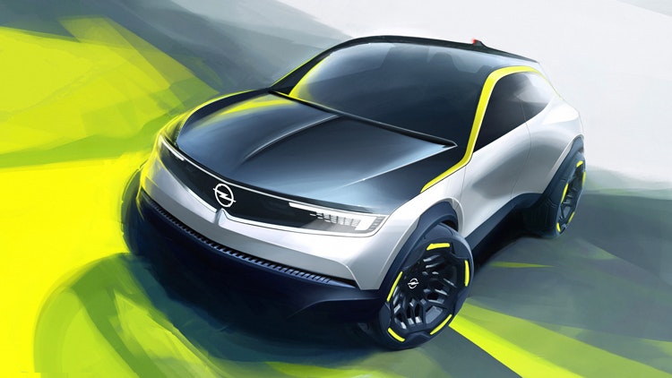
On the Opel GT X Experimental concept, a bright neon yellow was used for the car’s exteriors and interiors. This shade has now been used for the wider identity.
According to Opel, the yellow shade symbolises electricity which is “the new fuel in the electric age”. The marque adds: “The colour electrifies, imprints itself and thus creates an unmistakeable identity.”
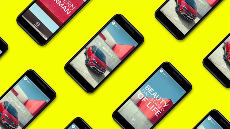
Monotype has designed a typeface for the rebrand. Opel Next is “light, powerful, modern and clear”, according to the marque. There are three versions: light, regular and bold.
The typeface and visual updates can be seen on Opel’s social media platforms as well as in a promotional campaign.
Opel global head of marketing Patrick Fournial says: “With the new brand elements, we are expressing our claim to be distinctive, progressive, open to the new and open to the future.”
What’s driving so many car brands to update their identity?

With its rebrand, Opel joins a long list of marques that have updated their identity recently, including Volkswagen, BMW, Toyota, Nissan and Rolls-Royce. Many of these updates have also featured a flat logo redesign.
Design Week explored this trend, talking to designers about the contributing factors which include a wider digital consideration as well as a focus on electrification.
What do you think of Opel’s new look? Let us know in the comments below.

- Design disciplines in this article
- Industries in this article


One response to “Opel reveals “electrified” rebrand inspired by modern German culture”
This is a rather disingenuous comment, but I think it’s a pretty overblown account of simply making the logo one colour flat for digital – as you say in your article like many other marques have moved to.
In the case of OPEL, who possess a very harsh, industrial identity akin to the facist symbolism of the 1930’s German cliche, personally I’d have made bigger, bolder graphic adjustments to be more friendly and human.
The strategy is frankly nonsense and should be discarded.