Nationwide overhauls its identity for the first time in 36 years
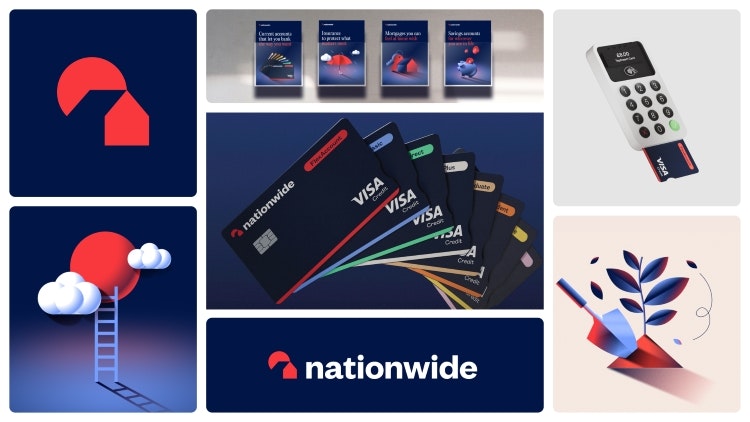
In October, Design Week got the exclusive on Nationwide’s first major rebrand since 1987, carried out by New Commercial Arts (NCA). Opinions on the new identity flooded in on social media and the story came out as the most viewed on Design Week this year.
The rebrand saw the implementation of a new, simplified logo, the capital N dropped from the name, and Nationwide’s signature blue hue darkened. NCA co-founder Rob Curran revealed that he found “a real design heritage” in the brand’s archives, particularly with its typography, adding that the agency took influence from Nationwide ads from the late 80s and early 90s.
Aston Villa FC rebrands to reach next-generation football fans
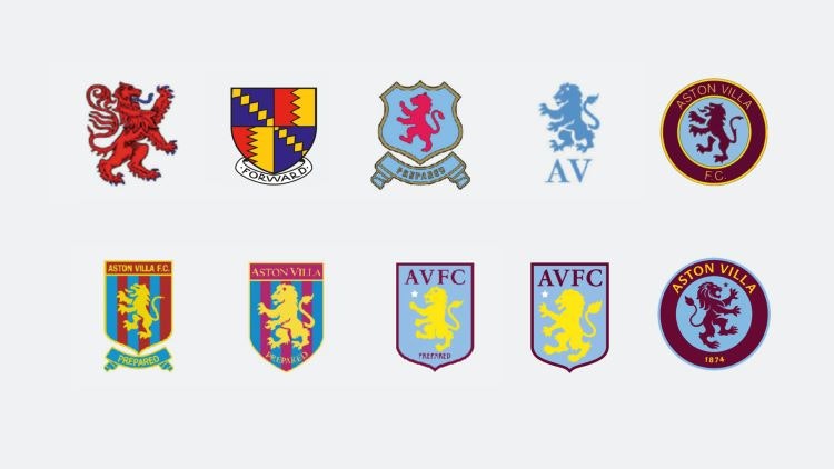
In a bid to help Aston Villa reach the next generation of football fans, Dragon Rouge’s London studio reinvigorated its crest, switching out its previous simple, two-dimensional design for “a classic design with a modern twist and agile approach”, according to creative director Becky King. It was designed so that the individual components of the crest could be “unleashed and used separately”, says King, although she recognises that “football clubs can no longer think of crest and colours only”.
She believes that “they must think like global entertainment brands and need their design assets to support that ambition”. Aston Villa FC was the first club to rebrand under new FA and Premier League guidelines, which state that fans must be part of the consultation process for any major changes to club crests and colours.
2026 FIFA World Cup identity introduces new design system
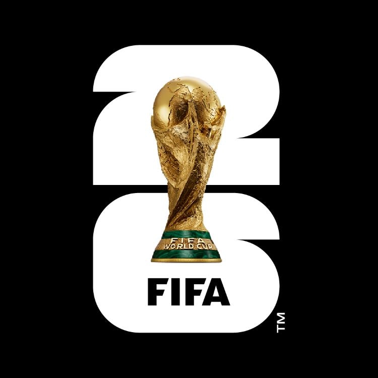
FIFA unveiled the official 2026 World Cup brand identity, with a logo designed to represent the trophy, host year and participating nations: Canada, Mexico and the US. For the first time, the official identity will feature a realistic expression of the World Cup trophy applied over the top of a number 26, which is made up of squares and quarter circles that reference the squared edges of the pitch and the circle of the ball.
FIFA opted for a largely monochromatic colour palette of black, white and gold to allow each host city to express its culture and location through its own version. Examples include waves in Los Angeles referencing its beach location and the depiction of the Golden Gate Bridge on San Francisco’s logo.
Jony Ive designs King Charles III’s flora-inspired coronation emblem
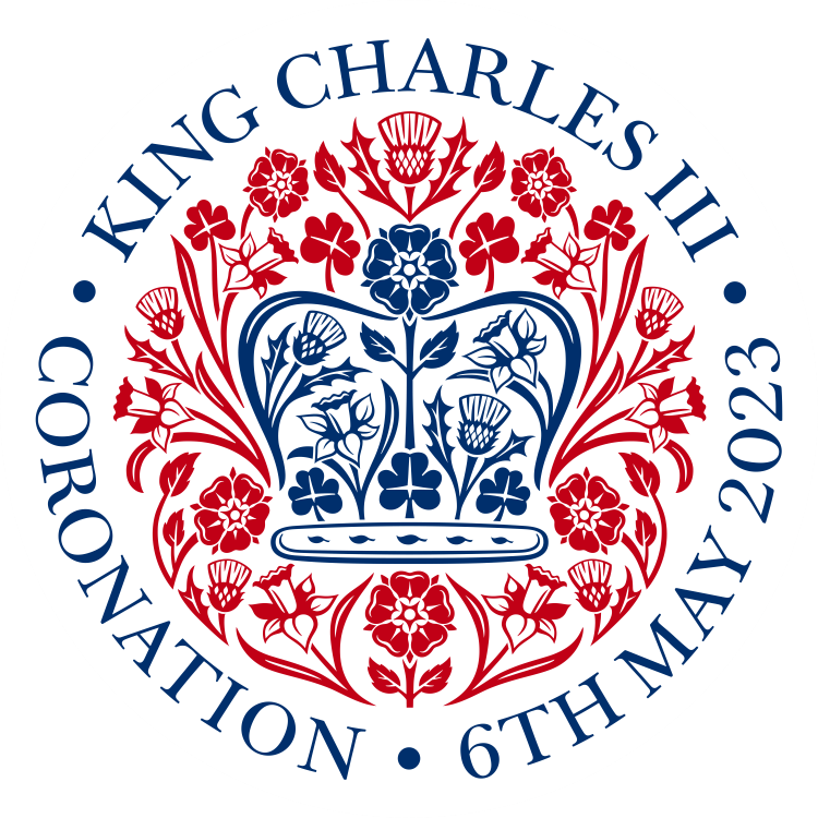
Ahead of the new British monarch’s coronation in May, Sir Jony Ive designed the official coronation emblem for King Charles III. The emblem depicted flora from each of the four UK nations as a gesture to the King’s love of the natural world: the rose of England, the thistle of Scotland, the daffodil of Wales and the shamrock of Northern Ireland.
The flora merge to form the shape of St Edward’s crown and appear in red, white and blue -the colours of the Union Flag. Ive designed the emblem alongside his creative team at LoveFrom and says the “natural forms” of the emblem were created to have a “gentle modesty” to them and seek to embody “the happy optimism of spring”.
Pepsi’s new logo takes influence from its 90s predecessor
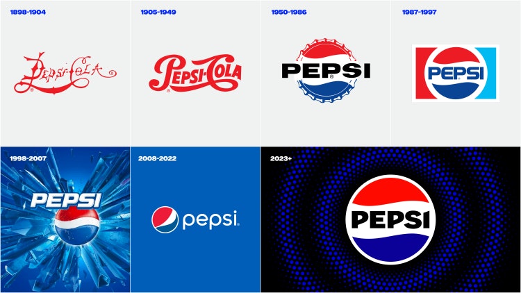
The muted blue of old was replaced by electric blue in Pepsi’s new identity, designed by PepsiCo’s in-house design and innovation team ahead of the brand’s 125th anniversary. The team “borrowed equity” from the brand’s history, merging it with more modern touches, as new Pepsi globe and wordmark bears similarities to the version used between 1987 and 1997, but uses a different font and font colour, and a slimmer border.
Pepsi’s previous logo featured a lowercase wordmark and was separated from the globe logomark, whereas the new version is uppercase and sits within the central white stripe of the logomark. Movement and animation were introduced into the visual system in the form of the Pepsi pulse, which PepsiCo senior vice president and chief design officer Mauro Porcini described as “a living and breathing design asset”.
Burberry reverts to its roots under new creative officer Daniel Lee
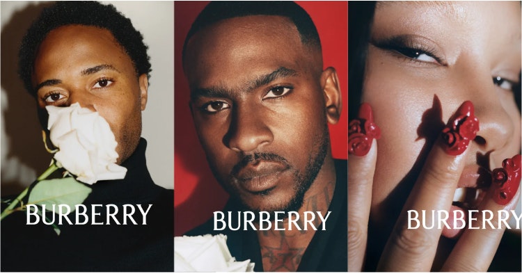
Under the direction of its new chief creative officer Daniel Lee, Burberry unveiled its archive-inspired logo and serif wordmark. The change bucked the sans serif trend seen in recent years across luxury fashion brands, such as Berluti, Balmain and Saint Laurent, resulting in a sea of wordmarks that were often uncharacteristic of the brands’ heritage or creative direction.
Burberry ditched its prosaic sans serif font in February this year, which was designed just four years ago by British designer Peter Saville. Its new serif font references typefaces used previously by the brand and features more subtle quirks and embellishments while remaining legible.
Amazon dimple takes the lead in Prime Video’s new identity
Pentagram partner Emily Oberman led the redesign of Amazon Prime Video’s visual identity earlier this year, evolving the role of the Amazon dimple and employing it across motion graphics as a framing device for imagery. Lucas Sharp from NYC-based Sharp Type foundry was commissioned to create a new bespoke typeface called Prime Video Sharp, which is a customised version of Sharp Grotesk and combines Swiss styling with 20th century American wood type.
A bespoke suite of illustrated “Iconics” appear in many forms across the identity, from vampire fangs and the rings of Middle Earth to footballs and cowboys. They were created by illustrators at Netherlands-based studio Patswerk to “represent various genres or create a rebus-like shorthand” and add further movement to the brand, as they become animated and interact with the typeface.
Pavilion made of mushrooms to debut at Glastonbury Festival
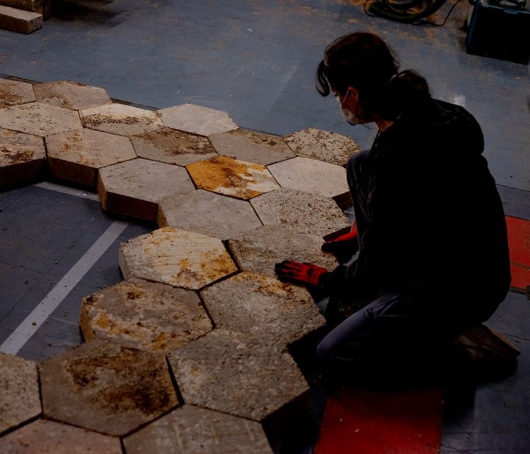
A pavilion made of mushrooms debuted at Glastonbury Festival 2023, designed by Temple Design director Simon Carroll to encourage the use of mycelium in the creative sector and beyond. To make the mycelium material, the roots were placed into a mould where it grew and reconnected into a solid panel over a period of a week or two and, once ready, Carroll glued it together.
The 26-metre-long pavilion sculpture was made up of 95% mycelium, with timber supports, bioplastics made from agar, and compostable gelatine glue. It was designed to “mimic Fibonacci arcs”, according to Carroll, who hoped that using mycelium for the pavilion would encourage its wider use across multiple sectors and have a knock-on effect on its cost and manufacturing time.
Inside Eurovision 2023’s set and lighting design “spectacle”
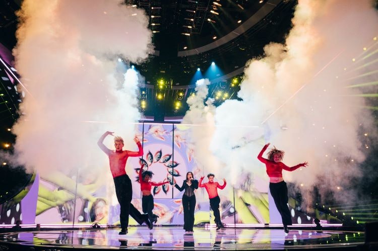
Set designer Julio Himede spoke on his use of LED screen technology, lighting and automation for Eurovision 2023 and how he created “a unique design” that works at scale and in accord with the Eurovision identity. The Eurovision 2023 set was 90% video technology – encompassing the floors, walls, and ceiling – blended with lighting and automation.
At Eurovision, the changeover between acts happens in under a minute, whereas most TV and awards shows do it in two-to-three-minute commercial breaks, according to Himede. A technological feature not visible to at-home audiences is the LED floor marking out system. Speaking from his sound booth at the venue, lighting designer Tim Routledge explains how this helps bring sets onto stage at speed via “spike marks” that show the crew “exactly where to place everything” as well as indicating where the artist should stand.
Royal Mint reveals new set of coins inspired by UK flora and fauna
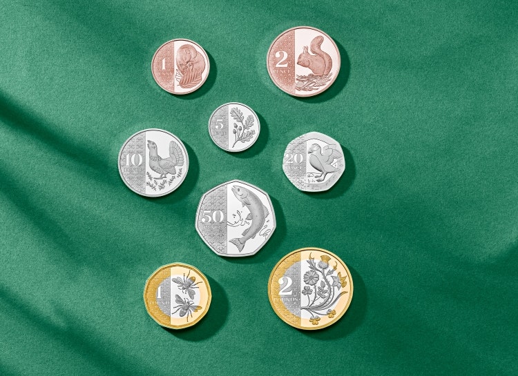
Taking on a similar theme to the King Charles III’s coronation emblem, eight new coin designs inspired conservation and nature were unveiled by the Royal Mint this year, completing the monarch’s transition onto British coinage. While flora and fauna “have deep roots in the history of UK coinage”, The Royal Mint’s chief engraver Gordon Summers told Design Week that this new collection marks “the first time that all eight coins have celebrated nature and wildlife”.
Each design feature animals and plants, some that are considered endangered and others which represent conservation success stories. The coins were designed with the support of the Royal Horticultural Society (RHS) and the Royal Society for the Protection of Birds (RSPB), which ensured the flora and fauna were anatomically correct.

- Design disciplines in this article
- Industries in this article
- Brands in this article


