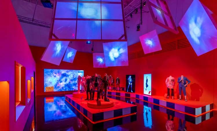
The Victoria & Albert Museum’s (V&A) new exhibition Hallyu! The Korean Wave opens with the frenetic energy of K-culture – loud, vibrant, constantly moving – its title displayed across multiple screens among rotating clips of PSY’s viral 2012 hit Gangnam Style.
Curated by Rosalie Kim and Yoojin Choi, it is the first major exhibition to survey the South Korean culture that has recently swept the globe, and, as Rosalie Kim explains, “It has transformed the country’s image from one devastated by the Korean War to that of a leading cultural powerhouse”.
It encompasses the rise of K-drama up to recent hits such as Boon Joon-ho’s Oscar-winning Parasite, as well as the global phenomena of K-Pop idols such as BTS, G-Dragon and aespa.
But in an exhibition designed by Berlin-based Korean graphic designer Na Kim as creative lead and Liverpool-based Studio Mutt as 3D designers, Hallyu’s global explosion is also given wider framing.

Invited to apply for the role of creative lead by the V&A, Na Kim was intrigued to tackle this now-global phenomenon with which, as a Korean national, she has a “love/hate relationship”.
To understand Hallyu, there was a need to look back to the wider Korean culture behind it, but on the other hand, she explains, how K-culture has taken off beyond South Korea’s borders. This cultural mobility is itself part of what makes Hallyu unique, where new ideas can “circulate or perform [through] pop culture [or] a contemporary scene”, she says.
Shaped by the social spaces of Korean life
It was important for Na Kim to root Hallyu in South Korean culture.
The signage gives strong visual presence to Hangul, the Korean alphabet, through bilingual titles that place Hangul characters side-by-side with the Roman lettering, using similar typeface weight and width across both languages.
Meanwhile, Kim also sought to express the energy of K-culture by collaborating with a number of other Korean creatives, including space designer San Jeon, graphic designer Yejoo Lee, and illustrator Joonho Ko.
However, the core of the exhibition proposal was to shape the exhibition through two contrasting settings familiar to Korean life: the public square, and a private room.

Na Kim explains how such spaces have been key to the political and social milieu from which K-wave evolved. Events such as the Asian financial crisis of the late 1990s brought people together in public, while in contrast, the more intimate space of a room is not only part of the traditional Korean home but is also characteristic of the specific public space of South Korea’s internet-café precursor, the PC Bang, now more commonly used for multiplayer computer games.
A focus on form
In a design which streamlined materials focusing instead on form, the two environments of public square and private room were realised through a 3D design by Studio Mutt, working with contractors Made Studio. Lighting design by Studio ZNA, helps to create these two atmospheres through lighting temperature and strength.
The concept feels strongest in the section on K-drama and cinema, designed to look like a set of a streetscape.
“We created this street scene where we could use buildings [to hold] museum cabinets, but also in some instances we used the building to represent a physical building you can walk into”, Studio Mutt director Alexander Turner explains.
Entering one ‘building’ visitors are dropped – almost too close for comfort – into

a “one-to-one” screening of a fight scene from Park Chan-wook’s 2003 film Oldboy, the wide and shallow dimensions of the space neatly mirroring the camera shot.
K-culture’s many moving parts
To deal with the wide remit of Hallyu, the exhibition is split into distinct sections. After the introductory From Rubble to Smartphones, comes Spotlighting K-drama and Cinema, Sounding K-pop and Fandoms and Making K-Beauty and Fashion.
Each space is saturated in a single colour across its various surfaces, clearly distinguishing each section. The specific colours were chosen by Na Kim for their relevance to aspects of Hallyu, such as a blue-purple associated with the band BTS, which would be immediately recognisable to its fans.
The design is flexible: more sombre moods are established for the section on Korean history, [which moves swiftly from the Josean Dynasty to the 1950 Korean war and the rebuilding of the country afterwards, and a restrained elegance is used for the section on the world-leading industry of K-beauty, which spans from the 13th century cosmetics boxes to the futuristic machinery to IOPE and Lincsolution’s 3D printed custom face masks. Against white walls, Joonho Ko’s silhouetted illustrations depict historical beauty products.

In contrast, the K-pop section features both intimate and open spaces. The walls of one room, featuring handmade fan banners, are lined with large cardboard tubes as if surrounding visitors with a giant curtain, while the next room is a riot of K-pop’s vibrant aesthetics, bordered instead with screens displaying K-pop music videos surrounding the exuberant stage costumes worn by the idols.
From hand-made fan banners to hi-tech collaborations
This section also showcases two examples of new technology. The first is a large transparent screen from LG Display which displays different K-pop lyrics.
Making use of its transparency, Turner explains, “we located [it] in a way that created a kind of enfilade […] a series of frames that pull you through the exhibition.”
Behind it was another collaboration, an interactive dance piece from Google Arts and Culture where visitors can record themselves performing K-pop dance routines.
The soft power of culture
Overall the exhibition shows the enormous variety and hybridity of K-wave, juxtaposing historical objects in the V&A’s leading collection of Korean craft and design against the innovations of recent decades.
There are design highlights throughout; these might include the installation of light sticks, a handheld illuminated wand unique to each K-pop idol and waved in unison by fans at concerts; or the webtoon comics of the 1990s, both a Korean design innovation that adapted cartoons to be read vertically by scrolling down on a mobile phone, and a cultural product that bore witness to the tumultuous period during the Asian financial crisis, and which still provide source material for K-drama, cinema, musicals and computer games to this day.

One of the design’s strengths is a flexibility that allows for this variety, moving between sensitive historical content, through fine art to pop culture. The history section alone features exhibits as diverse as propaganda leaflets, a poster from the Seoul Olympics, early smartphones and car models to the 33 TV monitors of Mirage Stage – the 1986 work from “father of video art” Nam June Paik. It also shows the unexpected cosmetic industry origins of LG – the electronics company which is one of the supporters of the exhibition.
Turner explains how Studio Mutt has tried to play with this mix of formality and informality throughout, something laid out from the start in the brief from the V&A.
The exhibition is likely to appeal to design fans, K-pop fans, and all those in between. Its design allows the viral hits to be shown alongside lesser-known highlights, while its singular but capacious concept shows how many things might come together in a particular place to explosive effect.
The exhibition Hallyu! The Korean Wave runs from 24 September 2022 – 25 June 2023 at the Victoria & Albert Museum, Cromwell Road, London, SW7 2RL
Banner Image: Installation image, Hallyu! The Korean Wave at the V&A

- Design disciplines in this article
- Industries in this article
- Brands in this article


