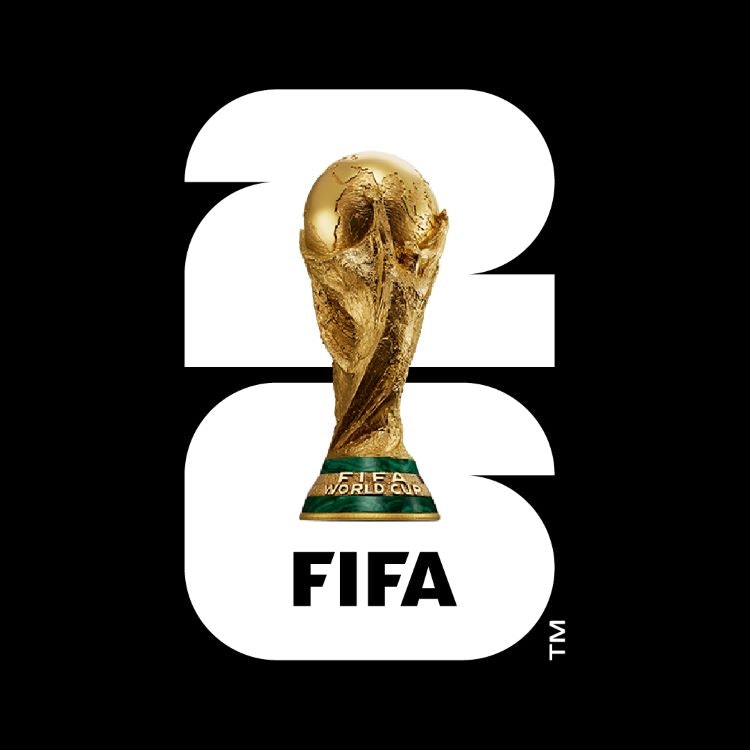
Football governing body FIFA has unveiled the official brand identity for the 2026 World Cup, including a logo designed to represent the trophy, host year and participating nations.
Due to take place in summer 2026, the next FIFA World Cup will comprise 104 matches played across 16 host cities in Canada, Mexico and the USA. The new brand identity aims to convey the unique diversity of the upcoming 2026 tournament, as it will be the first World Cup to include 48 teams (there were only 32 participating nations in the 2022 World Cup).

Marking another first for the tournament, the official identity will feature a realistic expression of the World Cup trophy. It will also introduce a bold depiction of the hosting year, which FIFA describes as “a vessel for self-expression”, designed so as not to distract from the event and the trophy element, according to the football body, which was unable to confirm who had designed the identity at the time of publication.
Squares and quarter circles make up the number 26 in reference to the squared edges of the pitch and the circle of the ball, according to FIFA. The number is made up of 48 units of these shapes, representing the 48 competing nations. FIFA confirmed that the new emblem will inform “an identifiable brand structure for years to come”.
The main version of the logo features a largely monochromatic colour palette of black, white and gold, which also allows each host city to then express its culture and location through its own version. Examples include waves in Los Angeles referencing its beach location and the depiction of the Golden Gate Bridge on San Francisco’s logo.
Other supporting assets include a typographic wordmark which incorporates the 26 symbol on a smaller scale, the official FWC2026 event typeface paired with a secondary font called Noto Sans and various graphic patterns designed to amplify the 26 icon.

The official for FIFA World Cup 26 brand was launched in Los Angeles, USA, alongside the WE ARE 26 campaign, comprising portraits of faces and places that represent the host cities and aim to express the event’s expanded diversity efforts. “WE ARE 26 is a rallying cry,” said FIFA President Gianni Infantino. “It’s a moment when three countries and an entire continent collectively say: We are united as one to welcome the world and deliver the biggest, best and most inclusive FIFA World Cup ever.”
The 2026 FIFA World Cup will begin in June 2026, with the champions being crowned on Sunday, 19 July 2026.

- Design disciplines in this article
- Industries in this article
- Brands in this article


3 responses to “2026 FIFA World Cup identity introduces new design system”
Why are graphics for anything to do with football so dreadful? And the rationalisation of this creation is utter BS. Why bother with this stuff?
Mike Dempsey nails it again… clearly there’s a reason why FIFA is unable to confirm who designed this: no-one wanted to put their name to it perhaps??
Pretty tricky brief – no one country to focus on and a nightmare of an application system to wrangle with, hence a lowest common denominator ‘shell’ execution, maybe it will come to life in animation and moving image??? Lets hope.