Experience design firm G&A has designed the exhibits in the National WWII Museum’s new Liberation Pavilion, which look to “make connections between the events that happened in the Second World War and the world we live in today”.
The two-floor exhibit space explores the end of the Second World War, the Holocaust, and the post-war years, and was designed to bring lessons learned from that time to modern US audiences. G&A has been working with America’s National WWII Museum since 2005, when it won a bid to design the exhibition experience for the entire museum.
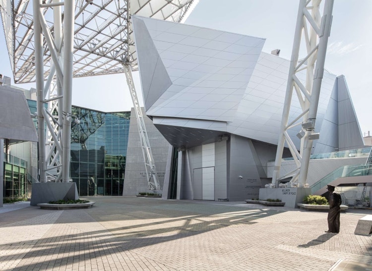
While the museum’s initial purpose was to detail the Normandy invasion of 1944 by allied forces, G&A senior exhibit designer Carl Rhodes says it “quickly determined that they needed to do something bigger and broader”. As it is now, the museum serves to tell the larger story of the Second World War and the history of the American effort.
Since 2005, G&A has designed experiences for seven pavilions at the museum, each with its own theme. Some pavilions, like the Campaigns of Courage pavilion focus on the war experience while others cover the pre- and post-war periods. Rhodes describes the Liberation Pavilion as “the final puzzle piece” of the plan that began almost two decades ago.
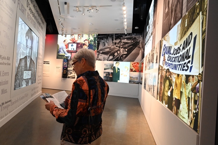
Over the years, Rhodes says the phrases “why does the Second World War matter today?” and “why we fought” cropped up consistently and so the Liberation Pavilion was designed to “make connections between the events that happened then and the world we live in today”. The process involved “several rounds of re-concepting” as both historians and designers tried to navigate the idea of “connectivity and relevance”, he adds.
Recommended: Studio Arc designs Postal Museum’s Dressed to Deliver exhibition
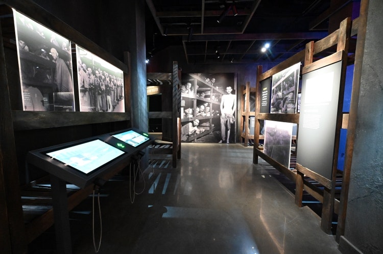
While previous pavilions utilised “scenic and linear media immersion to put visitors in the middle of key battles and engagements during the war”, Rhodes says G&A wanted visitors to have a “more reflective” experience when entering the new pavilion, considering the war’s impact “on both a global and personal scale”. During the design process, he explains how the studio explored “fractured and fragmented geometries” to approach global topics in the early parts of the exhibit before moving into “more personal, textured and intimate techniques” for exhibits like the Anne Frank Annex space.
Recommended: Design Museum and Urge Collective publish sustainable exhibition design white paper
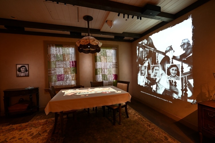
When visitors leave the Cost of Victory gallery – where they are exposed to “the sheer scale of the war’s global devastation” – they pass through a small hallway where a bookcase has been moved to reveal a doorway, says Rhodes. Through the doorway is a small room inspired by the secret annex described in Anne Frank’s diary.
Surfaces in the space are “activated through Anne’s diary entries and Anne’s voice”, while the walls “show her thoughts and dreams through her diary entries”, according to Rhodes. The living room table changes to depict the Frank and van Pels families going about their daily lives as news of the war progresses and the windows aim to show “the passage of time and the impending threat of discovery by Nazi forces”, he explains.
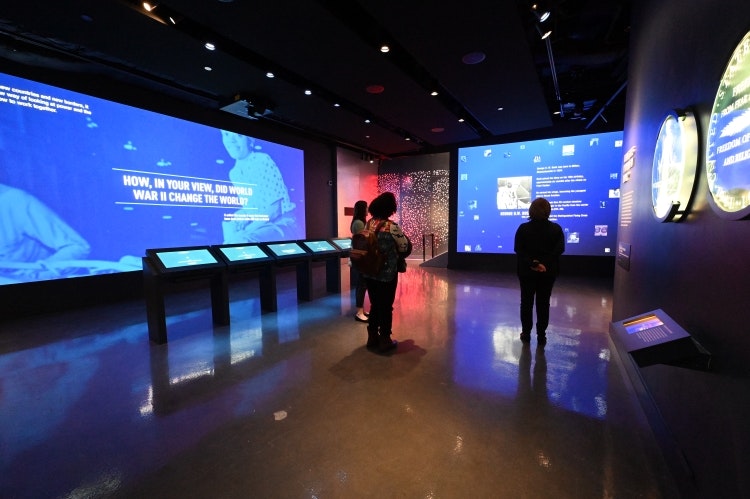
G&A employed similar transitions “from architectural to more intimate immersive environments” throughout the pavilion, such as the entry into the salt mine in the Monuments Men gallery, Rhodes adds.
In the Hope in a World Destroyed section on the first floor, a simple colour palette of off-white and dark grey paints and powder coats has been used for all walls and exhibits. White spaces aim to evoke “hope” while dark grey represents “a world destroyed”, says Rhodes. G&A also integrated “authentic industrial and Second-World-War-era material accents”, he adds, such as authentic dog tags of the era, galvanized steel panels with exposed hardware along the stairwell, and detailed, scenic rockwork inspired by the Altaussee Salt Mine in Austria, where art stolen by the Nazis was hidden.

- Design disciplines in this article
- Industries in this article


