Edinburgh-based design consultancy Studio Arc has developed the 3D and 2D design for the Postal Museum’s new exhibition Dressed to Deliver, which demonstrates the evolution of Britain’s postal uniform.
Initial concepts for the exhibition were “family focused” and realised through a “very participative and engaging” temporary exhibition, says Studio Arc director Lyndsey Bowditch. She reveals that the Postal Museum has “quite a big repeat audience”, which consists of families “looking for entertainment but also education”, so the exhibition caters to children of primary school age and upwards but also allows for “intergenerational learning”.
To be as sustainable as possible, Bowditch says Studio Arc made use of existing exhibition structures and walling, while introducing a new route and visitor flow to enable “key sight lines and reveals”, defined by new MDF and tensioned fabric panels.
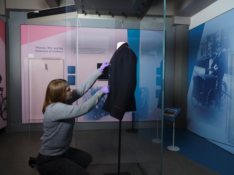
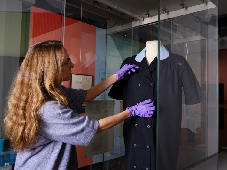
Bowditch suggests that the fabric panels can easily be reused to cover seating and explains how they allow for the display of “large-scale graphics” uninterrupted by joints, with the largest being three metres wide. Studio Arc was also able to give “a new lease of life” to a glass-topped unit from a previous exhibition, she adds, and commissioned new acrylic wall-mounted cases to hold the uniforms, designed with “removeable back panels” so they can be reused in the future.
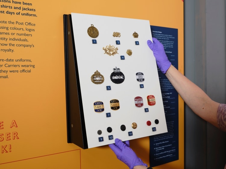
A hierarchy of content was developed for each section of Dressed to Deliver. Bowditch explains how introductory panels for the sections feature “life-size postal workers”. Studio Arc considered how it could make the space “visually accessible”, which involved positioning content at “children’s eye-levels” and catering to different styles of learning, she adds. Throughout the sections, Bowditch says there is headline text for “more visual learners who just want the key facts” as well as slightly smaller text with more information.
Dressed to Deliver’s introductory area looks to contextualise the exhibition and incorporate “a human aspect” from the off with “hundreds of images from the Postal Museum collection” as well as contemporary images of postal workers, according to Bowditch. Bowditch says she wanted to highlight the contrast between “then and now” by positioning the very first mail coach guard costume from the 18th century next to contemporary 21st century uniform.
Low-tech interactives have been integrated into this section, including an interactive door with accompanying audio. When opened, it reveals “an old illustration of a posty” delivering a letter, to represent “trust on the doorstep”, says Bowditch.
Visitors can also watch a contextual film featuring contemporary postal workers “giving their view of uniforms today, what they like about them and how they customise them”.
Beyond the introductory area, Bowditch reveals that there is a timeline beginning with the “familiarity” of the present day before taking visitors backwards through “the changes of the 1970s”, the postwomen of the Second World War, and the “stiff uniforms” of the 1800s.
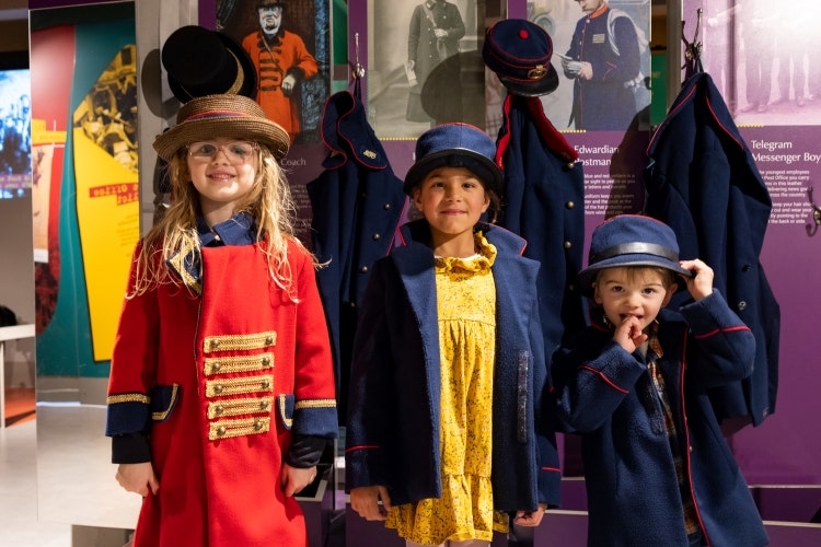
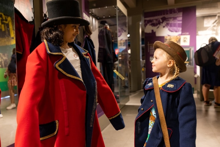
Throughout the space, digital content is generally more film-based and interactive elements are physical and hands-on. Dress-up opportunities are on offer throughout the uniform timeline, for both kids and adults.
Further into the exhibition there is a section detailing how uniforms developed in relation to specific job roles. Bowditch describes how there are “tactile opportunities for people to feel the different types of materials” as well as case studies of how uniforms evolved to workers’ needs.
It includes stories on the first Sikh postal worker given permission to wear a turban, the first postwoman in Scotland who wore trousers, and has altered uniforms, such as a Sari version and maternity version, all on display for visitors to see.
The final section is about “looking into the future” and comprises films showing how Royal Mail are developing uniforms and a “hands-on area for reflection” where visitors are invited to “draw their uniform for the future or write their thoughts”, says Bowditch.
Graphic patterns in the exhibition take inspiration from knitwear and stitching and are used in “high level areas that are less useful for content”, Bowditch explains. A “punchy colour palette” of pinks, yellows, blues and greens was chosen to contrast against the early examples of postal uniforms, which were quite dark in colour, she adds.

- Design disciplines in this article
- Industries in this article
- Brands in this article


