A potato-based bottle that you can eat, compost or dissolve
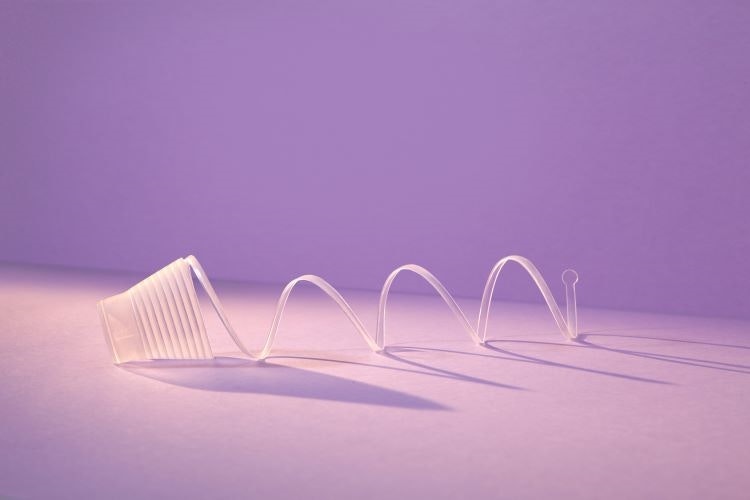
This bio-based bottle solution was the result of a collaboration between Swedish design studio Tomorrow Machine and juice company Eckes Granini that looks to provide a planet-friendly alternative to plastic bottles. The core concept of the project – named GoneShells – is that the lifespan of the packaging matches the lifespan of the contents inside, and so bypasses the conventional recycling system.
GoneShells takes inspiration from nature, specifically from the way a fruit is protected by its peel. Once finished with, the bottle can be wound down in the same way thanks to its spiral-like structure. Then, it can be eaten, home composted or dissolved in a kitchen sink.
Gomi’s new speakers look to prove “waste materials can be desirable”
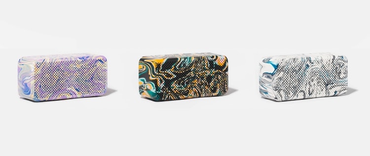
In March this year, Brighton-based product design studio Gomi launched Collection One of its “regenerative” portable speakers, made from e-bike batteries and reusing “unrecyclable” plastic. The studio took the disused e-bike battery packs, dismantled the cells, and tested them for capacity, before carrying out safety tests and putting them into the speakers’ power banks.
While an e-bike battery might need around 50 cells to power it, Gomi’s speakers only need four, meaning cells from each e-bike battery can power up to 12 speakers. Working with a couple of recycling companies around the UK, Gomi collected plastic waste and then turned it into pellets which are used to make the product. “This proves that waste materials can be desirable materials,” said Gomi’s co-founder Tom Meade, “it just needs to be designed better”.
Landor & Fitch reveals accessible toothbrush adaptors
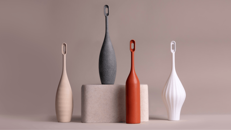
This year also saw the launch of Landor & Fitch’s (now Landor’s) first-of-its-kind accessible oral care solution called {access}ories, which comprises bespoke 3D-printed toothbrush add-ons for people with dexterity challenges. Landor’s product innovation design director Jack Holloway described the design of {access}ories as “an iterative process” with continuous opportunities to “improve and refine”.
He added that is it difficult to implement change into “a production line that’s already been built”, which is why making add-ons rather than whole toothbrushes offers a more immediate solution. Looking forward, the studio planned to scale up the solution and share it with WPP clients as well as potential stakeholders outside of the company, such as 3D printing companies and retailers.
Analogue modelling and AR headsets: inside Aston Martin’s design studio
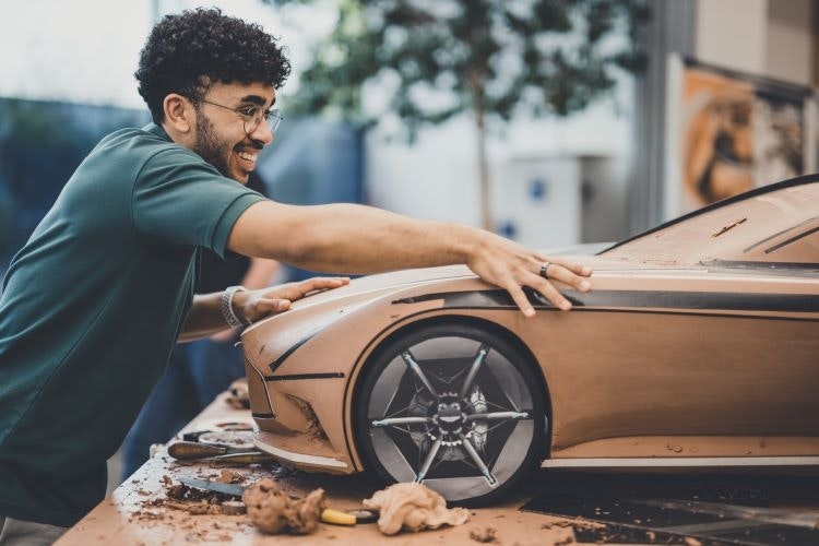
In the spring, Design Week went behind the curtain of Aston Martin’s Gaydon design studio to get a detailed look at the DB12 super tourer as well as the intricate design process behind each of its luxury cars. Despite the design team being responsible for some of the most high-tech hypercars on the road, including the Valkyrie, we found that they still favour analogue design methods.
GT & Specials chief designer Julian Nunn revealed that the clay modelling stage is often where mistakes are spotted, and certain features are tested to make sure they are possible. Design Week’s Abbey Bamford was one of the first from outside of Aston Martin to sit inside the new DB12 interior, which invoked a similar look to luxury handbags.
Campari looks to Milanese architecture for its new brand identity
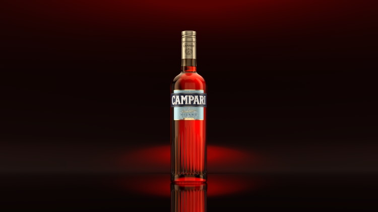
Campari took on a new look in May, courtesy of Milan-based branding studio Robilant, that was designed to pay homage to Milanese architecture with a grooved canneté bottle and “a late Deco decorative theme”. The bottle was embossed with a ribbed canneté design, defined by a series of narrow parallel grooves.
Robilant creative director Fabio Molinaro said the bottle structure subtly references Milanese architecture, including “a stylistic feature present in the Galleria Vittorio Emanuele II and among the architectural furnishings of the Camparino bar”. He also described how the “compositional depth of the label can only be perceived with a close and sensitive look”, just as Milanese courtyards are often hidden behind “elegant austere facades”.
Stilfold designs wind turbine foundation concept that mimics tree roots

Swedish design and technology start-up Stilfold unveiled its new design concept for wind turbine foundations that looks to minimise disruption and damage to natural environments. The design features long, curved recycled steel beams that mimic tree roots, using “industrial origami” techniques to strengthen the structure.
The patented computer-guided software and industrial origami manufacturing technology was designed so that each steel root structure could be tailored to the site of the turbine, using drones to scan the ground to assess what kind of curve is needed. While digging would still be required to get Stifold’s steel root structure into the ground, the concept allows the soil to be “put back into the structure”, like planting a tree, rather than leaving a pile of earth behind.
Fairphone and Above reveal new “de-technified” Fairphone 5
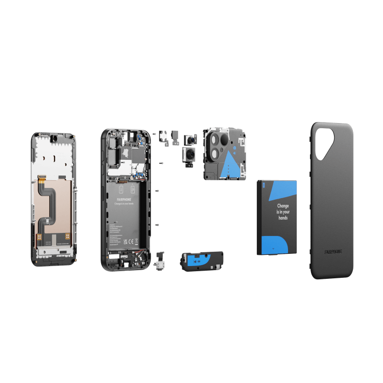
There’s no way that a mobile phone can be durable, repairable, modular, and sustainable, right? Well, in September, Scandinavian innovation agency Above and Dutch smartphone company Fairphone proved that it can with the Fairphone 5, designed to be gender neutral with “de-technified and refined details”.
The device can be initially opened by hand, without a tool, with only a small screwdriver required to access the modules inside and more than 70% of the 14 focus materials used in the device are from either recycled or “fair-mined sources” or support responsible production with unique Fairphone and partners’ impact projects.
Canada unveils new passport design featuring light-enhanced seasonal art

A new Canadian passport entered circulation this year, featuring a maple leaf on the cover and illustrations across the inside pages which represent the four seasons and change under ultraviolet light. Designed by the Canadian Bank Note Company, it was one of the first travel documents from a Commonwealth country to reference King Charles III.
In a pale red and yellow Autumn scene on the visa pages, children can be seen holding pumpkins in a field. A mother bear and her cubs are depicted in the spring scene on a faded blue and green background.
Bruichladdich cuts carbon with new whisky bottle design by Thirst
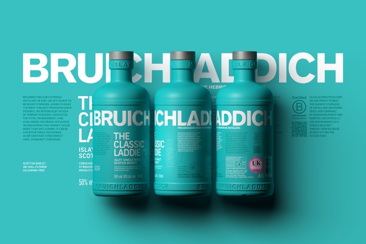
While having secondary packaging for spirit brands had previously been a sign of luxury, design studio Thirst took whiskey brand Bruichladdich in a new, more sustainable direction this year in a bid to prove that “you don’t need to have secondary packaging to represent luxury, quality, or to be interesting”.
The previous Classic Laddie bottle contained an average of 15% recycled glass, whereas the new version has around 60% recycled glass and is also 32% lighter than its predecessor. The new shape and increased use of recycled materials seek to reduce Bruichladdich’s global environmental impact, as it can now transport more 60% more bottles per pallet, “cutting its CO2 packaging emissions by 65%”.
Other sustainable features included the use of a water-based, organic ink coating and the polypropylene closure and cork, which are made from a synthetic resin made from bio-based sources.
Salt handles and microbe packaging: real-life applications for innovative biomaterials
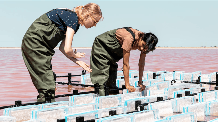
At London Design Festive 2023, Shellworks co-founder and CEO Insiya Jafferjee and Atelier Luma’s material designer Henna Burney revealed how they are working with bio-materials to design innovative packaging and product solutions.
Burney explained how her research in Arles, a city located on the Rhône River in the south of France, resulted in the creation of crystalised salt panels, a process which she later developed in order to make modular door handles. She found that salt has many useful properties, including the fact that it is naturally antibacterial, which means this material could potentially slow the spread of germs on surfaces.
Jafferjee spoke on changing attitudes towards using microbes, revealing how we could use the vast amounts of microorganisms at our disposal to create “different types of material systems all with the same end of life”. Her company is responsible for creating Vivomer, a 100% vegan, compostable mono-material made with microorganisms found in marine and soil environments that can adapt to fermentation methods common to the food industry.

- Design disciplines in this article
- Industries in this article
- Brands in this article


