The Conran Shop, by The Conran Shop in-house team and Apt Design
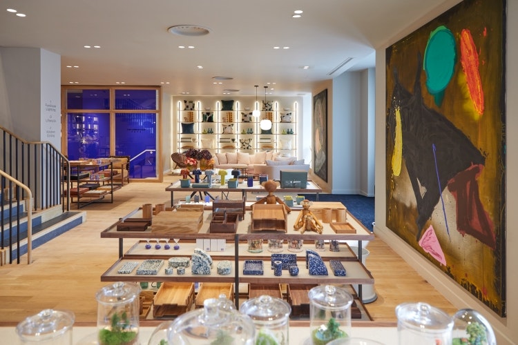
Following the closure of its Michelin House location earlier this year, The Conran Shop has opened its new store in Sloane Square, designed by its global head of visual merchandising Mark Upstone and implemented by Apt Design. The new interior takes cues from The Conran Shop’s brand identity designed by Sascha Lobe and Kimberly Lloyd at Pentagram, as it moves to focus more on collections designed in-house while keeping Sir Terence Conran’s design philosophy – Plain, Simple, Useful – in mind.
Conran drew inspiration from architect Le Corbusier’s concept of the Modulor, which uses systems of proportion rooted in the human form and the golden ratio. Drawing on this, Lobe created an adaptable tile system with 18 distinct modules in the store’s bathroom, showcasing three designs titled the Modulor Man, the Spiral and the Divine Number. The permanent tile installation was designed to come to life through digital augmented reality, as users can step into animated versions of the three patterns through an Instagram filter.
Following Conran’s lead in his support of young creatives throughout his career, London-based artist Charlie Sheppard was commissioned to design a colourful mural for the opening of the store. The abstract mural uses cracked mosaic tiles, making up a series of individual compositions, each with its own colour palette. The compositions were designed to be appreciated in isolation but their tones also work harmoniously together as part of a larger colour palette.
The Hoxton Lloyd Amsterdam, by AIME Studios and Nicemakers
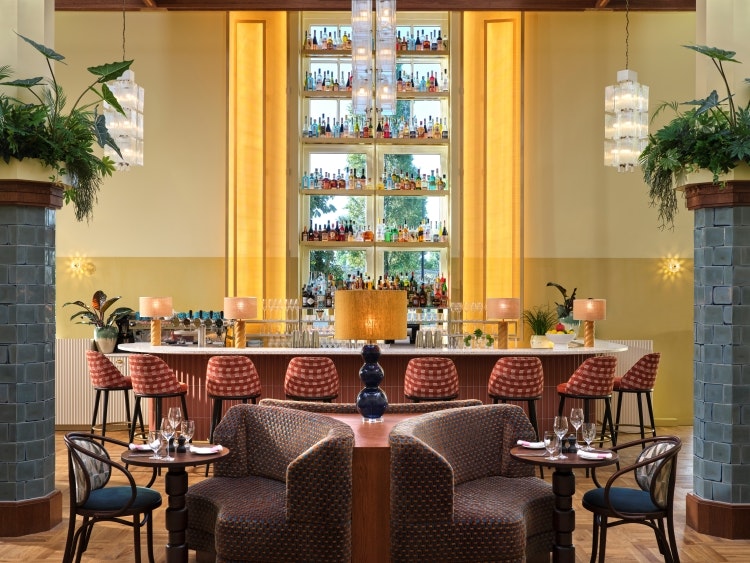
The Hoxton has opened its second Amsterdam location in the city’s Eastern Docklands neighbourhood, transforming a century-old neighbourhood landmark that was originally built by the Royal Dutch Lloyd Shipping Company. AIME Studios collaborated with local firm Nicemakers to revive the building’s original period features, such as its stained-glass windows, panelling and intricate tiling, while referencing its Art Deco roots.
Bold tones and playful, geometric patterns feature throughout the hotel, which boasts an all-Dutch artwork collection from neighbouring gallery Bisou. Artistic expression is carried onto the hotel’s exterior, with its dedicated space for large-scale murals soon to be created by some of the city’s leading street and graffiti artists.
Each of the 136 bedrooms adopt a warm palette of corals, reds and ochres, juxtaposed against cool blues and greys, the latter nodding to Lloyd’s shipping connections. A few rooms have more unique designs, such as the Tower Room with its spiral staircase and waterfront views and the Gather Room suite, which features a separate dining area, oversized bed and statement neon-green bathroom.
Down at the hotel restaurant, Breman Brasserie, the glamour of Art Deco comes through in gold tones, which seek to add “a subtle and refined elegance” to the space, according to the design team. Much attention was paid to the layout of the room during the design process, as the aim was to create an intimate and cosy atmosphere.
Barbue is a cocktail bar housed in an old ticket office, where travellers would buy their tickets before boarding ships, and has been fully preserved in its original state. Original light features hang from the high ceilings while a mezzanine balcony overlooks the central horseshoe-shaped bar.
Le Grand Mazarin, by Martin Brudnizki Design Studio
In the heart of the Marais district in Paris, Maisons Pariente has opened its new five-star hotel Le Grand Mazarin. Over 500 works of art adorn the hotel walls, including bespoke pieces by contemporary artists such as Jacques Merle and Sophia Pega.
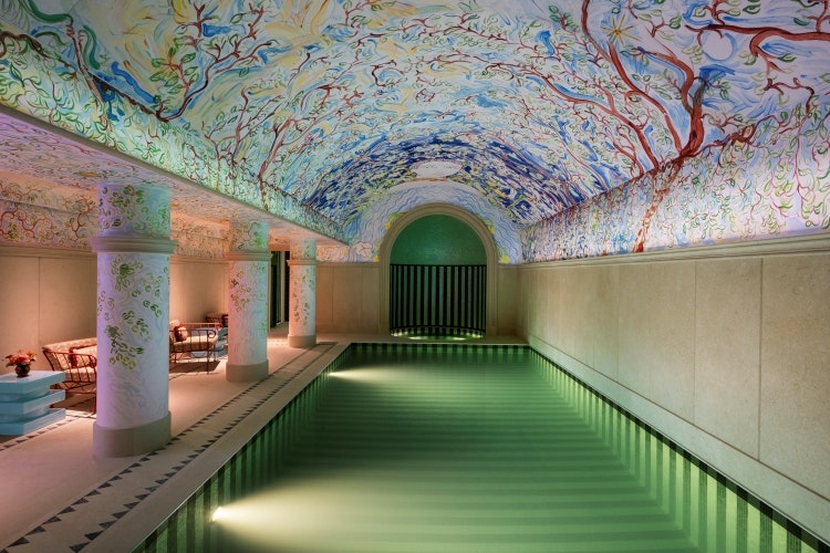
Merle’s floral ceiling art above the pool is inspired by tales and myths, while Menorcan-born artist Sophie Pega takes cues from tarot cards, dressing Le Grand Mazarin’s winter garden with 12 celestial windows. With the help of contemporary art gallery Amélie Maison d’Art, vintage furniture was sourced from Paris, London and other cities to complement the artwork.
London and New York-based interior design studio Martin Brudnizki are responsible for the hotel’s décor, which combines the French classicism of 18th-century salons with “a refined, poetic fantasy”, according to Maisons Pariente. The historic 14th-century building embodies Brudnizki’s signature style, with vintage objects, seashells embedded in the wallpaper, and custom rugs, in every corner.
Calling on the skills of some of France’s greatest craft houses, such as those awarded the Entreprises du Patrimoine Vivant (Living Heritage Companies) label, Maisons Pariente and Brudnizki commissioned bespoke lighting and tapestries for the space. They sought out artisans who are still working with traditional handmade methods honed by previous generations, asking them to create pieces that demonstrate their technical skill.
The Largo, by Space Copenhagen
Danish design studio Space Copenhagen has recently completed the interiors for The Largo, a new hotel in Porto, Portugal, located on the historic Largo de São Domingos. The 18-room hotel, restaurant and bar occupy five interconnected 15th, 16th and 19th century buildings that have been stripped back and restored to reveal their original features. The renovation, which went on for three years, focused on conserving the buildings’ architectural history.
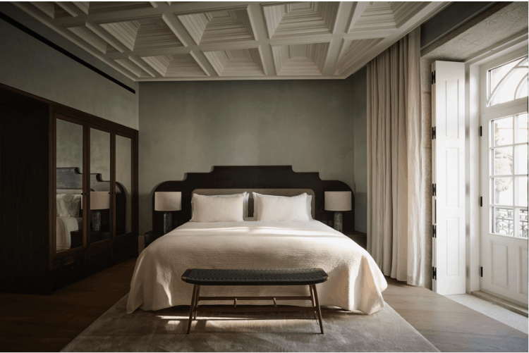
Space Copenhagen founders Peter Bundgaard Rützou and Signe Bindslev Henriksen designed the interiors to be “soft and slightly nostalgic yet timeless and historically detailed” with “an overarching sense of slow design and travel”. They incorporated elements of craft, materiality, texture and art throughout the hotel. Locally sourced materials such as stone, wood, brass and soft fabrics feature repeatedly and were chosen for their subdued, warm, tactile and natural qualities.
Rooms and suites are laid out to mimic the intimacy of an apartment living room, with beds framed by elaborate headboards that reinterpret Renaissance features in a modern way. Another special feature in the rooms are the large tile stone flooring and bathtubs in the bathroom, which have been craved from a single piece of Portuguese stone. In homage to local craft and traditions, Portuguese artisans were chosen to work on everything from the millwork and stone to the metalwork, and tiling was also sourced from local tile manufacturers. The studio opted to use subdued tones for the wooden flooring, granite portal, entry passage and plastered walls, while ornate lamps hang from the ceiling that were preserved from the building’s original design.
Belstaff, Regent Street by Specific Generic
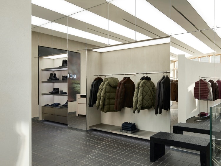
Ahead of its 100th anniversary next year, fashion brand Belstaff’s Regent Street flagship store in London has reopened its doors, unveiling its new interior design scheme by Scandinavian architecture and interior design studio Specific Generic. The design concept was born from a conversation on “the evolution of motorbikes” as Belstaff has a diverse motoring heritage, which is where the idea of “future garage” came in, according to Specific Generic chief creative officer Maja Bernvill.
“It’s where the journey starts and ends, where you prepare for the journey, and where you bring memories and souvenirs back from the road”, says Bernvill. The design aims to reference the brand’s history of innovation while projecting what this might look like in a new era and is rooted in “exploration, motion and the joy of the journey”, says the studio.
Materials were chosen to represent and contrast both the old and new. Smoke-hued Staffordshire Blue ceramic tiles by Ketley Brick cover the floors, nodding to the vernacular stone flooring of the industrial workplaces and potteries of Stoke-on-Trent, where the brand was founded. Suspended from the ceiling, stark lighting in the space looks to highlight the products, tying in with the lightboxes that are set above race cars in Formula 1 garages.
Natural clay covers the curved walls on the ground floor, while brushed stainless-steel continues the industrial motif, while hand-hewn wooden benches and shelving by Studio Fonk seek to bring nature into the space. The brand’s Phoenix icon is now subtly stamped across tiling in the space, as an “elements of discovery” for customers.
Banner image: The Hoxton Lloyd Amsterdam

- Design disciplines in this article
- Industries in this article
- Brands in this article


