Camper flagship, by Jorge Penadés
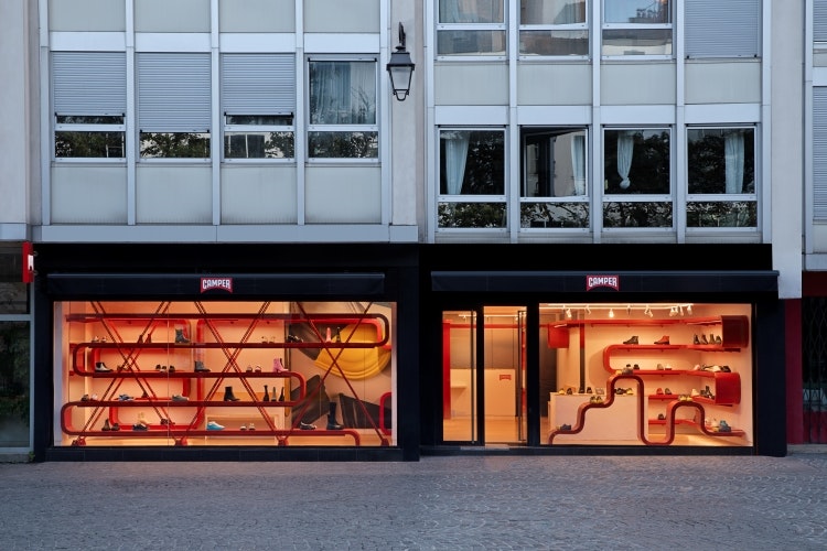
Spanish designer and creative director Jorge Penadés – known for developing furniture, products, interiors, installations and exhibitions – has refurbished Camper’s flagship shoe store in Paris. Penadés took influence from the Centre Pompidou, which is just a short walk away from the store.
The Centre Pompidou’s glass and metal structure was designed by architects Renzo Piano and Richard Rogers to resemble a heart fed by enormous arteries in bright primary colours. Penadés created his own distinctive take on the design language of the Centre Pompidou in the Camper flagship through a continuous, bright red shelving system that follows the entirety of the store’s walls, enveloping the interiors and making use of the five-metre-long windows.
Just as the Centre Pompidou exposes the technical elements of the building, Penadés’ shelving system comprises cable metal trays, revealing a technical element that would usually be hidden. As well as referencing the local design history, Penadés looked to incorporate Camper’s Mediterranean roots with raw plaster wall finishes and handmade clay tiles which top the cash desk.
San Carlo Alderley Edge, by Fettle
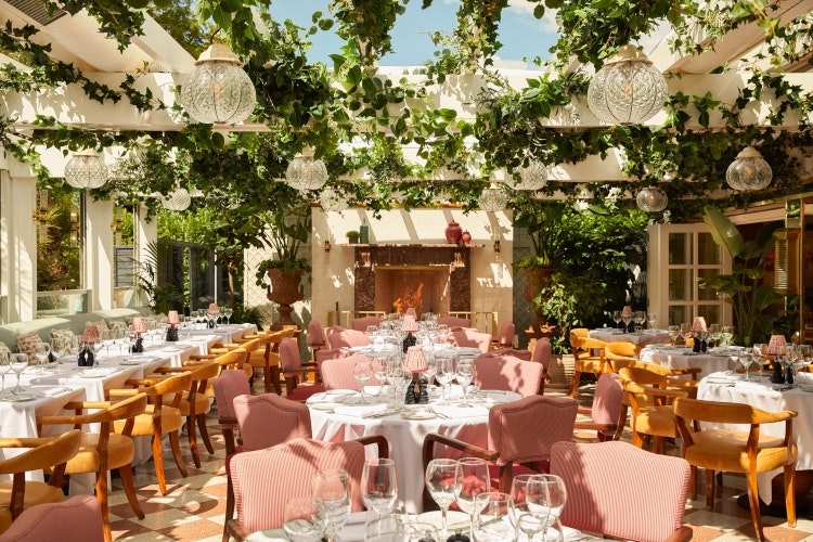
Following interior design projects for San Carlo in Liverpool, Knightsbridge and St Christopher’s Place, London, Fettle has completed the interiors for San Carlo Alderley Edge in Cheshire. The project included a £3 million transformation and full refurbishment of the 34-square-metre space and 205-cover restaurant.
Its new indoor-outdoor dining terrace includes a retractable roof, allowing the space to be used all year round. A white pergola strung with crystal pendant lights, an open fireplace and plenty of greenery aims to make the space reminiscent of an Italian garden. Alicante marble sits atop the bar, which is surrounded by stained oak bar stools with green leather seats and features high-sheen timber and brass detailing on its front.
Terracotta and white patterned terrazzo floors, high-gloss timber and high-sheen white-painted panelling are combined with green, gold and pink tones that appear on patterned fabrics and textures throughout the space. Fettle looked to add sophistication to the restaurant through gold leaf wallpapered ceilings and richly upholstered bespoke furniture coupled with vintage pieces.
Mirrored panels, artwork and photography adorn the walls of the restaurant while the lighting – which includes a mix of Murano glass chandeliers, bulkhead fittings at high level, brass wall lights with bespoke patterned fabric shades and brass picture lights – was chosen to add a warm glow and softness to the space.
Café Mars, by Format Architecture Office
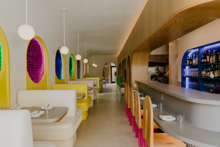
New York-based architecture and design studio Format Architecture Office has designed the interiors for Italian American restaurant Café Mars, founded by co-chefs Jorge Olarte and Paul D’Avino. Upon entry, visitors must turn the pasta die door handle – sourced from local third generation and family-run manufacturer D. Malardi & Sons – which nods to the building’s pasta factory and Italian grocery history.
The restaurant was designed with a combination of influences in mind, from Memphis Milano to the Amalfi Coast. Format co-founder and principal Andrew McGee stresses the importance of connecting “the intent of the culinary experience with the intent of the spatial experience”. Since the menu was curated to showcase knowledge and “love of traditional Italian cuisine” with a twist, McGee says it seemed “only natural to reference the character and movement in [Ettore] Sottsass’ and the Memphis style with a similar vintage in the architecture and design” of the space.
Designed to juxtapose, the front dining room and bar are the first spaces that guests see. On the left, six booths with custom Format yellow and white bench seatings, situated between Stuff by Andrew Neyer pendants, sit adjacent to matching yellow windows. Original brick walls are illuminated by hidden LED lighting in honour of the building’s past.
On the right is the central L-shaped bar followed by an open kitchen space, separated by white oak panelled archways. Studio Apotroes’ custom Phobos Dining Chairs with hot pink, zig-zag legs and Grand Rapids Company Chairs with white detailing punctuate the space.
At the rear of the restaurant is the Blue Dining Room, with bright windows, exposed brick and white hexagon floor tiles. Format designed and upholstered cobalt blue banquette seating, placing it across from sets of Grand Rapids Chair Company chairs. MushLume pendants made of mycelium with hot pink wiring are suspended above bespoke Todd Higuchi tables. The curved-edge tables fit together like puzzle pieces and can be reconfigured as needed.
TABLE Fare + Social, by DesignLSM
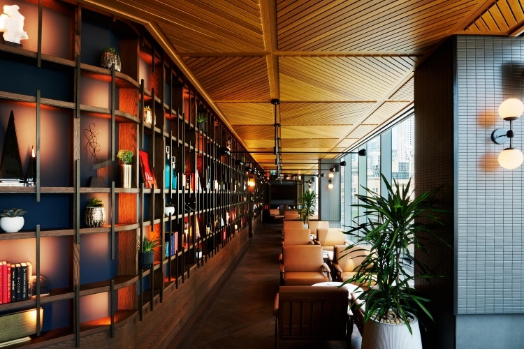
A new 46-story food hall in Toronto, Canada, has been designed by DesignLSM with a focus on sustainability and wellbeing. In a bid to foster a sense of connectivity throughout the venue, DesignLSM devised a layout that eliminates walls and favours fluid zones. Flexibility was another consideration, as the space had to be multipurpose, used for everything from casual business meetings, quiet lunches, after work drinks or weekend get-togethers for families.
Large metal-framed arches look to add intimacy to the high ceilings and provide a framework for the food and beverage kiosks. A lounge area has been separated from the dining space by floor-to-ceiling bookcases housing books, plants and art, while large lounge chairs have been positioned so visitors can look at the surrounding views.
Coloured tiles, woods and metals feature in the main dining area. Scale was an important consideration in this space, according to DesignLSM, so oversized pendants and large plants were added to “create drama”. Zones are defined by the different floor finishes, varying heights of seating and communal tables. Booths with mirrored fretwork sides and wooden ceiling rafts were designed to provide some softer enclosed areas.
Tate Eats, Holland Harvey
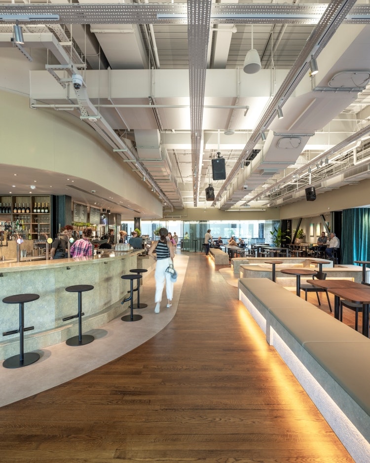
Holland Harvey has designed a café/restaurant/bar for Tate Modern which will connect the Southbank and the Turbine Hall via a new entrance onto Tate Modern’s lawns. Tate Eats was designed to celebrate accessibility and inclusivity and provide an informal setting suitable for the daytime and the evening.
The studio’s ambition was to develop a timeless, modern design that pays homage to the building’s post-industrial history. Materials were chosen to consider circularity and decarbonisation, including soft, tactile and robust materials that contrast with and complement the harder surfaces of the building’s architecture.
Bespoke furniture and lighting pieces were commissioned by Holland Harvey for the Tate Eats space. The furniture comes from London-based designer and social enterprise company Goldfinger while tabletops, which reuse Tate Coffee grounds, were created by start-up Spared. Lighting design by London-based There’s Light helps to define different spaces and mark the transition from day-time cafe to night-time bar.

- Design disciplines in this article
- Industries in this article
- Brands in this article


