
Design Week: What exactly is a visual effects designer?
David Sheldon-Hicks: It’s a new term. I always had a passion for animation and wanted to make graphic design move but when I was training as a graphic designer, the term motion designer hadn’t been conceived. Some graphic design houses were directing animation, but no studios were marrying movement and design or realising that both were equally important. Either they looked good but didn’t move very well or they looked awful but were technically well animated.
When I was graduating, the internet showed the possibilities of telling stories with graphic design and with screen-based work. It was also the democratisation of the Mac, which meant people had more power to create their own animations. What I do now is the second evolution of that. When it comes to working with film, there’s a next level of technical delivery, as you have to make the special effects part of the storytelling. Today we primarily design and create graphic interfaces and 3D effects for technology screens, vehicle displays and holograms in film. And, we have recently set up a visual effects team in-house that creates CG props, set extensions and environments.
DW: What’s your educational background?
DS-H: After A-Levels in Maths, Physics, Art and Photography, I studied graphic design at the University of Portsmouth.
DW: What’s your career journey been so far?
DS-H: In 2002, I won a D&AD student award and one of the prizes was an internship a graphic design studio in Berlin for three months. After this, I worked in London at a studio called Peacock Design, which has now closed, on album covers and animated graphics for music videos. I wanted to move into film, and found a job listing that didn’t reveal much but I suspected it was for a film project. I got the job, and it turned out it was for designing the computer displays and mobile phone graphics for the Casino Royale. James Bond was a baptism of fire in the film industry, and looking back, my work wasn’t great in it. I bluffed my way through that one.
But I impressed the team, and from there I moved onto the second Batman film, the Dark Knight film where I mastered my craft. The brief from Christopher Nolan was to create a brutalist aesthetic, and it was a lightbulb moment for me — things just worked. I then worked at a studio called Fold 7 where we produced commercial content for clients like Nike and Orange. I met my business partner there and after two years, we started Territory in 2010.
DW: How creatively challenging is the job?
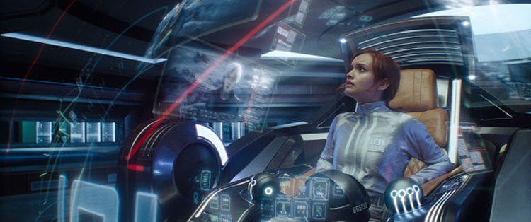
DS-H: Hugely. If you think about the brief, how do we use computer screens, mobile phones and holograms to tell a story in the film. How do we make that interesting? Trying to relate to everyone’s lives, when we’re connecting with other people, it’s through mobiles. That’s why films show it the whole time, but we don’t want to watch Batman texting or on a spread sheet, so how do we make it entertaining? The other question is: How do we make it realistic? For Guardians of the Galaxy, we were working with a walking tree and a talking raccoon — those are utterly fantastical, and you don’t want to lose the audience.
DW: How different are clients’ wishes?
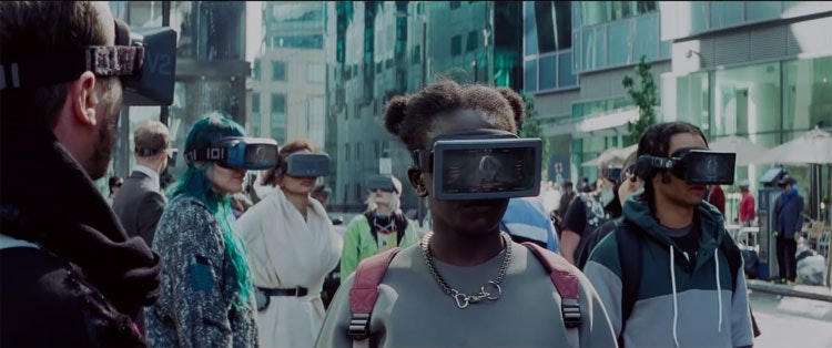
DS-H: Some films are more realistic. For Ex Machina, the director Alex Garland wanted the technology to be more believable. With Ready Player One, Steven Spielberg wanted to connect with retro 80s romanticism but was also making a statement about social media escapism.
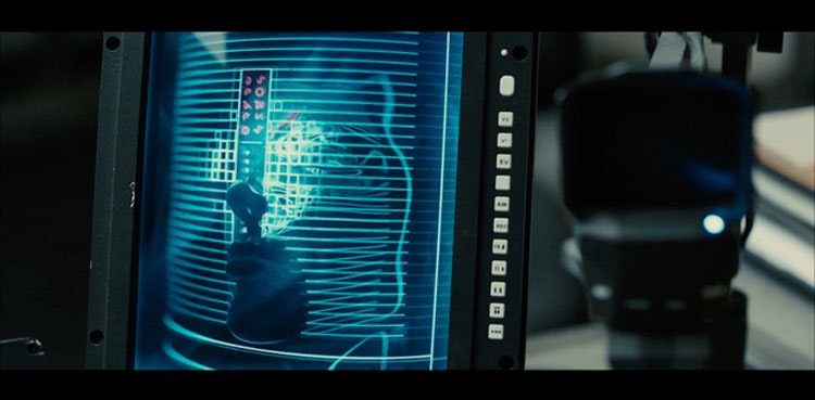
Blade Runner was really hard because everyone loves the original one. So there’s personal pressure involved, designing for a film, that’s based on a pre-existing film, but adapting it for now. Blade Runner was more about questioning creative process. We did the imagery for all the medical screens, like the DNA and pelvis bone check as well as the psycho-analytical tests. We also did the work for K’s (Ryan Gosling’s character) spinner vehicle and LAPD offices. And it all needed to feel analogue — the director was using technology as a statement about the film’s society; the mass population cannot afford high-end technology but the ultra-rich can.
DW: How do you approach a project?
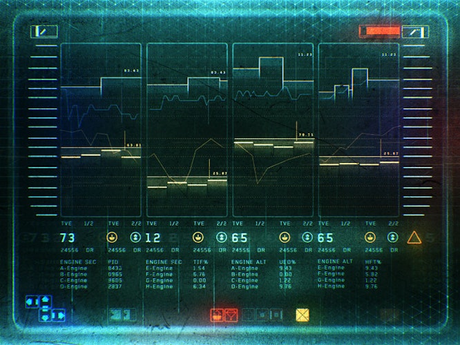
DS-H: Before the design, there’s a step back where you need to ask: What material are you working with? Portsmouth taught me to research the material. On Black Mirror, it’s about how technology impacts our lives — not just about touch screens — and how it weaves into the fabric of our lives. After thinking about the material, the levels of meaning lead into the storytelling component and we work out how it sits within the film or TV show.
We also think about the medium being used. If you’re designing for audiences on mobile – how does it connect? Some say that audiences have become less sophisticated, but I argue the opposite, culture keeps moving on and we become more and more nuanced. It’s now just more difficult to speak to a larger audience, but that’s an exciting challenge.
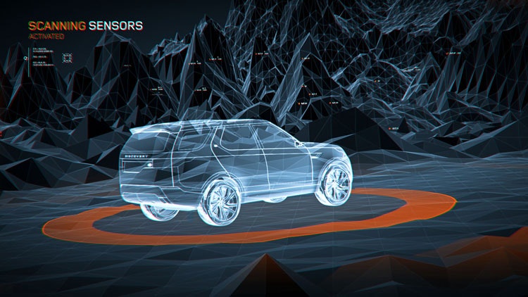
DW: You’ve recently moved into creating visuals for real-life cars, with clients including Land Rover and Volvo. How did that come about?
DS-H: Brands are interested in our skillset, in forgetting about what’s technically possible right now, and just future gazing. They want to know: is this the near future, is it five, ten years out?
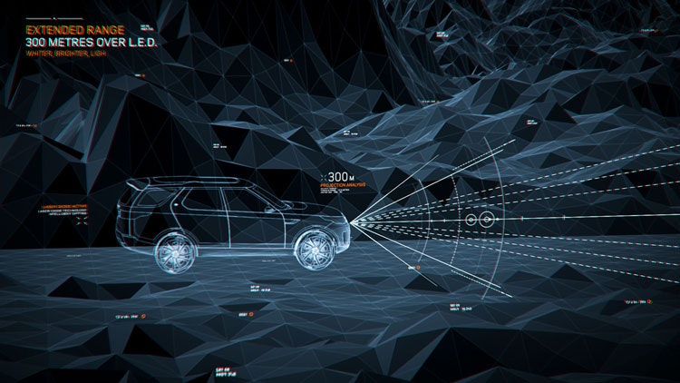
For Land Rover, we looked at concept cars and made a series of films explaining what those technologies meant. We looked at UX and UI for Volvo on their concept cars. We think about details like production design but also more abstract ideas. We look at the environment in a wider context or how city and country relate to automotive. Suddenly it’s not just about the car, it’s about your travel and your day, if your commute is a moment of day where you’re sleeping.
DW: How is that work different?
DS-H: The theme that connects our film and automotive work is future gazing — our question of what if? What if we don’t need a car or driver — what does a dashboard look like? If AI completely kicks in, what does the interface look like? Do you need a visual display? It’s about anticipating change and working with the past. There will still be a need for visual communication I think. I would hate to understand a map through audio. It’s far more effective to see visual.
There are similarities. Both fields are about how technology connects with the mass population. I need to understand what’s going on, but so does my mother and daughter. The difference when we’re working with brands is that we want a hopeful look at the world, and they also have to be functional. There’s a rigour around every single element, and how that’s going to live on. You also need to consider historical expectations around driving. You can’t just throw away the UX or a speedometer or warning light, you have to work with those.
DW: What strengths do you need to be a visual effects designer?
DS-H: In film, your work does need to be beautiful and your imagery has to work within a larger frame that’s often stunning. When you’re working on films like Blade Runner, and the director of photography is Roger Deacon and every shot is beautifully composed, you need work to that level.
DW: What are the best parts of your job?
DS-H: Going on a filmset and seeing your work in a wider context in terms of film production. Our employees get to be on filmsets for Bladerunner and The Avengers — not many designers have that privilege. You also work with really smart people you can learn a lot from. Having regular conference calls with film directors in pre-production — they know how to connect with audiences, treading somewhere between art and entertainment.
DW: What are the worst parts of your job?
DS-H: Expectation. There’s incredible pressure and you have to be able to turn work around quickly.
DW: If you were interviewing for a junior visual effects designer, what would you look for?
DS-H: They have to know what graphic design is and have good taste in design. They’d have to love film, work on games and love their area of interest, it is demanding, we want people to care, we want everyone to be the same as us. Just wanting to learn. Sometimes it feels like, of course you want that, but it’s a rare thing, people who want to keep on pushing and being uncompromising on everything.
DW: What advice can you offer people considering a job in visual effects?
DS-H: You have develop and adapt as the industry is constantly changing, and that the skills you learn might not be where you end up. You can change paths a lot, so you need an aptitude for learning new things.
It’s important to use social media. Being aware of where the world is going and all the things that’s going to impact design is crucial. AR (augmented reality), our movement away from owning things, having higher value for experiences, connection with the world, the current political movement — all of this affects how we do our job.
DW: What is the job market like for a visual effects designer?
DS-H: The great news is that everyone keeps watching stuff on TV and on their mobile: a lot of content being consumed. Netflix was quick off the mark and it would appear any FTSE 100 wants a TV channel. Premium content has been important again. There’s tons of great content in the UK — most Marvel films are made here. UK industry is highly respected for intelligent design, well-crafted work. We don’t like to compromise here.
Likewise, with the automotive industry, people know these challenges are coming through but that’s just what they are: challenges to be solved. The UK’s prestige in design puts us in a good place to export those services out to different automotive brands. It’s future-gazing, but it’s not too far future — it’s the near future.
Salary expectations based on Design Week Jobs:
Junior motion graphics designer: £25,000 — £28,000 per year.
Mid-level motion graphics designer: £30,000 — £35,000 per year.
Senior motion graphics designer: £42,000 — £55,000 per year.
To browse motion graphics roles, head to Design Week Jobs.

- Design disciplines in this article
- Industries in this article


