Set 60 years after the events of the original trilogy, The Matrix: Resurrections presents viewers with a new world, a new fight and – perhaps most importantly – a new Neo. The film premiered in December 2021, with on-set and post-production graphics developed by London-based motion design studio Studio C.
Given the cult status of the film franchise, studio creative director Gordon Spurs says his initial reaction to being given the script was excitement. “The original Matrix screens are Sci-Fi folklore,” he says. But with the excitement came a considerable amount of pressure – the visual world of The Matrix is one fans are protective over, so Studio C’s work needed to fit seamlessly into it.
Spurs explains the project was an exercise in balance. Technology in the real world has evolved beyond recognition in the years since the last Matrix movie was released and there was a need to show a similar progression in the film. But at the same time, graphics needed to feel familiar. “It’s the last great sci-fi film before the full shift to digital downloads and media, and we wanted to keep the analogue romance of that in the ether,” says Spurs.
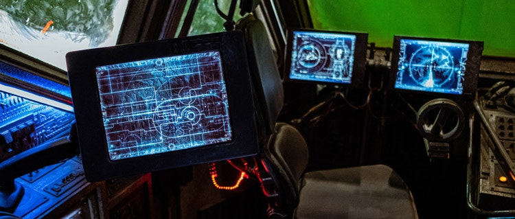
Conceptualising the franchise’s design “as a whole”
Work on the project took around two years. Like many projects, it was punctuated with a months-long gap because of the pandemic. In the initial stages, Studio C was given the script and asked for its interpretation. This was then sent to production designers Hugh Bateup and Peter Walpole to gauge their thoughts, while they were filming on-set in San Francisco.
Studio C director and motion graphic supervisor Sam Jones says the work progressed with discussions and research in pre-production. The art department for the film gave the team some references – including two ring binders which had screengrabs of every time a graphic had appeared in the previous three films.
Sticking all these prints-outs over walls was one of many immersion tactics. Others, Spurs says, included exploring the film’s audio signature as well as its visuals. He says the team listened to plenty of Massive Attack as a way of focusing on “the design as a whole”.
The first element of the project the team developed was the graphics for Deus Machina, the games company film character Thomas Andersen co-founds. “It was a nice way to ease into the project as we weren’t yet dealing with the iconic sets of the first film straight away,” Spurs says.
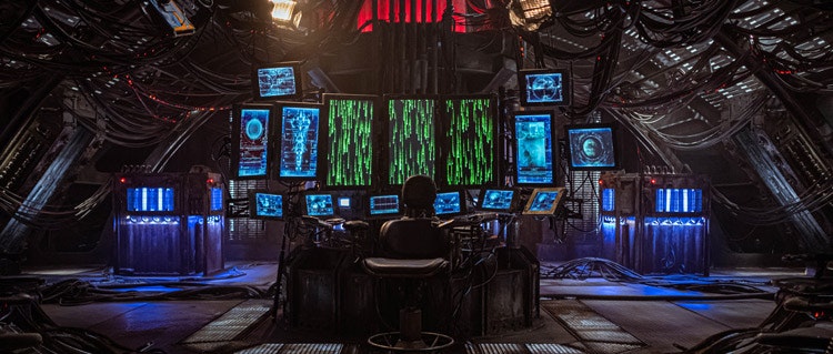
“To make the world feel like an evolution, instead of something new”
For the most part, Jones explains Studio C was entrusted to produce its own vision of what the graphics should look like for touchpoints across the film’s more than 20 sets in San Francisco and Berlin, like computer screens and handheld devices. Of course, there were other elements that were “off limits”, Jones says. These are the graphics you might expect, like the iconic dripping code.
Carte blanche to continue the visual world of The Matrix was both a blessing and a curse. “Our thinking was always ‘how would this set up have evolved over the 60 years that have passed in the universe?’,” Jones says. “We had to maintain a consistency with previous visual graphics to make this world feel congruous with the Matrix style.”
Jones explains one of the ways this continuity has been embedded is through references to previous films’ UI and typographic elements. “The idea was to make the world feel like an evolution, instead of something new,” he says.
Spurs also wanted to acknowledge the now-obsolete analogue and digital media, which was cutting edge at the time of the original trilogy. “In the first film Neo keeps his hacks on Minidiscs in the hollowed-out Simulacra and Simulation book and [the character] Tank loads training into the computers via a fictitious drive and disc which back then seemed mad futuristic,” Spurs says. “So minidiscs, CDs and datadiscs definitely had an influence on the pure abstract graphic design of the Mnemosyne [the new hover ship used by the rebels] main deck screens.”
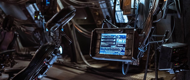
“We dug into how the Matrix world had evolved since the end of the third film”
All this said, there is plenty that is new in the film’s graphics. Certain plot developments mean that in many scenes, the Studio C team were dealing with uncharted territory within the franchise. “We dug into how the Matrix world had evolved since the end of the third film,” Jones says.
One of the most marked updates is the introduction of Synthients [robotic creatures] to human ship crews. “Working on the premise that these friendly robotic-synthetic hybrids had helped the rebels reconstruct their technology, our UI became informed by these machines and as a consequence is more organised, structured and sharper, more optical than previous UI,” he explains.
Then there were the all new graphics needed for onscreen interactions with actors. “With something like the hero sequence for Thomas Anderson inspecting his Modal, most of the discussion revolved around the scripted structure of the scene,” Spurs says. “We had to make sure we had the main beats built into a Unity App for Keanu to perform with on the day.”
For all elements, director Lana Wachowski was giving feedback he adds.
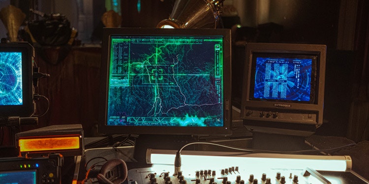
“A dream for anyone in motion graphics to have worked on”
As with any film Studio C works on, there are elements which Jones and Spurs are particularly excited for viewers to see. For the former, it’s the first sight of the Mnemosyne. “With the dripping code and the surrounding graphics, it’s classic Matrix and a dream for anyone in motion graphics to have worked on,” he says.
Meanwhile Spurs is eager for fans to see the numerous “Easter Eggs” which have been added into the final cut. For example, he says Neo’s on-screen operating system and Modal have little Red Pillicons for notifications.
“We noticed producer James McTeigue in an interview telling people to watch out for Easter Eggs on the screen graphics so it’s nice to think that people notice the background stuff where it’s just us geeking out,” Spurs says.

What do you think of the graphics from The Matrix: Resurrections? Let us know in the comments below…

- Design disciplines in this article
- Industries in this article
- Brands in this article


