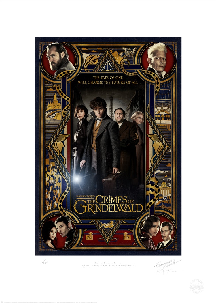
Stepping into the House of Mina Lima, with its winding, wooden staircases, hand-written letters dangling from the ceiling and strewn across the floors, and colourful graphics of dragons and monsters plastered across the walls, visitors might think they were stepping into Hogwarts rather than a shop in London’s Soho.
Situated on Greek Street, the little three-floored house is home to the graphic props produced by design studio MinaLima for the Harry Potter films, and now, author J. K. Rowling’s more recent cinematic venture, Fantastic Beasts and Where to Find Them.
With the widely anticipated release of the second Fantastic Beasts film this Friday 16 November, MinaLima has decided to showcase over 50 of the studio’s graphic art prints in an exhibition on the ground floor of its shop space, giving visitors a taste of the hard work that goes into producing the paper props and scene-setting material. This film art is crucial to getting the feel of the film right yet could easily be missed at first watch.
The first Fantastic Beasts and Where to Find Them film was released in 2016, a fantasy prequel to the beloved Harry Potter film series, based on J. K. Rowling’s books. While Fantastic Beasts also explores the fictitious wizarding world, it is set in a past era, from the 1920s to 1940s, unlike Harry Potter, which is set closer to the current day.
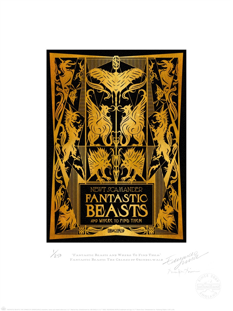
Neither was Fantastic Beasts an epic, seven-part book series dramatised for film, as Harry Potter was. While Rowling did write one book in 2001, under her pseudonym Newt Scamander, any film sequels have been co-produced by Rowling but are not based on any written text. There are due to be five Fantastic Beasts films in total.
MinaLima created the graphics for the first Fantastic Beasts film, and now two years later, the second, entitled Fantastic Beasts: The Crimes of Grindelwald. Eduardo Lima, co-founder at the studio, says that the lack of novel series on which to base their work has proven to be both tricky and rewarding.
“The challenge [with Fantastic Beasts] was that we didn’t have books to refer to, so everything is brand new,” he says. “We don’t know what’s going to happen in the next film. That’s also really exciting and means we have to work closer with J.K. Rowling.”
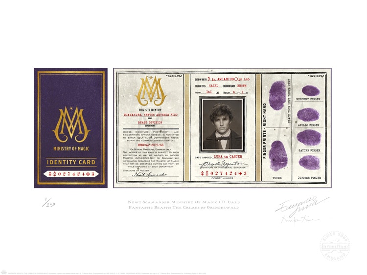
From letters, passports and fake newspapers through to street posters, shop fronts, maps and even labels on small bottles, MinaLima has created hundreds of graphic pieces for the film, with roughly five to 10 repeat copies made for each piece, given that they will get “folded, ripped, thrown in water or burnt” by actors in various scenes, says Lima.
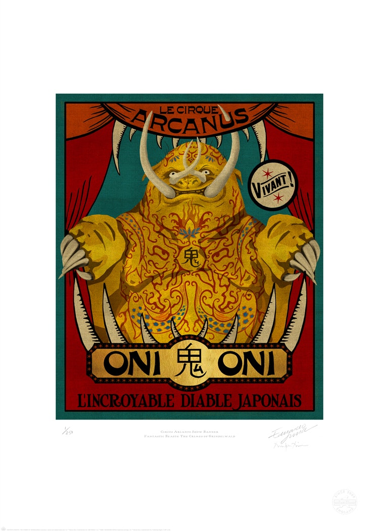
The props are made through a mix of hand-craft and digital means, with some posters being screen-printed, but other things, such as old lettering and type, being scanned from archival books, then copied and pasted together to create new words.
“Doing it this way gives you ‘bad quality’ printing, so it’s not 100% perfect,” says Lima. “That’s the effect we wanted, because in the 1920s, there would have been fuzzy or faded printing – it wouldn’t be printed perfectly like things are today.
“With things we had more time on, such as circus posters, we screen-printed them with beautiful results,” he adds. “Other things, like newspapers and labels, we didn’t have time to use letterpress or silk-screen, so we would recreate digitally, print and photocopy. Things need to be done quickly.”
The new Fantastic Beasts film is set in Paris between 1926 and 1945, and so many of the graphics, though magical, take inspiration from this real-world era, which was an “amazing period for design”, says Lima.
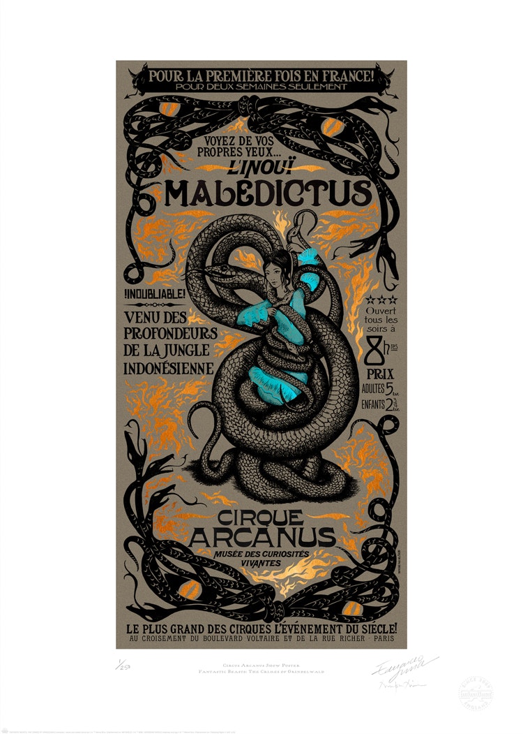
Therefore, graphics have been partly inspired by the Art Nouveau architectural movement, which was most popular between 1890 and 1910, and is characterised by decorative patterns, particularly of natural forms and objects such as plants and flowers.
In keeping with this style, ornate, gold-leafed frames make it into the design studio’s street posters for the film, many of which are used to advertise a fictitious circus going on in the Muggle – or non-wizard – community. “Organic” iconography and symbols are used, says Lima, such as vines, to mirror the botanical, art nouveau style.
The studio was also influenced by traditional hand-painted signs from the late 19th and early 20th century, says Lima, and the designers dug through 100-year-old books and manuals about sign-writing found in the archives of French publishing house Éditions Gallimard for inspiration.
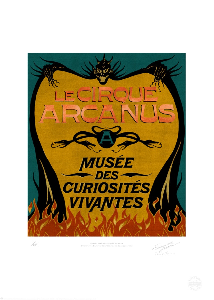
“Me and Mira [Mina] are crazy about typefaces, we’re real geeks about them,” says Lima. “We did a lot of research into what typefaces they were using in that period, and there were so many different styles, both sans-serif and serif.
“Our favourite bit when we start a new project is to do the research,” he continues. “We went to France and spent a couple of weeks going through archives like Gallimard’s and museums.”
MinaLima worked as a team of six to create all the graphics for the new film: founders and creative directors Eduardo Lima and Miraphora Mina, three assistants and a coordinator, who is French and so was able to assist the designers with translations.
As well as designing type and graphics, the team wrote all the copy and headlines, such as for the fake newspaper fronts, and created all the illustrations and drawings, like on the street posters.
Lima says the graphic props fall under two categories or lists – action props, the props that actors are going to handle and use themselves as part of their acting, and are “important in telling the story”, and background props, which help create atmosphere and setting, such as street posters featured in certain scenes advertising the circus.
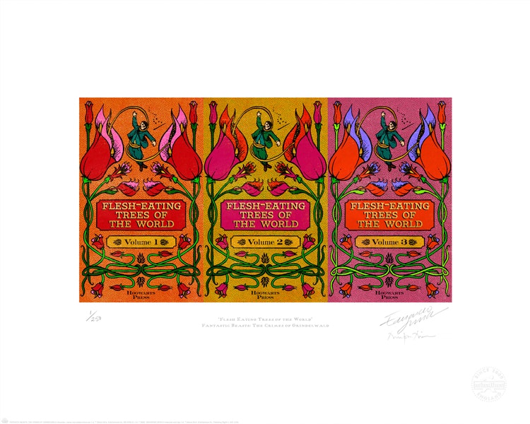
The design studio was also responsible for producing the props; for example, MinaLima needed to make sure the books are bound with all the necessary pages in, a finished product.
“We deliver props absolutely ready to be filmed,” says Lima. “We then collaborate with the visual effects (VFX) team to see how these things work on screen, and whether they will be made three-dimensional (3D) or animated. For example, we made a set of graphics which will appear as moving graphics in the film, painted on buildings and wizarding shops. There’s about four months of post-production once the graphics are made.”
Lima says that working on the Fantastic Beasts films, as on the Harry Potter films, has given the design studio a lot of creative freedom to interpret objects and graphics how they see fit.
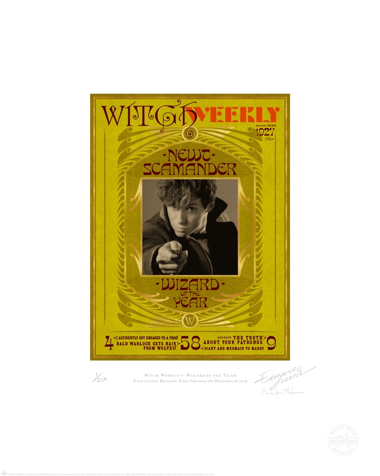
“[Rowling] never really gave too much away when it came to printed items,” says Lima. “She didn’t explain exactly what a Marauder’s Map or a Daily Prophet newspaper looked like – she left it to us, the readers, to imagine that. She would just say ‘a piece of parchment’ or a ‘leather-bound book’. I think that’s brilliant – we’ve been able to imagine things, and the things we have proposed are now part of Harry Potter history.”
He adds that the most rewarding part of the process is this ability to invent, sometimes completely from scratch. The addition of “new wizarding environments” in the film that are yet unseen, such as the French Ministry of Magic, Le Cirque Arcanus (the circus) and certain shops, gave the studio’s designers the chance to fully use their imagination.
“We had to invent all the names of these things, and give them logos and identities,” Lima says. “While the setting of the Muggle world, 1920s France, is a beautiful and elegant period to design for, it’s moments of invention like this that were really exciting.”
The Fantastic Beasts: The Crimes of Grindelwald graphic art exhibition opens on 15 November at the House of MinaLima, 26 Greek Street, Soho, London W1D 5DE. Alongside 50 graphic pieces from the film, the exhibition also features two new books designed by MinaLima, including a written screenplay and a behind-the-scenes journal. All books and prints are available for sale. The film previews on 16 November 2018. For more information on the exhibition, head here.

- Design disciplines in this article
- Industries in this article
- Brands in this article


