Morrissey biopic England is Mine hits cinemas this weekend and tells the story of the formative teenage years of The Smiths frontman, who grew up in a 1970s Manchester from which he both drew inspiration and looked to escape.
For the most part, the film places the viewer squarely in the pre-Smiths frame, when Steven Patrick Morrissey was a long-haired, awkward outsider struggling with a nine-to-five; before he cut a more familiar, foppish figure.
The movie is a “labour of love”, conceived and directed by Mark Gill, co-founder of The Chase Films, which is part of The Chase design consultancy.
Gill hales from Morrissey’s hometown of Stretford, an industrialised Manchester suburb that lies between The Manchester ship canal and the Mersey, and provides a backdrop to parts of the film.
Both sides of The Chase business have collaborated on the project, meaning that graphic designers from the consultancy have been working on the design of hundreds of props, that appear within the film.
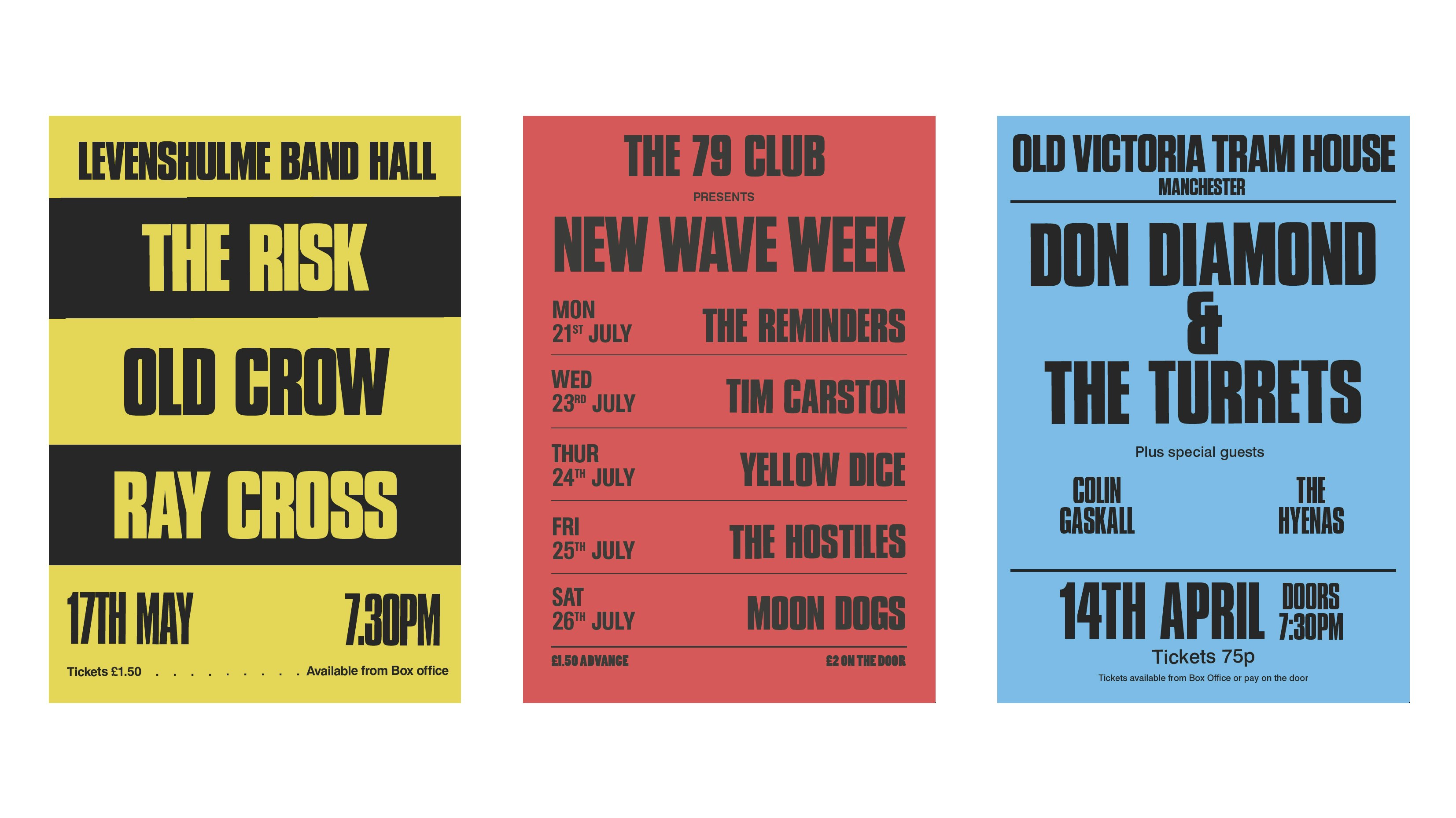
This undertaking has meant creating gig posters for the likes of Duran Duran, cereal boxes for domestic scenes, and even blank HM Revenue and Customs forms.
Design-wise it feels like almost as big a job as MinaLima is used to taking on for the Harry Potter films, – albeit for a very different world – its work on The Imitation Game, or Annie Atkins’ designs for The Grand Budapest Hotel.
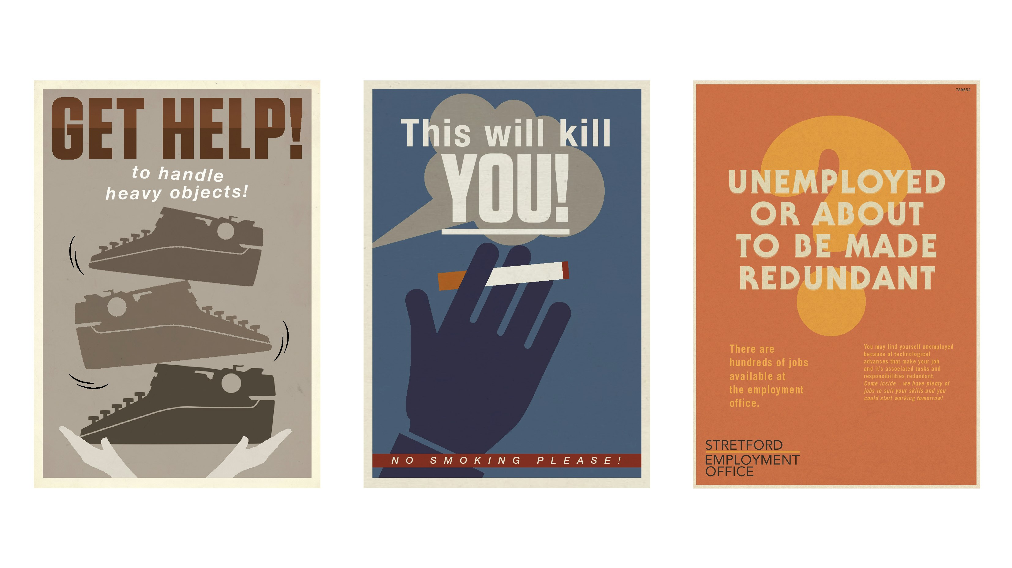
While Gill was working on the beginnings of the film some three years ago, pre-production began in April 2016 and took around 16 weeks, before a further 16 weeks in post-production and a final 16 on editing.
“That era was part of our design education”
Whitworth was part of the design team who poured over archival material as part of a rigorous research stage at the beginning of the project.
“We’ve all got a keen interest in Morrissey’s story but also that era of Manchester,” says Whitworth, himself a Mancunian. “From a design point of view, that era was part of our education.”
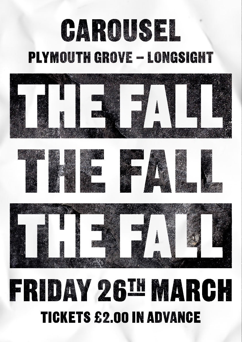
The Manchester Digital Music Archive proved to be “a gold mine” and was particularly useful for referencing gig posters from the time – the likes of which had to be reimagined or recreated for the film.
Such is the love for Morrissey in his native city that serendipity also played its part in the design process.
Gill says, “We had a chippie on set doing some carpentry and it turned out he was a massive Smiths fan. He lent us loads of original posters for inspiration, that he’d ripped off walls at gigs years ago.”
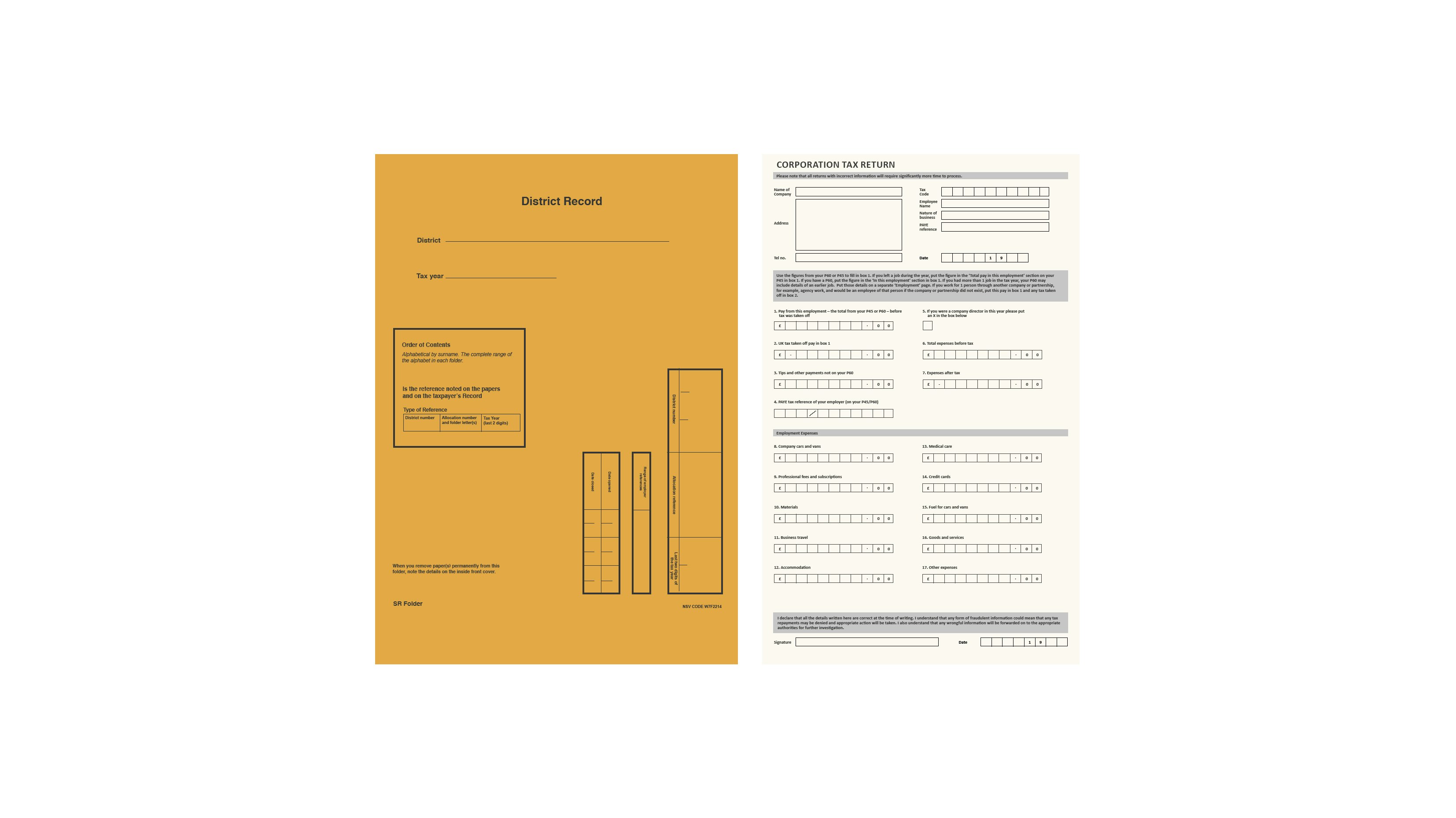
It was the background dressing of the set where detail was key and this part of the work seems to have appealed to the fastidious and perfectionist sides of the designers.
“We created forms that would never be used”
Gill says: “There were five designers working on that stuff, which included everything down to the beer pump graphics in pubs and all sorts of forms for the Inland Revenue office” – where a 17-year-old Morrissey worked for three weeks.
Designer Garry Whitworth says: “We even had to create forms that were in folders; things that would probably never be used, just in case an actor wanted to adlib and grab it. We had to be prepared for that to happen.”
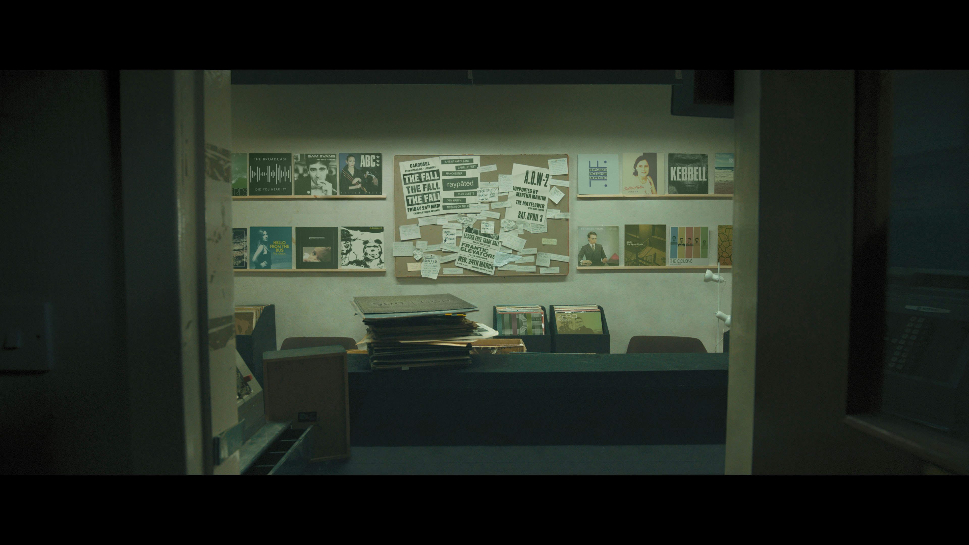
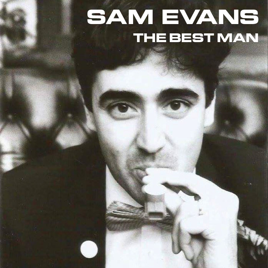
A record shop which features in the film is another trove of designed props and set design. Gill says, “We created a few sleeves that I worked on with Matthew Evans, which look like they’re from the time. They feature a few family and friends, and a reference to my next film.”
Post-production
Some of the work done by The Chase has been achieved through Adobe After Effects, rather than solely pre-production prop-making.
An old Art Deco cinema – which has now fallen into disrepair – has been restored to its former glory by Evans in After Effects. It forms a backdrop, which “locals will warmly recognise” and has all been done in post production.
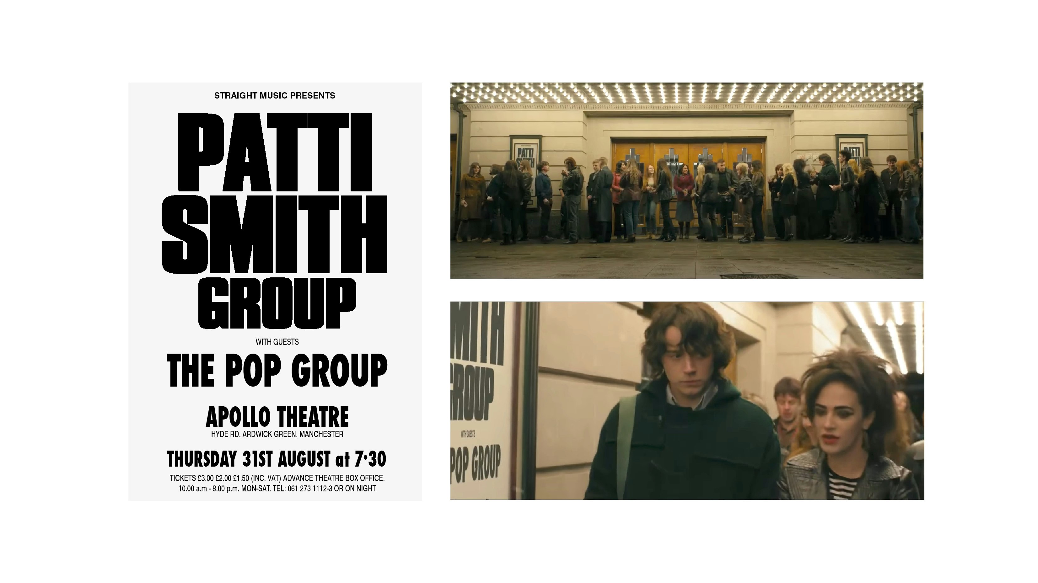
It can be a lot of fun, putting something like that together, Evans says: “With one Patti Smith poster in particular, which features outside the Manchester Apollo, Mark [Gill] had sourced an original and we had to identify a typeface to recreate it and make it look like it was from the era.”
“It screams Morrissey to me”
Naturally, the collaboration extends to the promotion of the film. A photo taken by Gill on set has formed the basis of the movie poster, which Evans has designed. “As an image and a piece of design, it screams Morrissey to me,” says Gill.
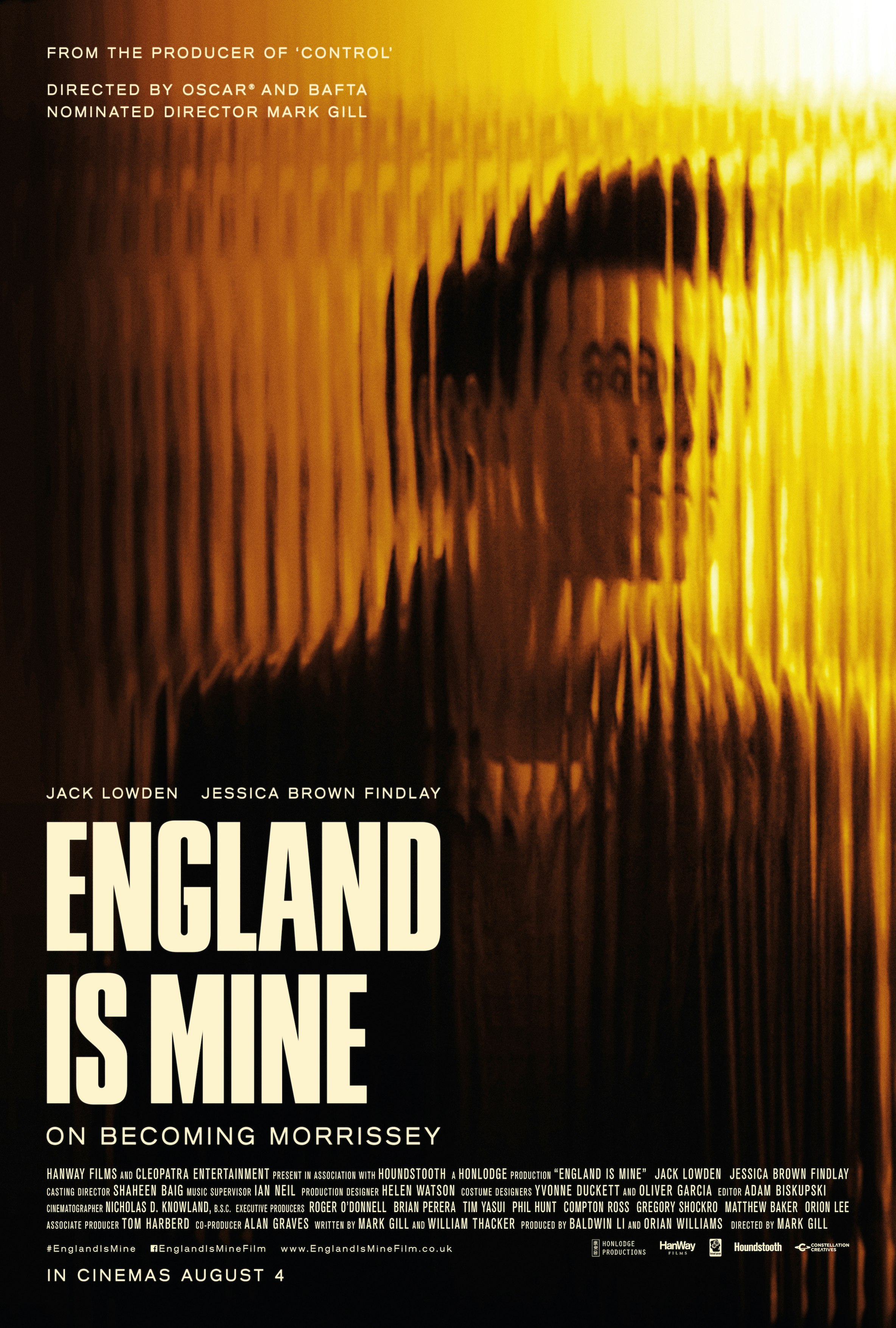
“We just wanted it to look simple but communicate powerfully and the England is Mine wordmark helps achieve that,” adds Evans.
Prior to this, The Chase and The Chase Films have worked together on brand films and TV advertising, with clients including ZSL London Zoo, M&S Bank, as well as producing film titles for black comedy Frank, and the Oscar nominated short film The Voorman Problem.
This time round, the designers who have worked on England is Mine have been rewarded with a cameo and can be seen shuffling into crowd scenes as extras – probably just to make sure that the set is dressed as it should be.

- Design disciplines in this article
- Industries in this article
- Brands in this article


One response to “How the new Morrissey biopic England is Mine was designed”
Were you inspired by Sad City (aka Gary Caruth)?
https://musicbysadcity.bandcamp.com/