In the 24 years that design studio Harrison has worked with Nando’s, it has designed over 340 of its restaurants, more than any other studio on its roster, according to Harrison interior designer Annita Liasi.
She says the restaurant designs have “evolved so much over the years”, from being dominated by timber materials and “very earthy colours” to “more colourful and vibrant designs”. Liasi has been involved in many of the projects – including new restaurants, refurbishments and minor changes – and, despite it being the same client, she says she “always tries to push [herself] to evolve it and go further every time”.
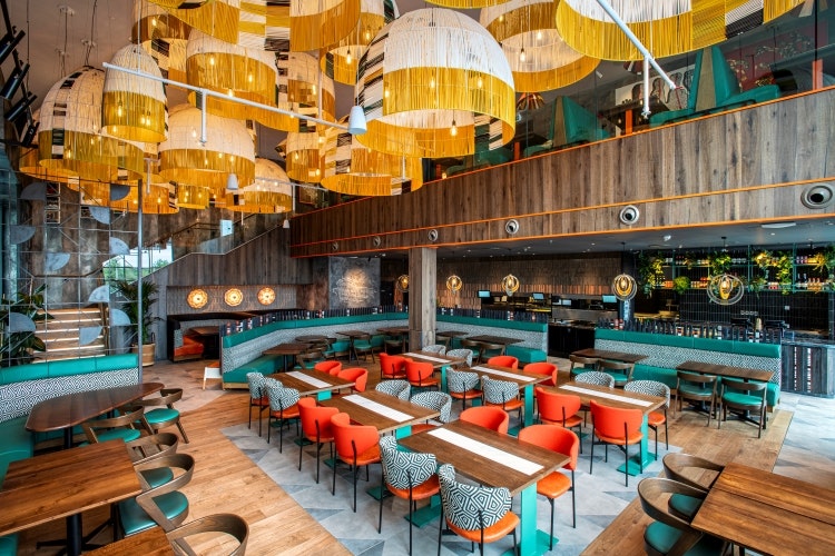
Making sure “nothing is the same” helps to “keep the brand alive”, says Liasi, admitting that it is “a challenge for designers to come up with new ideas for every project” while still retaining the Nando’s identity. Three other design studios also work with Nando’s, according to Liasi, who thinks it’s good to be “challenged by other companies”.
When designing the restaurants, Harrison creates everything from the layout and the style of the seating to the floor finishes and wall finishes. For new builds, Liasi says the studio tries to use materials “like recycled tiles and reclaimed timber” while there is more scope to see how they can use existing materials creatively as part of refurbishments.
Central to each brief is referencing the locale of the restaurant and blending that with South African style into a holistic design.
Read more: Nando’s global rebrand looks to re-connect with South African roots
Recently, Harrison redeveloped the interiors for the Mile End Nando’s. Liasi notes how a lot of fabric table runners were used during the pandemic that had not been used since, so she decided to apply that fabric to the back of the chairs and use it for decorative panels.
Each Nando’s restaurant concept is different and designed to characterise its location in the best way, Liasi adds. Nando’s Coventry Arena has pipework hanging from the ceiling to represent the organ pipes of the famous Coventry Cathedral Organ.
“Something that customers will remember”
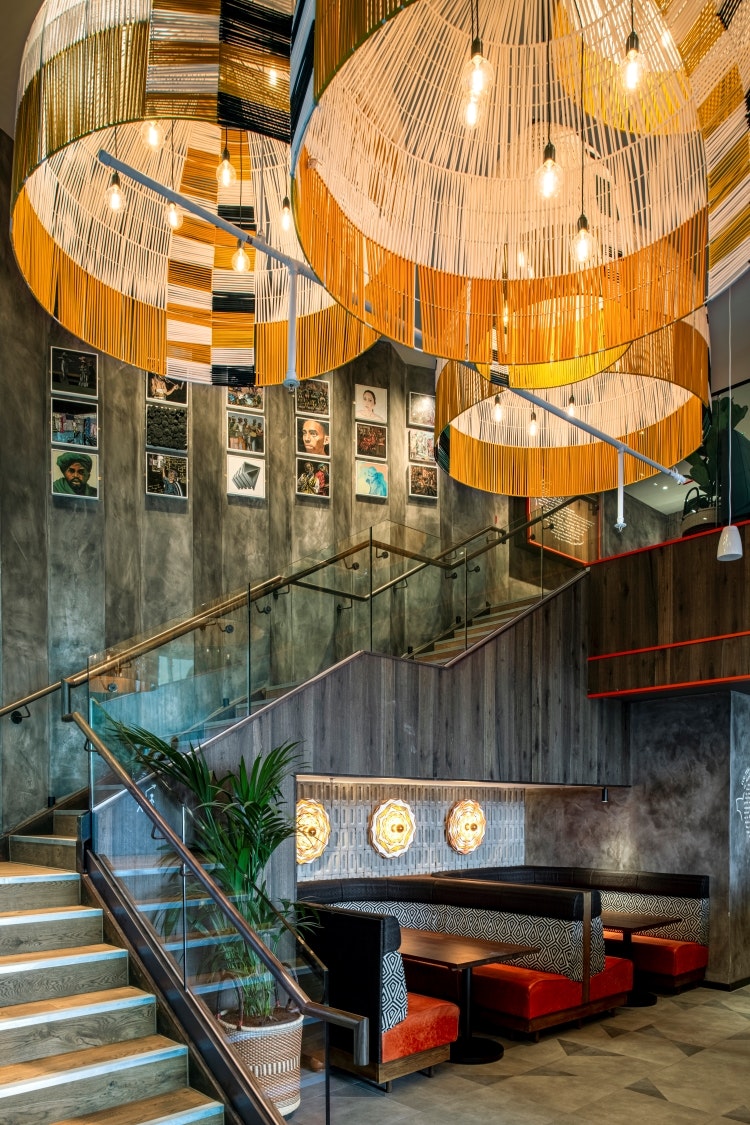
Harrisons latest project for Nando’s is a new build restaurant in a Limerick shopping mall, which began in December 2022. Green, orange, white and black – the colours of the Irish flag – make up the primary palette, referencing its location. These brighter hues contrast with the darker, earthy tones from the concrete walls and timber, according to Liasi.
She emphasises how materiality was a key focus for the project, describing how the exposed concrete walls, a combination of flat and geometric 3D tiles, and reclaimed timber were chosen to add “another dimension to the space”.
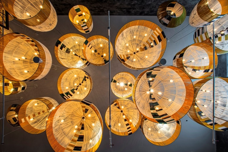
Large scale light pendants are the focal feature of the Limerick location, which were designed in collaboration with South African light designers Ashanti Design. Harrison sought to design “something that customers will remember” and, with the overall height of restaurant being 6.5 metres with a mezzanine, Liasi says the feature had to be “visible from all the levels and draw you to look up”.
The pendants are a scaled-up version of an Ashanti product called Awali except they’re “ten times bigger” with a bespoke design, says Liasi. Around 585kg of upcycled cotton from fabric houses in South Africa was used to create the lights, averting it from landfill sites.
“The colours you see are from the waste products,” says Liasi, explaining how she had to choose from the colours available as the cotton isn’t dyed so as not to impede it from being recycled again. As it was such a large project, Ashanti had to stop producing any other products to work on these pendants and employed another 15 local weavers, “giving job opportunities to more local craftspeople,” according to Liasi.
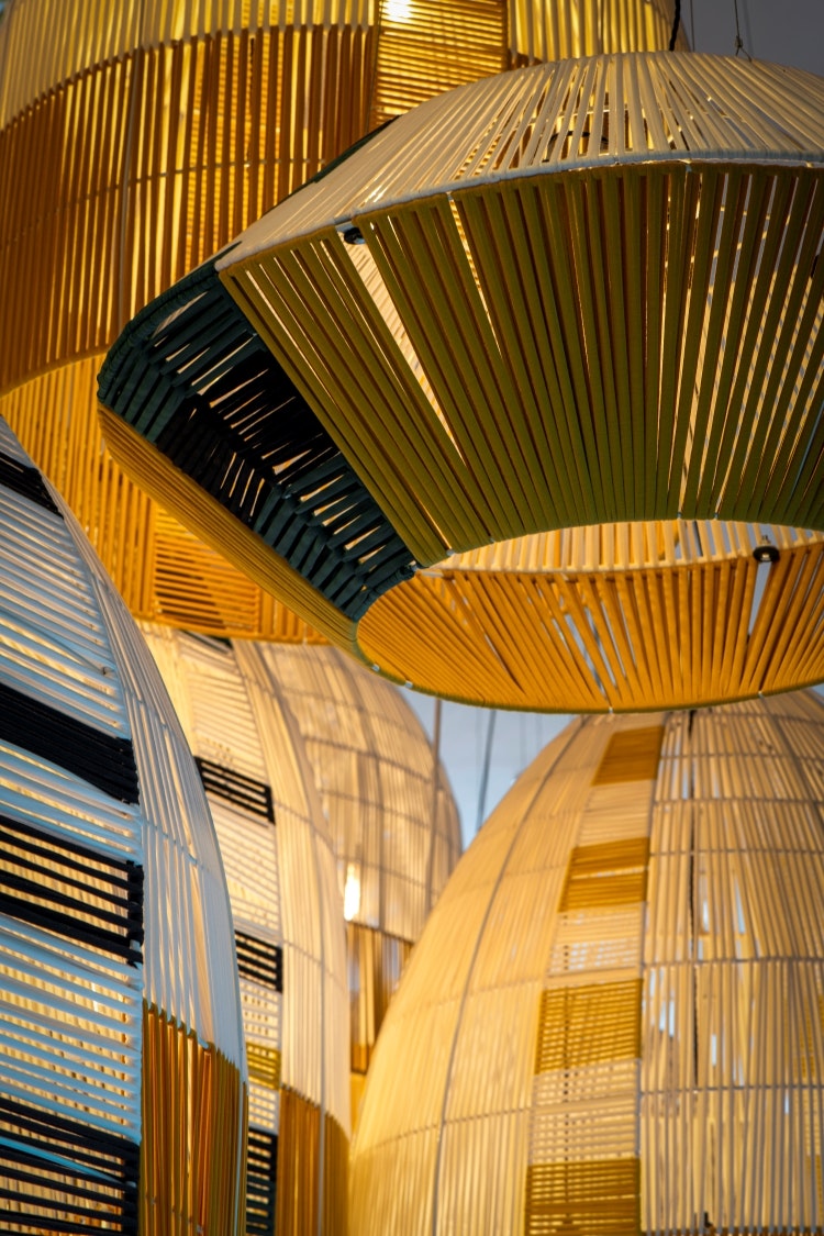
One challenge was that Harrison and Ashanti had to be mindful of the weight of the pendants, as the heaviest one is 20kg, says Liasi. She explains how the studio had to “calculate their collective weight” and ensure the restaurant ceiling could support them.
Choosing the overall dimensions of the pendants was also a challenge, as they had to fit through the doors of the South African warehouse they were stored in and into crates to be shipped. Liasi says the solution was designing them to fit together “like a Russian doll” to save crate space and improve on sustainability.
“It was an amazing experience to work closely with Ashanti and being part of the process and see all the hard work that the weavers put into it”, says Liasi. Inspired by this handmade process, she later introduced some stripy patterns to all pendants.
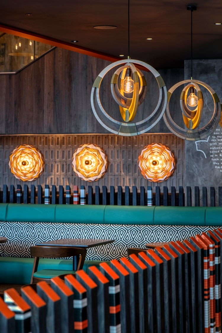
Overall, there are 26 different pattern combinations to be used as a guidance to the weavers. She explains that the idea behind the patterns was that “each light pendant would be as unique, vibrant, and beautiful as the individuals making the lights”.
The 32 pendants come in different sizes and shapes, with the largest being 1.8 metres in diameter. Each woven pendant is supported by a metal frame.
The Limerick restaurant opened 12 October 2023.

- Design disciplines in this article
- Industries in this article
- Brands in this article


One response to “What does it take to design a Nando’s restaurant?”
Not sure what point there is to a change of design to any Nando’s restaurant while the quality of the over-priced food and menu have remained unchanged for years?