New York design agency Smakk has developed the branding for a new product line from kids’ food brand Little Spoon, looking to appeal to four-to-seven-year-olds as well as hinting at healthy ingredients on the packaging for parents.
Little Spoon’s products are marketed as healthy options that avoid artificial, heavily processed ingredients and it claims to make parents’ lives easier with its quick-to-make meals and snacks. The direct-to-consumer brand already had products ranges for babies and toddlers and was seeking to “grow its product offering” with a new “aged-up” line of products, says Smakk founder Kate Klencheski.
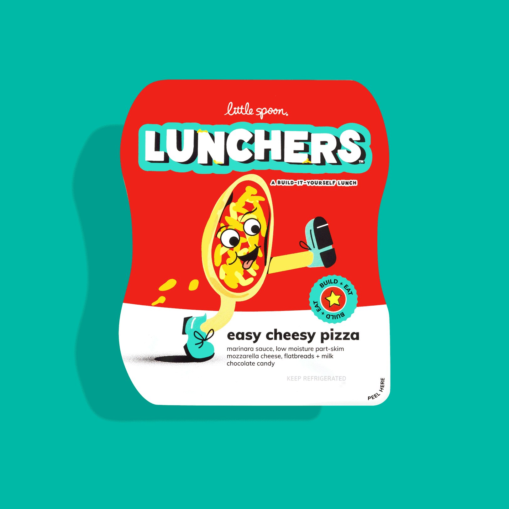
Smakk sought to keep “the look and feel of the packaging” for the new range in alignment with the existing brand identity but make it “nimble enough to be easily applied” by Little Spoon’s in-house team as the range expands, Klencheski reveals. Smakk’s strategic approach was to design an identity that could be “both functional and fun”, she adds.
To appeal to this new target age group for Little Spoon, the design team looked into what differentiates kids aged four to seven from younger toddlers, according to Klencheski. “In some ways, six is the new thirteen”, she says, explaining how the team identified design motifs that read as “playful, cool, and not for babies”.
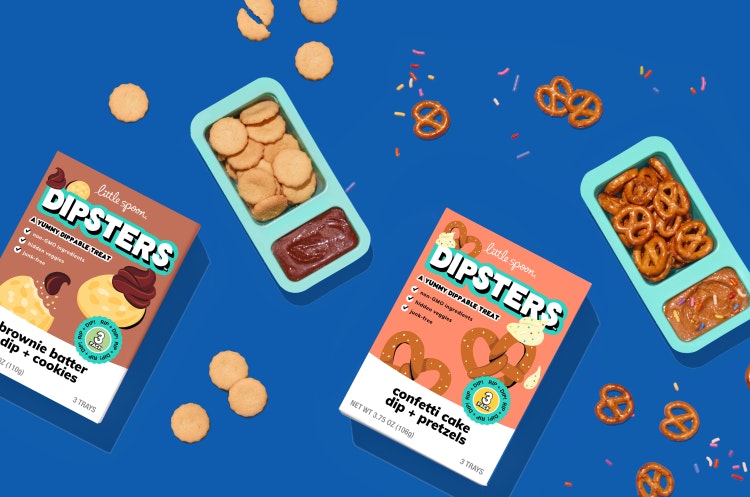
Using product language to achieve this, Smakk devised “strong, ownable” category names and flavours that would be memorable for kids as well as “healthy callouts” hidden in the small-print product descriptions and illustrations that only parents would notice, Klencheski explains.
Before the project began, Little Spoon already had an illustration bank to showcase its 100+ ingredients. With this as a starting point, Klencheski says Smakk designed an illustration system that caters to the young audience’s “playful preferences”, while still communicating the ingredients for parents.
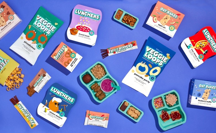
Looking at the Veggie Loops product, for example, the flavour Pizza-licious has a spinach leaf hidden in the top right corner while the Pancake Party flavour features a hidden pumpkin, with personified Veggie Loop characters taking centre stage. Klencheski notes that Smakk was careful not to personify any of the ingredients that were “alive”, for example, opting to make a character out of “a chicken nugget, not a chicken”.
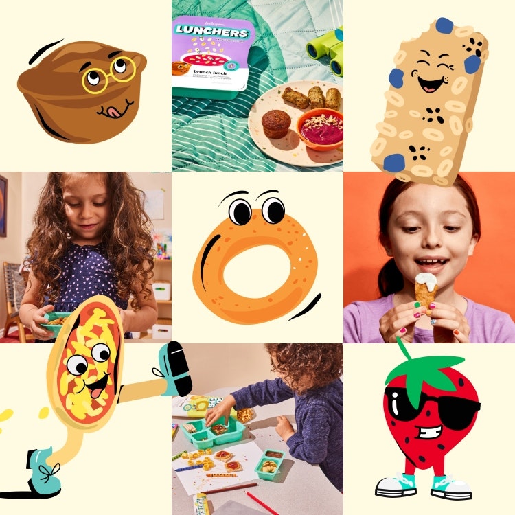
While most fonts used, such as display sans font Wonky and sans serif font Muli, come from the existing brand identity, the new range also features “bold, custom type lockups” that are “hero-ed on the packaging”, says Klencheski. She adds that the range’s colour palette is also derived from the parent brand, though Smakk “upped the saturation” and “leaned into the bolder colours” from the wider identity.
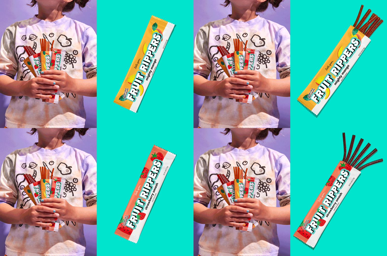
Ultimately, there had to be “a clear delineation” between Little Spoon’s product ranges to make it easier for parents with multiple children in the house, Klencheski explains. Smakk created guidelines for how the personality, tone, messaging, photography and visual elements should be different to other ranges.
The range includes five “Luncher” SKUs and four snack categories, each with two or three flavours, making 15 SKUs in total.

- Design disciplines in this article
- Industries in this article
- Brands in this article


One response to “Smakk designs “functional and fun” identity for Little Spoon’s kids’ range”
It’s a shame Little Spoon’s illustration bank was made up from its Shutterstock subscription. What a missed opportunity for an up and coming (cheap?) post graduate illustrator.