The Unlimited Dream Company has designed hip-hop artist Loyle Carner’s 2023 show, using lighting inspired by the sun cycle to tell the story of his latest album Hugo.
Established in 2021, the studio has designed shows, graphics, and artwork for artists such as Slow Thai, Alicia Keys, Gerry Cinnamon and Pa Salieu. To design a show, Unlimited Dream Company start with mood boards created by artists with their creative directors, followed by the design work which takes between two and six weeks, and finally the production phase, according to its co-founder and creative director Harrison Smith.
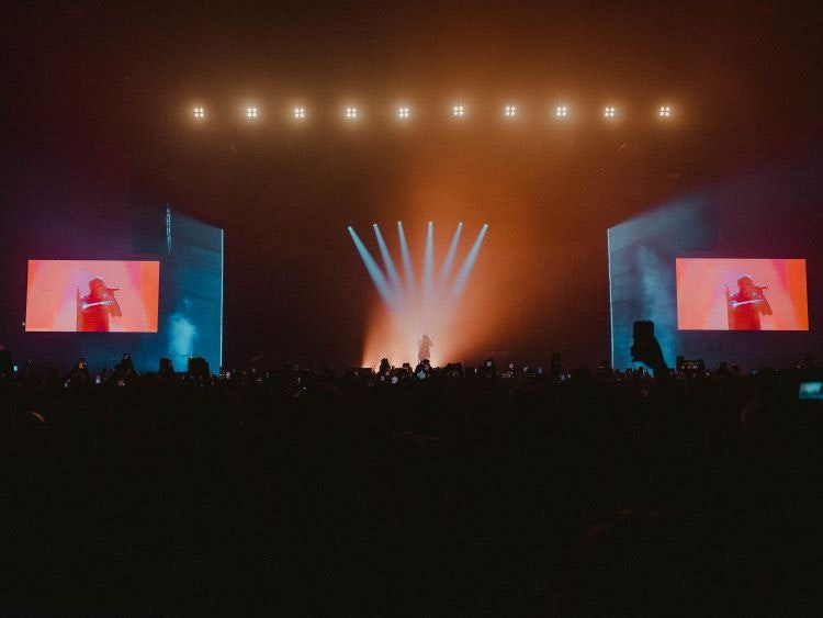
He says that the ultimate goal is it to “translate the artist’s story into live shows” through a collaborative process. Co-founder and creative director George Thomson adds that “because music artists are so close to their own creative process, it never really works to just put your idea on them”.
Loyle Carner’s latest album explores his relationship with his father which developed through a series of driving lessons.
“A sense of progression”
Thomson describes Loyle Carner as “a well-known storyteller of his generation”. The Unlimited Dream Company saw “a clear story structure” in his album, he adds, as well as an “emotional journey and sense of progression”.
The studio divided the show up into four acts and correlated each section with a phase in the sun cycle. Smith says the idea was “a really neat concept”, which “resonates with the artist’s message and makes it more impactful”.
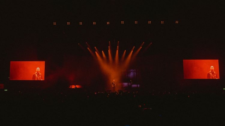
The show begins with Hate, the first song from Loyle Carner’’s new album and Thomsom explains how the “red, intense sunset” hues and “aggressive staccato” effects of the lighting provide context. Acts two and three were designed to reflect “the contemplation of night”, mimicking the luminescence of moonlight, says Thomson, while the final act is comparable to “the golden light of dawn” signifying a new beginning.
The changes in lighting also serve as “anchors throughout the course of the show” without which Thomson says there is a risk of the audience losing focus.
In a bid to eliminate hard lines between the stage and the audience, the studio opted to extend the lights beyond the stage and into the crowd.
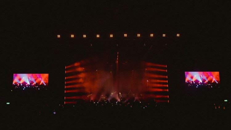
The Ultimate Dream Company also sought to create a sense of movement through the lighting, similar to that of a car. Thomson describes how light “emanates from the centre outwards so you get a sense of motion trail and movement lines physically in the set”. He says it employs the optical illusion of “extreme forced perspective”.
The notion of passing time and movement continues through the “half-toned aesthetic treatment” of the props and backdrops, says Smith. The same pattern is referenced in Loyle Carner’s album artwork and is similar to the gradient found at the bottom rim of a car window.
A less is more approach
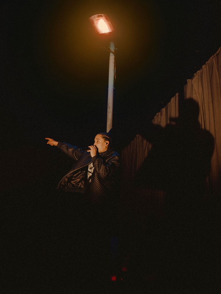
The studio opted for minimal use of props. The stage features only a car, a lamppost, a mic stand, back boards and drapes as a backdrop. Smith says that they went through “lots of iterations of the physical set design”.
It was an option to have the actual car used for his driving lessons on stage, but the studio decided to go for a non-literal version. Likening the car prop to an “art installation”, Smith describes how it is sunken into the stage and only half visible, adding that this seeks to create a “classier aesthetic”.
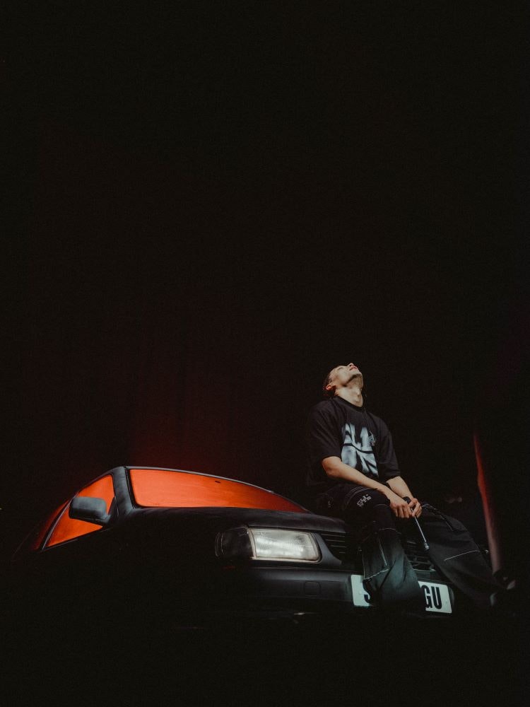
Props are also used to create “mini stages on the main stage”, says Thomson, providing a more intimate space for Loyle Carner to perform his spoken word pieces. Lighting comes back into play here, as the lamppost prop lights up as he stands underneath it while, in other moment, the inside of the car illuminates with red light, seeking to guide the audience’s gaze.
During these moments, Thomson says that “the whole energy becomes much smaller and much more condensed” and, although all the props are always present on stage, they are revealed at different times through lighting.
The stage was also designed to accommodate a full live band, including keys, drums, and brass, as the artist was keen to make the music a focal point of the show.
Smith and Thomson say that one of the biggest design challenges was creating stages to adapt to different sized venues, from Wembley to O2 academy stages. Thomson says they sought to create “flexible design that expands and contracts for different stage sizes”, aiming to give different sized audiences the same experience.

- Design disciplines in this article
- Industries in this article
- Brands in this article


