The world has seen protest after protest over recent years, from those rallying against US president Donald Trump, to ones campaigning against gender inequality, austerity, the refugee crisis and militant leaders.
Climate change, ecological destruction and human interference with nature are the latest topics on people’s agenda, and acts of dissent are currently underway, led by environmental action group, Extinction Rebellion. The organisation has three key demands for the UK Government – to commit to zero carbon emissions by 2025, to “tell the truth” about climate change, and to establish a citizens’ assembly so the public can oversee its progress.
Protests are happening all week in London and Edinburgh, where participants are not only marching the streets but also camping out, complete with food stalls, washing lines and a pink boat being used as a DJ deck in London’s case, to bring traffic to a halt and make a statement about inner-city pollution. The group’s organisers say that demonstrations are planned in 80 cities across 33 countries.
As global dissidence and anger becomes increasingly more visible, there has been a creative outpouring from protesters. Protest art has reached new heights, with marchers not only picking up pre-made banners and placards, but using artistic skills, humour and wit to create their own. Inventive ones created to attest Trump’s first official visit to the UK last July included a giant, knitted banner, crowd-sourced by multiple contributors, and a three-dimensional poster designed with vinyl among other materials.
For Extinction Rebellion’s protests, there has been an unprecedented level of planning with its protest graphics. The movement has an in-house art group, made up of graphic, fashion and stage designers and artists, who have created many branded, unified protest materials for the week-long camp-outs. The group is also holding DIY workshops in London’s Oxford Circus, where protesters can print their own t-shirts and posters using Extinction Rebellion motifs, typeface and colour palette.
All pre-made materials are available to download for free on Extinction Rebellion’s website, provided they are strictly used for non-corporate purposes, says graphic designer Clive Russell, who was the lead on the art group’s protest graphics project. The materials are vast, including everything from small leaflets to large posters, placards and banners.
“Protest graphics have been coerced and co-opted into corporate design, taken on by fashion brands like Adidas,” he says. “The commodification of protest symbols happens so quickly. So that’s why our stuff is free to use, as long as it’s non-commercial.” To stress this point, the group has copyrighted all of its graphics, and registered them with Anti-Copying in Design (ACID).
While protesters are encouraged to create their own, unique protest materials, Extinction Rebellion’s pre-made graphics certainly have a consistent aesthetic.
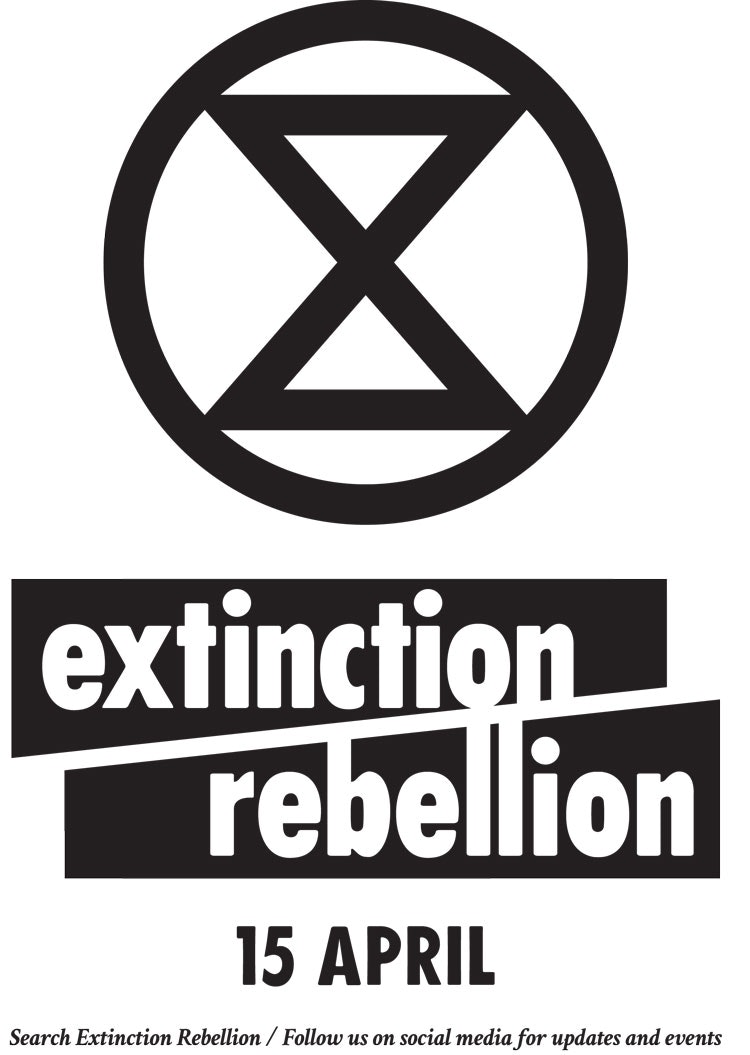
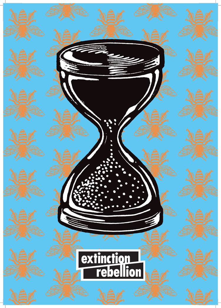
The graphic look is framed around the group’s sand-timer logo, which was designed by a street artist who wishes to remain anonymous, stressing that time is running out, as we hurtle towards extinction.
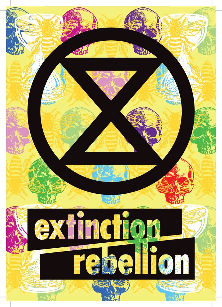
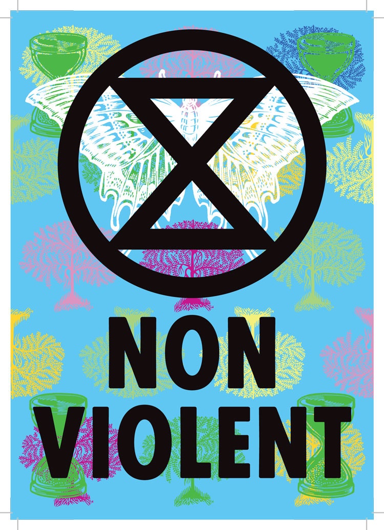
A vibrant colour palette, bleak motifs of skeletons and skulls, as well as more positive symbols of the natural world such as animals, insects and trees make up the background of posters and leaflets, in a slightly faded, letterpress-printed style.
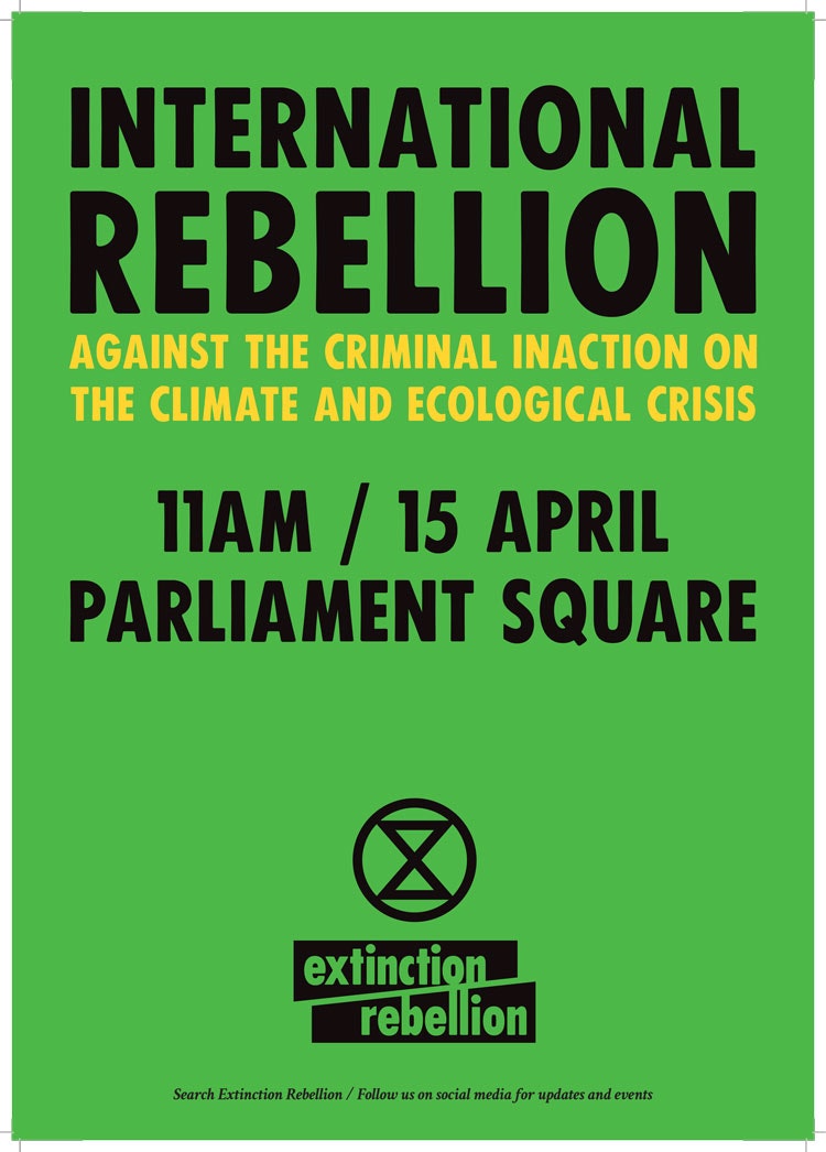
The organisation’s name is set in all-capitals, in a sans-serif typeface based on Futura Condensed that was originally hand-printed using old, wood type blocks, paying homage to letterpress again. The logotype, as well as the sand-timer motif, are set in bold black over the top of the light, colourful graphics, contrasting starkly.
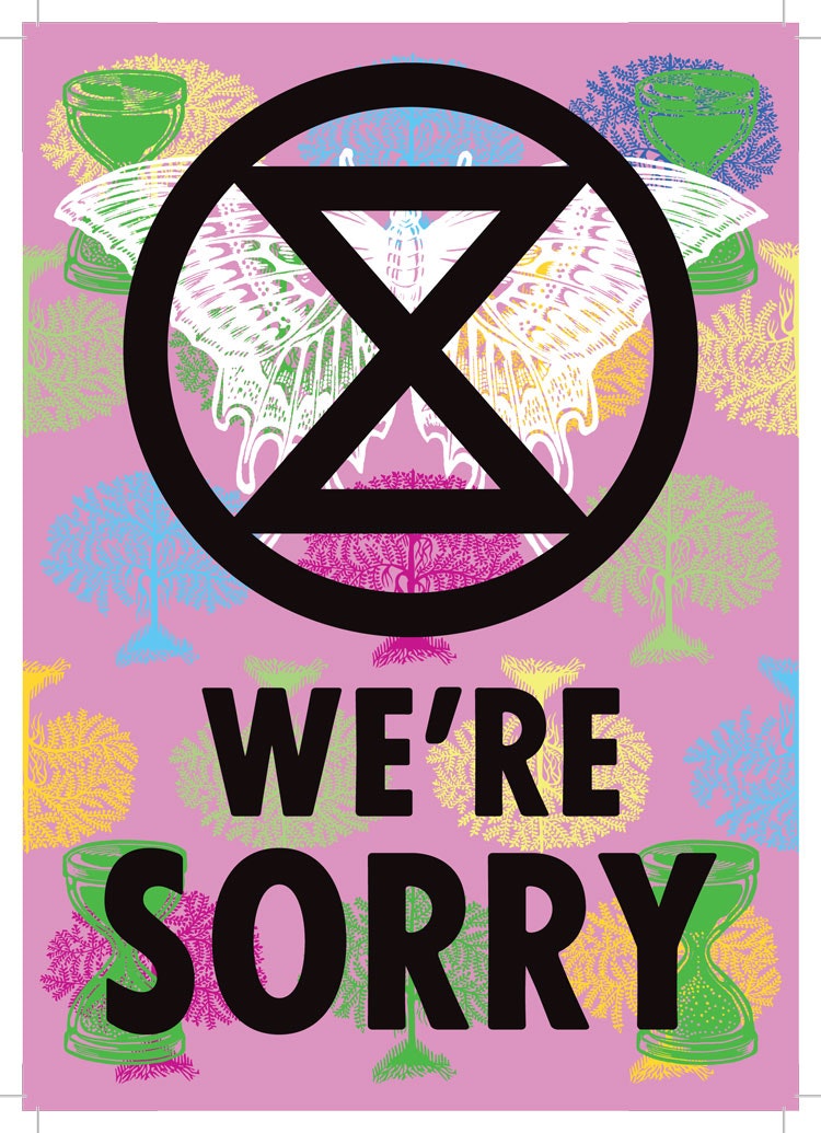
By borrowing from traditional printing techniques, the graphics aim to have a “slight retro feel”, says Russell, while looking “completely different from other eco or punk movements”. The contrast aims to help the materials look both “angry but peaceful”, he says, symbolising campaigners’ rage but also their peaceful methods of protest.
“We drew some inspiration from the Paris, 1968 riot graphics,” says Russell. “I also love Eduardo Paolozzi and drew from his colour palettes. The type looks deliberately a bit wonky, to give it that 1950s, analogue feel.
“One of the most important things was that this movement needed to feel really inclusive. A lot of eco movements feel a bit hippy and exclusive, and not particularly urban. It was important to have a consistent look, so we could be an umbrella movement that everyone could come underneath.”
The art group was also behind naming the organisation – and as the graphics have looked to promote unity and collectiveness while promoting Extinction Rebellion as a catch-all group, so did the name.
“We tried to make the name shorter, but we just couldn’t,” says Russell. “We had to include everything, from climate change to animal biodiversity laws to consumerism. The only way of summing all that up is through the term ‘extinction’.”
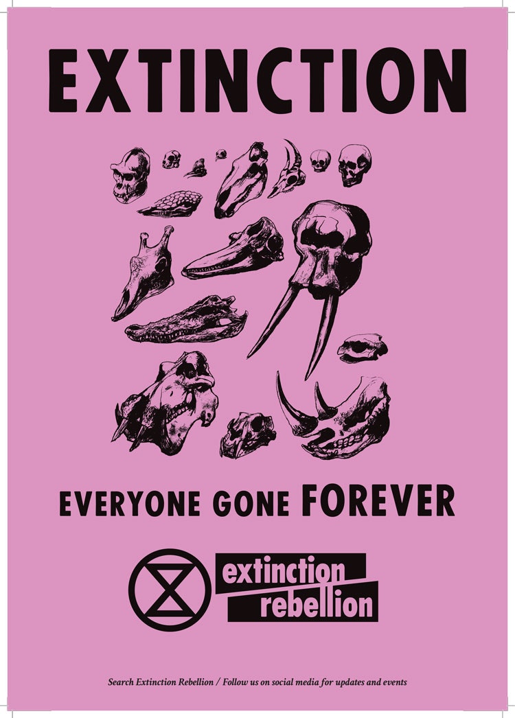
The art group has opted for an eclectic range of symbols, with some direct and some abstract. The skulls and human bones are “pretty easy metaphors” around human extinction, says Russell, while hexagon shapes are used to represent Extinction Rebellion’s demand for a citizens’ assembly to oversee Government progress, with the six-sided shape representing many different people coming together.
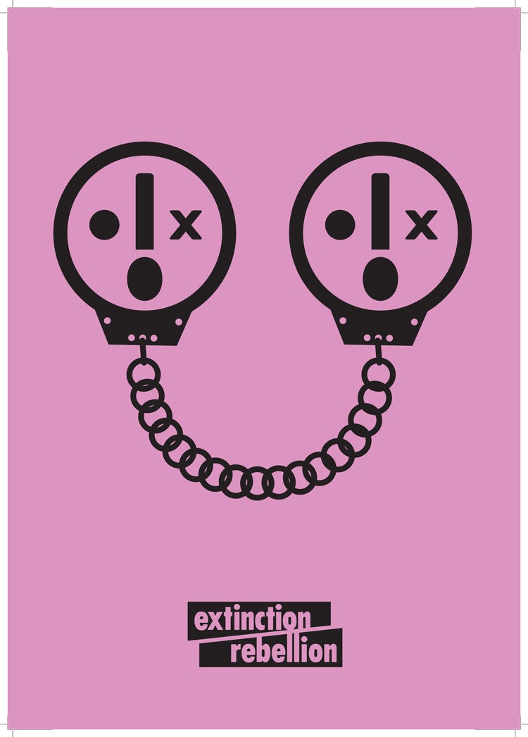
Protesters have also used Extinction Rebellion’s symbols as a springboard for their own satire – as well as pre-made graphics, the group has made stencils of different design elements, such as the logo, available online, and interpretations have been fly-posted around tube stations. This includes a fake tube map where every underground line “leads to extinction”, and another advert that shows a group of skeletons at an empty table, accompanied by the phrase: “They were so busy with Brexit, they forgot we’d run out of food”.
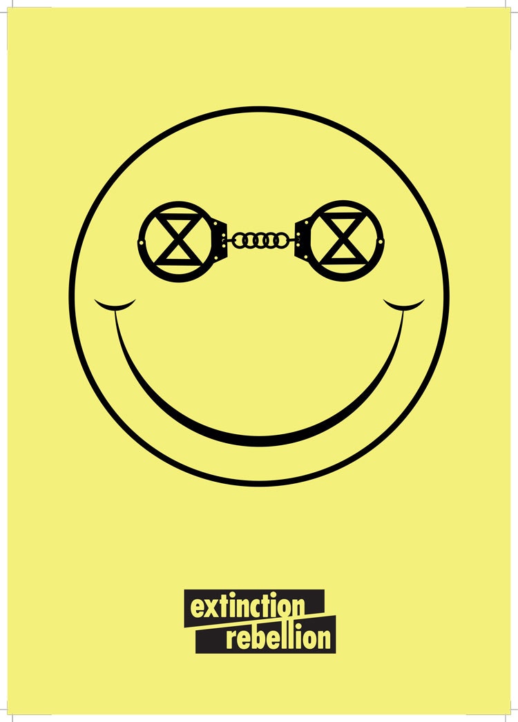
“I’m really humbled by the weird things people have done with our artwork,” Russell says. “That’s the wonderful thing about open-sourcing. We’ve told people to use the three core elements of our graphics – the logo, font and colour palette. Between these, the aesthetic holds together.”
Through providing an ample amount of pre-made graphics to choose from, as well as giving people the chance to make their own posters using Extinction Rebellion’s graphic language, Russell says that the main purpose is in making the movement inclusive and accessible – as well as causing the public to realise they also have collective responsibility.
“I hope people see the graphics and feel like they can join in,” he says. “We’re not a revolution, we’re not looking to overthrow Government – we need people to join us. Forget Brexit – this is the most important issue of our time.”

- Design disciplines in this article
- Industries in this article
- Brands in this article


3 responses to “How Extinction Rebellion designed “angry but peaceful” protest graphics”
Was just wondering why there has been no discussion about this topic yet?
Either everybody is on holiday or demonstrating on the streets.
Personally I think it is an effective, distinctive and cohesive identity and makes a change from other graphics I have seen used recently to promote demonstrations and campaigns or the two new political parties both of which have very poor identities. Nobody thought to get an designers on board for those though I personally would not want to be pitching my ideas to Nigel Farrage…
I’ve always had the impression that the overwhelming majority of mainstream designers are scared sh*tless at the idea of even *talking about* a topic with genuinely serious consequences, beyond minor influence over consumer purchasing decisions.
I hope I’m wrong, and I know there are brilliant AND socially conscious/activist designers out there – I’m just surprised there aren’t more of them. Maybe I’m looking in the wrong coffee shops.
Please make green car stickers of the ‘Everyone Gone Forever’ image. And make them freely available and inexpensive. It gives a very clear message.