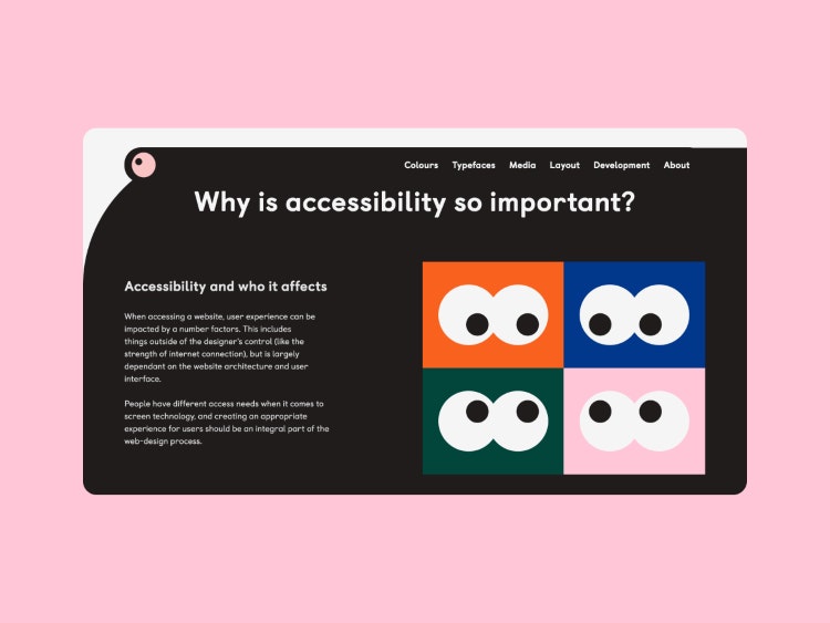
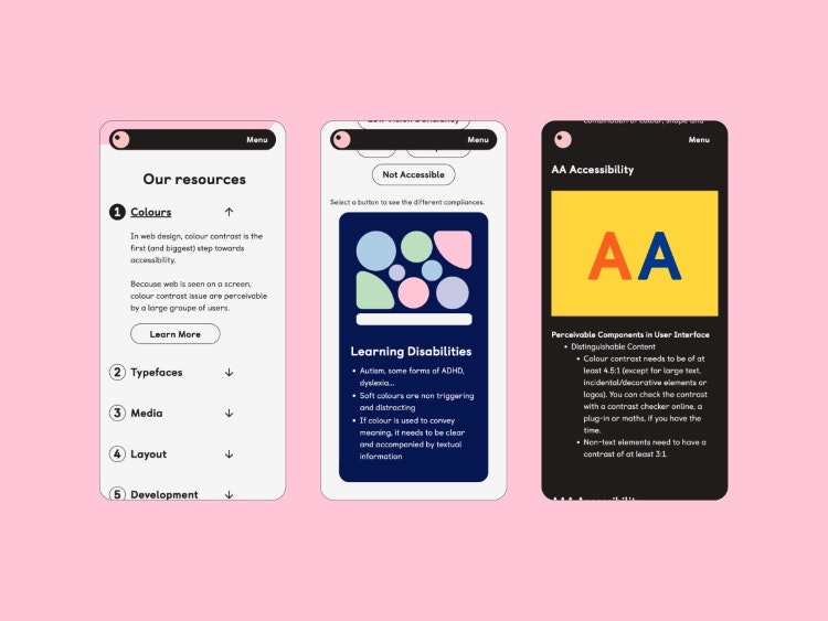
Designer Alaïs de Saint Louvent, supported by Edinburgh-based design consultancy Studio Lutalica and web design studio Lattimore + Friends, has developed a free website in a bid to demystify the Web Content Accessibility Guidelines (WCAG) and help designers make websites more accessible.
Understanding Accessibility was created to be a simple step-by-step guide for web designers that they can use to help them design for disabilities. A 2023 WebAIM report found that that 49,991,225 distinct accessibility errors were detected across one million website home pages, with an average of 50.0 errors per page.
Lattimore + Friends designer and Studio Lutalica design lead Alaïs de Saint Louvent is the creator of Understanding Accessibility. Studio Lutalica founder Cecilia Righini was responsible for the creative direction and Studio Lutalica communication manager Lily Hannigan carried out the copy editing.

A tool for web designers and developers
Although it could be used by anyone, Understanding Accessibility is primarily for web designers and developers looking to improve the accessibility status of their websites. The team envisions designers will use the site in two ways, “firstly to get an overview of accessibility and web design, and secondly to double-check specific compliances when they’re working on a project”.
“Accessibility should be on the table right from the beginning, continuing through to development”, says Righini, adding that a “one-size-fits-all approach” isn’t practical. They note how there are different things to consider, “from the spectrum of neurodiversity to people of different ages”.

“Clear and comprehensive resources”
While the official WCAG are available online, they are “complex, lengthy and famously difficult to follow”, according to de Saint Louvent. Righini says if they were training a designer, “telling them to read through the whole WCAG would be a practically impossible task”.
The idea for the website started when de Saint Louvent was doing research around accessibility on the web for her own work and wanted to create a useful tool with what she was learning. She was frustrated with the constant accessibility issues she was encountering, “both in broader society and particularly within the design field”, which is why de Saint Louvent says she wanted to give web designers “a convenient place to access clear and comprehensive resources”.
Despite there being “plenty of blog pieces and how-to guides for accessibility on the web”, Hannigan says they are usually “patchy and repeat very top-level guidance”.
Recommended: How can inclusive design help overcome accessibility challenges?

Avoiding overwhelm
One of the main challenges was “finding a balance between making a very accessible website and having an informative website”, says de Saint Louvent. Initially there were going to be decorative and functional illustrations, but this complicated accessibility issues.
Opting only for decorative illustrations, de Saint Louvent chose Glasgow-based illustrator Emily Peat for the “playful and straightforward nature” of her work.
Understanding Accessibility complies with the general principles issued by WCAG 2.1, and the layout is designed for “clear communication and balancing the differentiation of letters” while colours are all compliant with triple AAA contrast standards, “ensuring optimal visibility”, says Righini.
Recommended: What to expect from Web Content Accessibility Guidelines 2.2

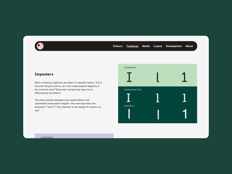
de Saint Louvent explains that Castledown by Colophon Foundry is considered to be “one of the most accessible typefaces available” as the letterforms are “clearly differentiated from each other” with “a rounded design” that increases readability for users with learning disabilities. She explains how the colour palette is “composed of soft colours with high contrast” and how a lot of research went into finding colour combinations “that weren’t problematic for particular users”, including people with ADHD and Autism.
The team also sought to avoid colour combinations that “aren’t differentiable for users over the age of 60 as well as people with colour blindness”, de Saint Louvent adds. The logo looks to evoke an eye, which she describes as “a little nod to how most users experience the web”.
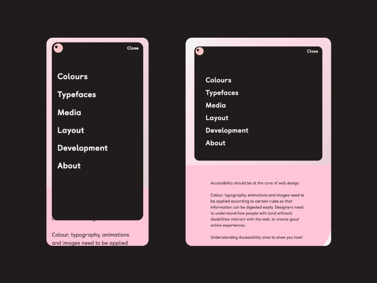
As different users might have different needs, Understanding Accessibility is “more complicated than a step-by-step guide”, says de Saint Louvent. To make it “as easy as possible for users to filter and find information”, says Righini, everything is subdivided by topic, specialism and focus area within the WCAG 2.1.

- Design disciplines in this article
- Industries in this article
- Brands in this article


