How&How has rebranded residential energy services company Hometree, aiming to demonstrate its move towards “cleaner, greener energy”, guided by Maple, a tree icon who appears across the brand and is also the face and personality of its chat function.
According to research by the influential MP committee, Business, Energy, and Industrial Strategy, 14% of the UK’s greenhouse gas emissions come from heating and it is on of the biggest contributors to a person’s carbon footprint over a lifetime. Knowing how to reduce emissions while keeping costs of running a home affordable can be confusing, which is why Hometree wanted to reposition as “a homeowner’s end-to-end companion throughout this period of transition”, according to How&How co-founder Cat How.
She explains how the company is “restructuring its offering” to align with its “future focussed business mission”. On a practical level, this means “not just repairing boilers” but also informing customers about the benefits of heat pumps and using “cleaner, greener energy”, while providing financing to help people make the change, says How.
The studio won the project through a pitch process. How recalls that Hometree noticed the studio’s track record for giving brands “unique signifying colours” that are “a bit out of sector.
Hometree’s new primary palette is led by yellow and incorporates some dark green hues. Yellow was chosen to “push Hometree into a different category” and convey “optimism, warmth and a heat glow”, says How. Its secondary palette includes softer tones of blue, purple, and orange each with a darker pairing, so a lighter lilac hue will be paired with a darker purple.
Although How&How tried some different routes for the logo, Hometree wanted to retain its tree, which has now become Maple and is positioned as a “transition companion” for customers, according to How. Its slightly rounded cylindrical middle was designed to evoke “a swirl of energy”, taking influence from the fluid components of boiler and heat pump circuitry, How adds.
Recommended: Wolff Olins recharges energy company OVO’s identity and strategy
Motion behaviours, such as a ripple to signify when a message is sending, rotations when something is processing or loading and a sound-wave-like animation when speaking, have been applied to the logo icon. It is also employed in a super graphic style to frame, mask and emanate from photography.
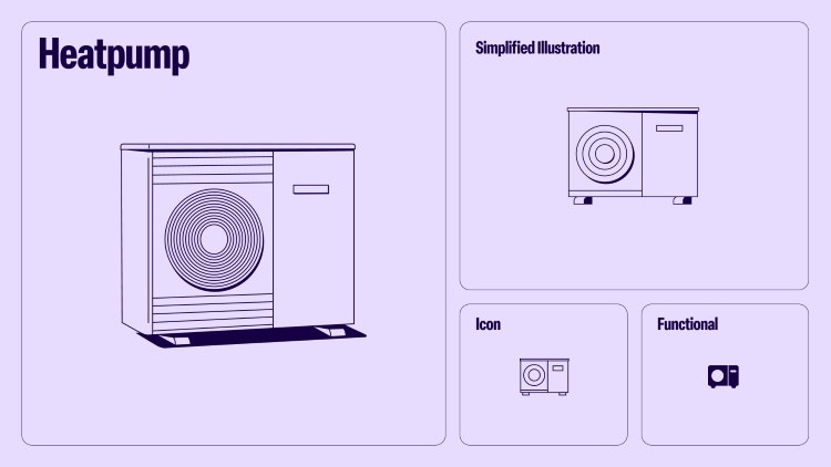
Linework illustrations done in-house at How&How are used at different scales throughout the identity. Larger applications are reserved marketing purposes while “functional and simplified” versions are used for the website and iconography, says How, adding that they bring a “more youthful” look and feel and “a different dimension” to the brand.

Recommended: Renewable supplier So Energy rebrands to “empower” customers
Hometree’s personality comes through in the brand voice, with phrasing like “turn brrr into whirr” adding “playfulness” to it, says How.
Hometree’s wordmark is a modified version of the neogrotesque font Beausite Classic. How&How chose Elza Condensed as the headline font and Instrument sans for the secondary font.
Stock photography will be used across the brand, with guidelines provided by the studio about where Hometree can find it and what effects to use to make images look “homogenous”, How adds.

- Design disciplines in this article
- Industries in this article
- Brands in this article


