Humble Crumble, which bills itself as the world’s first crumble bar, started as a market stall. It became a viral hit on social media with its ‘specials’, such as fluffy ice-cream topping and pumpkin spiced apple, which is served in a pumpkin.
Now with 192,000 Instagram followers, each outlet is designed as a photo opportunity.
Following its Borough Market stall, an outlet opened in Spitalfields Market in 2022. A year later, a Humble Crumble opened in Camden Market, and in August that was joined by one in Covent Garden. All three were designed by London-based SODA Studio.
“The client briefed us to create three distinct units that responded to the existing character of each site, yet which felt part of the same brand,” says SODA architectural assistant, Tim Lucas.
“Where Spitalfields and Camden were envisioned as the more ‘grown up’ spaces, it was decided that due to its unique site conditions, Earlham Street would be the ‘eccentric sister’ and would therefore be bolder in terms of colour and materiality, to reflect the vibrancy of its Covent Garden location,” Lucas adds.
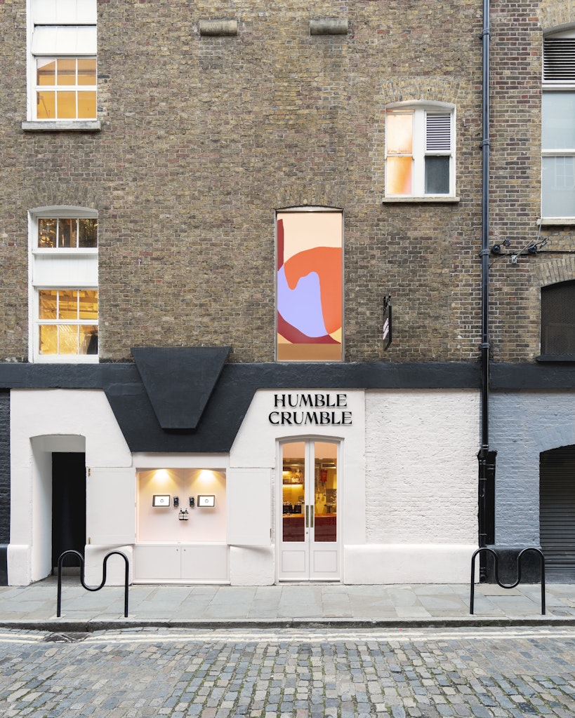
This outlet is in an existing retail unit within the Grade II Listed Seven Dials Warehouse. The design needed to include a commercial kitchen and external order point.
The unit is approximately 27 square metres and has low head heights in some parts and 8m-high ceilings in other parts, making it a challenge both to design and construct.
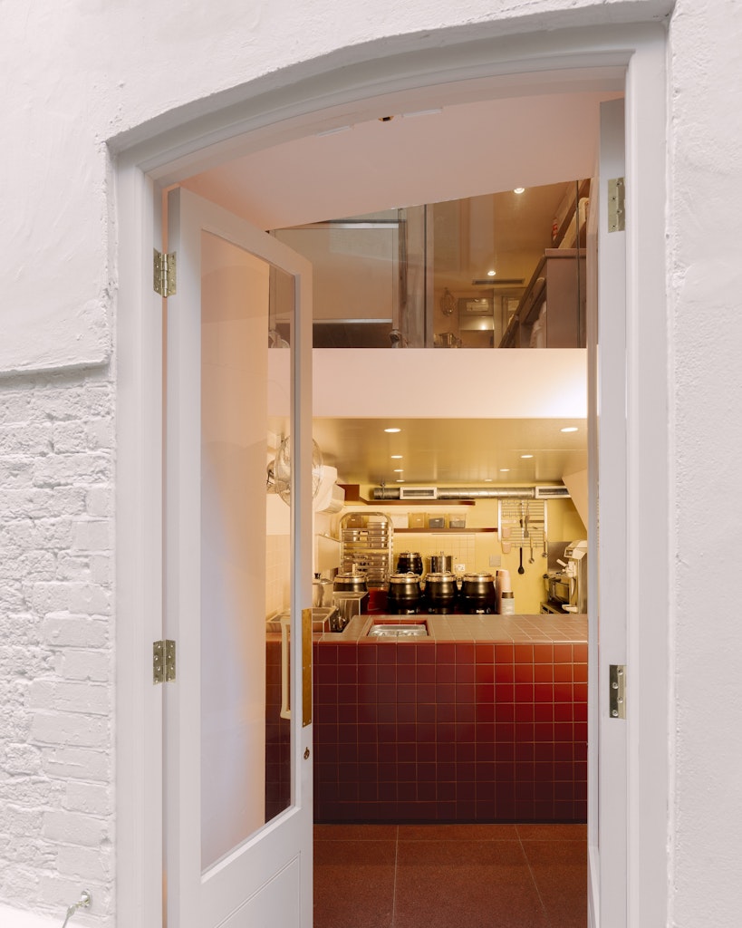
SODA’s scheme had to celebrate the high ceilings, and to accommodate all the crumble-making equipment. The space is organised with baking and food preparation on the retained mezzanine floor, and fruit and assembly on the ground floor.

The exterior colours and signage had to be sympathetic to the context – a Grade II Listed building in a protected conservation area and a limited shop frontage. So the interior is deliberately bold and colourful to catch the attention of passers-by.
Elements of the space considered for Instagram include the view of SODA’s mural through the big window from the street.
“As the store is open until 10pm it was important that the mural was properly lit to create activity and interest at night,” says Lucas. And for close-ups, the burgundy tiles act as a backdrop to the product. SODA also made sure the lighting has the correct CRI (Colour Rendering Index) value, so it doesn’t flicker or strobe in videos.

Key decisions
Borrowing from the recipe
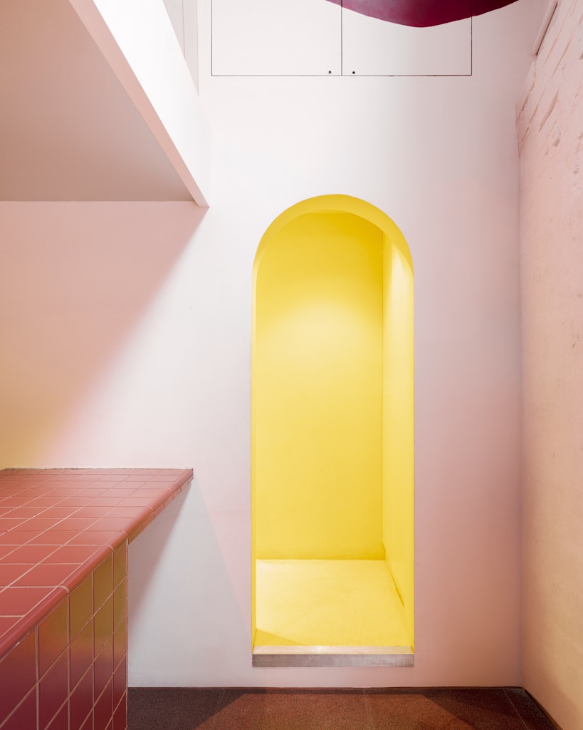
The material palette is informed by crumble ingredients. “The fruit base influenced the berry tones on ground floor and front counter; custard influenced yellow tiles and full saturation yellow staircase; pink marshmallow topping influenced pink tones throughout,” says Lucas. Meanwhile, the mural, intended to draw visitors’ eyes up through the space, features abstracted versions of crumble ingredients, such as flour and fruit.
Introducing a partition as concealment and as a canvas
SODA’s 9m-high partition hides the mechanical extract and acts as a canvas for the mural. This meant the mural wrapped around two walls of the interior, and allowed additional storage to be integrated into the space, including a cupboard at the bottom of the stair and more shelving on the mezzanine.

Improving flow by rethinking a window
SODA transformed the adjacent display window into an ordering area. Customers order from the two screens installed outside and collect their crumbles in the shop. This is intended to improve flow of the queue and reduce crowding inside the small unit.
- Design disciplines in this article
- Industries in this article
- Brands in this article


