What do you think 2023 will hold for interactive design?
In The Humane Interface, designer Jef Raskin explained that: “An interface is humane if it is responsive to human needs and considerate of human frailties”.
What I hope to see in the year ahead is the proliferation of humane and considerate apps that are designed to be helpful, supportive and mindful of the user’s needs and preferences. Apps that do not expect us to behave like machines, in a repetitive cold-blooded way, or that make us feel annoyed, frustrated or even wrong.
So many apps now interact with us as if they were a human: they have names; they send us messages. Now it’s time for them to become polite. There are four key pillars to creating considerate apps which I believe will be addressed in 2023:
Don’t be too demanding
It’s tempting for apps to demand infinite attention and measure their success by calculating the time a person spends using them. That’s not respectful. When designing an app we should be asking what the right amount of time and energy is required of the user to get the most out of it. How can we give the most support in the shortest amount of time?
Be caring
What is on your user’s mind right now? How can your app offer comfort and support? It’s important to avoid using triggering imagery and wording that might make the user feel wrong or sad. It should not be about success or failure, but about supporting the user on their journey.
Clarify complexity
Remember the wonderful feeling of something being explained clearly by someone and finally getting it? For an app to be considerate we need to design out complexity. We need to use a familiar mental model – a structure that the user knows already – to explain and order something new and otherwise confusing.
Consider the physical context of use
This is often the most neglected aspect. Apps are used by humans in the real world. Let’s make sure we design for that.
Overall, the trend towards more supportive and considerate apps reflects the growing importance of personalisation, engagement and user experience in the digital world. As technology continues to advance, I hope to see even more apps that are designed to provide users with the support and assistance they need to enhance their lives.
Optimising design for efficiency is simple because it is quantifiable, but optimising design for emotions is trickier. Those who get this balance right and enhance the unquantifiable aspects of life – empathy, wellbeing, delight – can create truly enriching experiences and products.
What was your favourite interactive design project from 2022 and why?

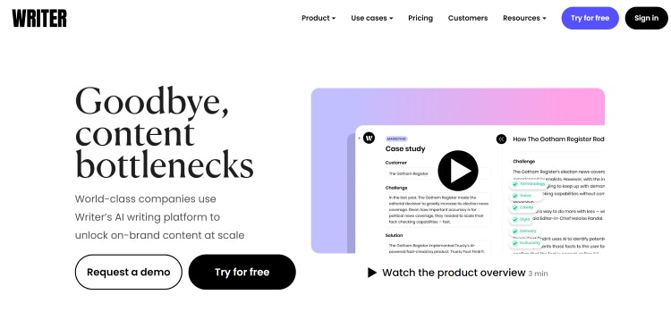
My favourite project of 2022 is Writer.com, an AI writing tool to help improve spelling and grammar and suggest a better way of constructing sentences and even paragraphs of text. I’ve found it especially useful as someone whose native language isn’t English. From improving my emails to preparing talks, it’s come in handy for everyday life.
I am also a fan of the AI tool ChatGPT, which generates content on any subject or question that is asked of it, making writing more accessible. It even helped to form my answer above!

- Design disciplines in this article
- Industries in this article
- Brands in this article


