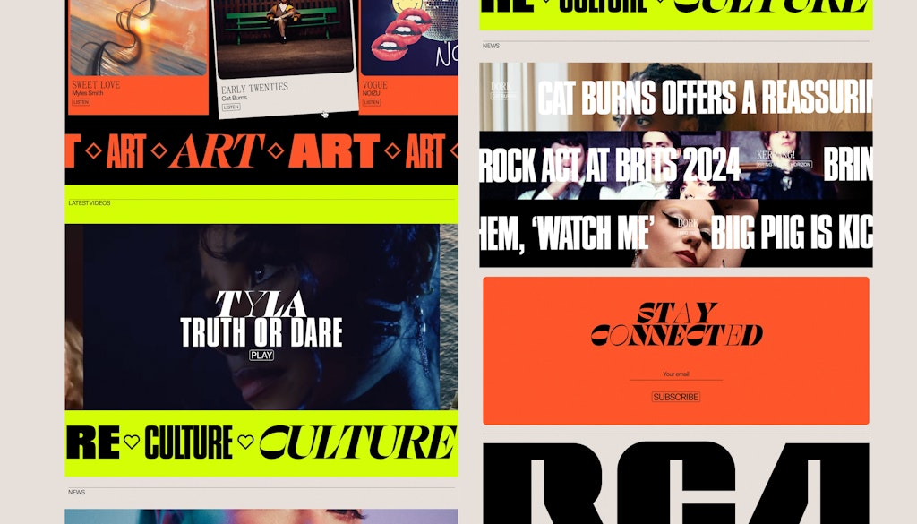
OHMY has created a new UK website for one of the world’s most influential record labels.
Although it dates back to 1929, RCA Records is a relentlessly forward-looking label. In 2023, JosephMark worked with RCA Global on a brand refresh that won multiple awards, feted for its bold use of colour and variable typefaces by Elias Hanzer.
This year, RCA team approached Leamington Spa-based studio OHMY to update the UK site in line with the new identity.
The brief had two main elements – to become a place where fans could access the latest information about their favourite artists, and to position RCA as an appealing home for prospective new signings. The challenge was to modernise the label’s online presence in a way that felt coherent with the overarching brand, but also tailored to the UK audience.
UK users can explore the new site here.

Key decisions
Balancing a vibrant brand with a good user experience
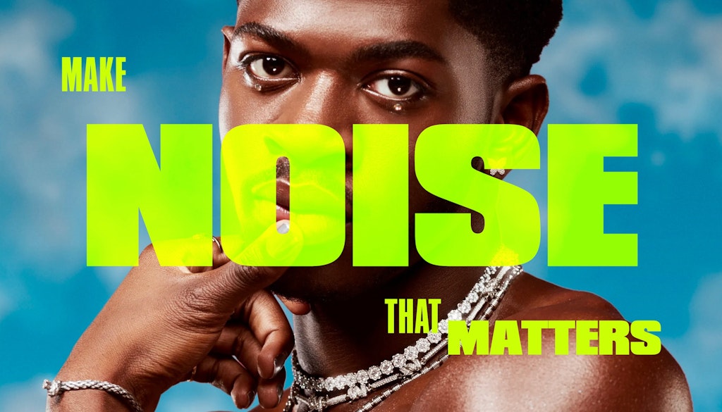
“RCA’s brand identity features a vibrant palette of neon greens and punchy reds, coupled with diverse typography. This, combined with the eclectic visuals from artist videos, press shots, and album artwork, presented a challenge in creating a cohesive design without overwhelming the user,” OHMY creative director Joe Burke explains.
“We continuously refined the balance, adding and removing elements to maintain a youthful feel while ensuring optimal site performance. This iterative process was crucial in achieving a design that was visually striking yet functionally efficient.”
Using oversized elements to counterbalance the visual complexity
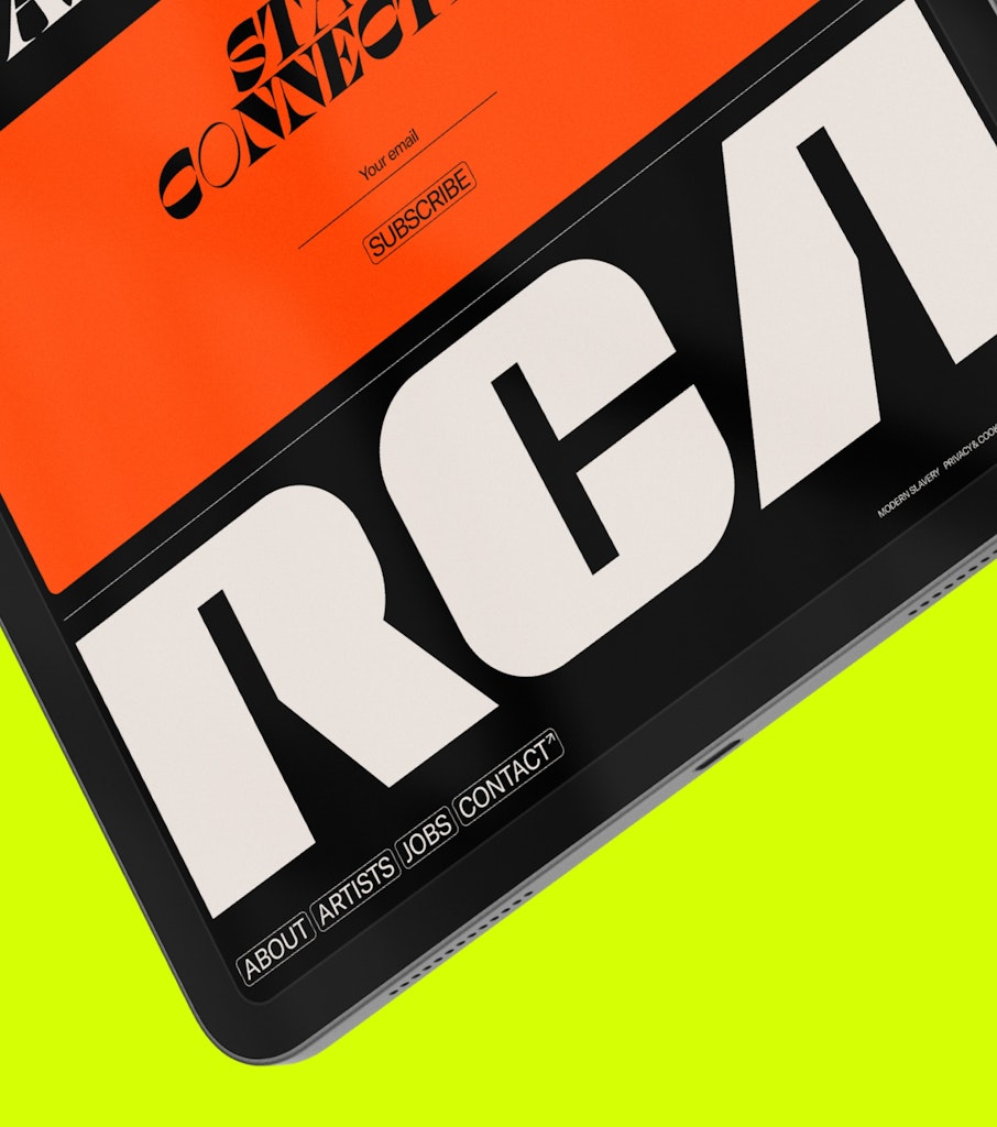
“Large typography and prominent logos were used strategically to anchor the layouts and provide visual hierarchy,” Burke says. “This is evident in the footer and menu designs, which cut through the visual noise and offer clear navigation points for users. This helped maintain clarity and usability amidst the rich visual content.”
Adding a UK flavour
“With RCA US having recently relaunched their site, we faced the challenge of creating something unique for the UK arm while ensuring it fit within the broader RCA family,” Burke says.
“A lot of the UK artists have more of a DIY aesthetic which is a little more rough around the edges. We didn’t directly incorporate distressed elements or grunge textures, but our more eclectic approach to the design definitely made it fit with this ethos. The overall feel is more dynamic and a bit looser than the US counterpart.”


- Design disciplines in this article
- Industries in this article
- Brands in this article
- Tags in this article


