Studio Sutherland has designed the branding and wayfinding for St Albans Museum and Gallery, a new cultural space dedicated to historical and contemporary artwork.
The museum opened in June this year and is based in the centre of St Albans, a city in Hertfordshire, north of London. It has a long history, having formally been a Roman market town called Verulamium in the first century, which was the second-largest town in Roman Britain.
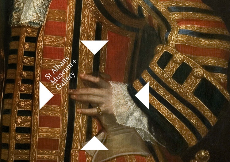
Studio Sutherland has completed the branding, marketing and wayfinding design for the new space, working alongside Jane Wentworth Associates, which has completed the brand strategy.
Architectural design studio Mowat and Co has worked on interiors and exhibiton spaces, while architectural practice John McAslan + Partners has refurbished and restored the building. Mowat and Co has developed a series of exhibition structures, based on the building’s existing material palette of oak and brass alongside greys, which are used to showcase exhibits and can be moved around the gallery space.
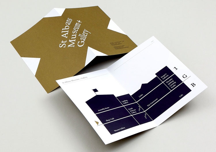
The new gallery is based within the former town hall, alongside its assembly room (originally used for concerts, balls and galas), courtroom and prison cells, which were in use throughout the 19th century.
The town hall is the main gallery space, while a basement gallery has also been built to host the museum’s main exhibitions, and has opened with First Impressions, a show looking at St Albans’ printing history.
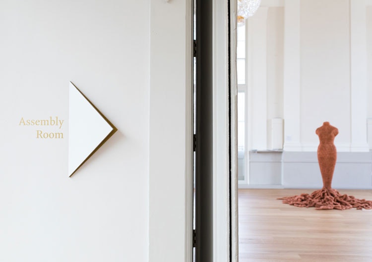
The assembly room, which features Georgian architecture alongside details such as chandeliers and gold leaf, will be home to art installations, while the courtroom and prison cells have been preserved and will feature collections related to law and order. A café and shop have also been fitted.
The space is set over three floors, and will feature roughly 2,000 pieces of contemporary and historic artworks, sourced locally, nationally and from across the world.
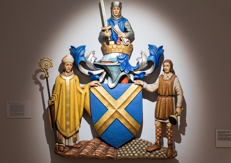
Studio Sutherland’s identity for the new museum and gallery has been inspired by the crest and flag associated with St Albans city, which is a blue shield, marked with a yellow cross.
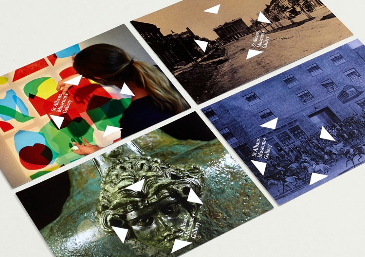
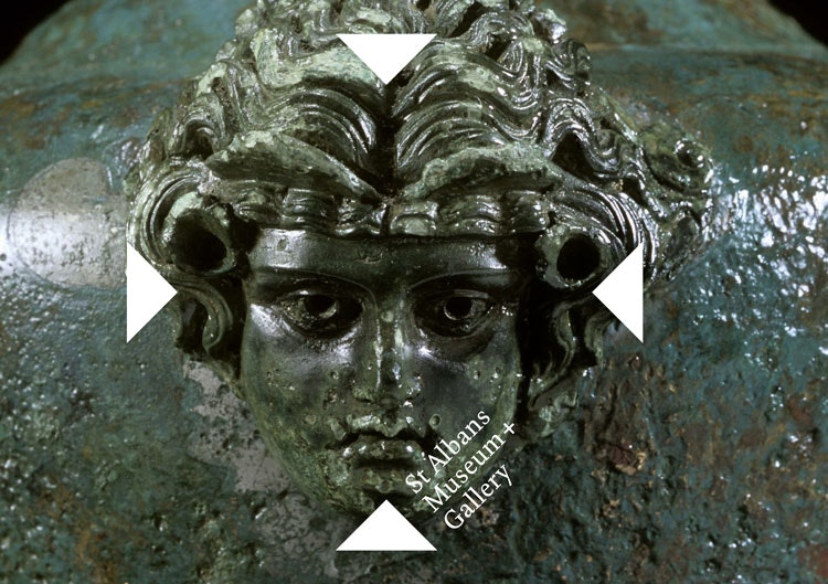
The logo is based on the negative space created by the cross in the shield – four triangle shapes are arranged to create a cross-shaped space at the heart of the logo.
This is accompanied by the museum name set at a diagonal, 45-degree-angle between two of the triangles. This turns the “+” sign used in the name into an “x”, again emphasising the cross shape. The serif typeface used is Kingfisher, designed by Jeremy Tankard, and this is also used throughout communications.
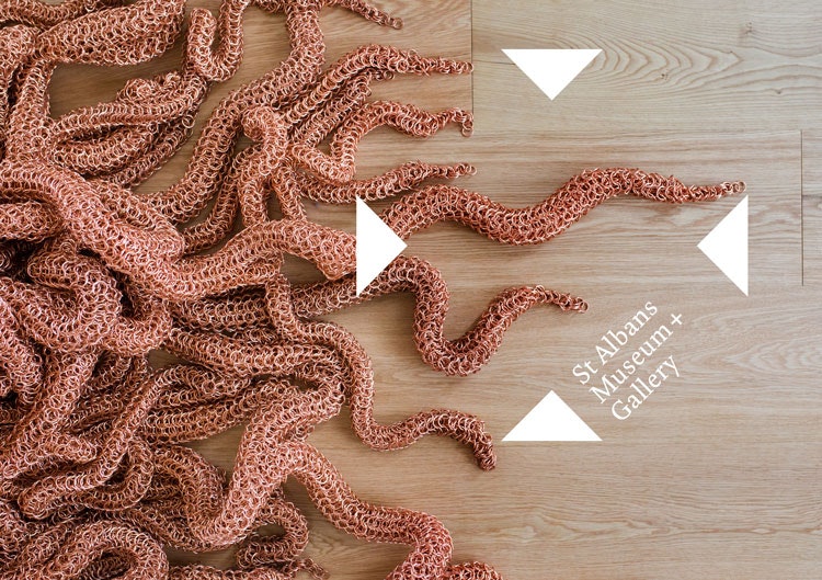
The triangle symbols in the logo aim to be versatile and flexible across communications, and move around images, expand and contract to highlight certain objects, images or words.
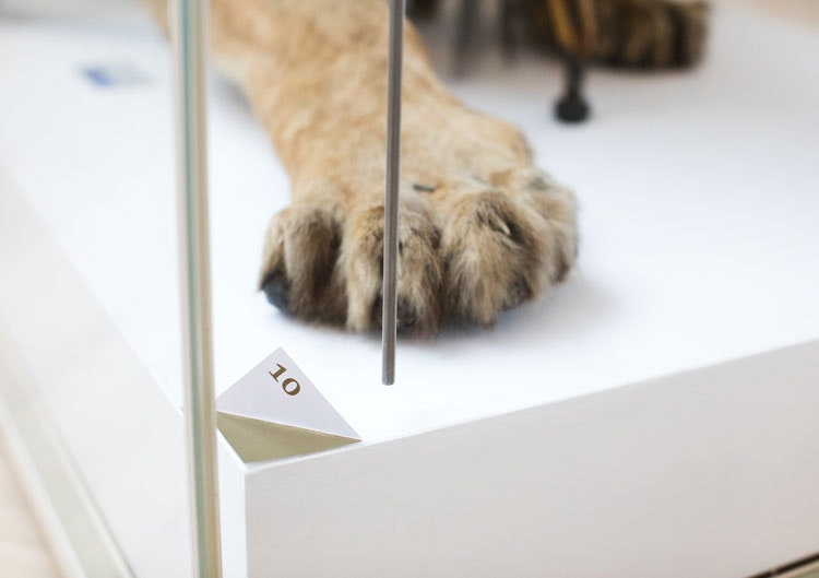
“We used the triangle shape strongly throughout, highlighting images, folding them to form caption stands, coming out of walls in the gallery space to create a unique wayfinding system, and more,” says Jim Sutherland, founder at Studio Sutherland. “We wanted a flexible and adaptive system that could work with historic and modern content.”
He adds that the identity also reflects the central location of the gallery and museum building in the city itself, as “X marks the spot”.
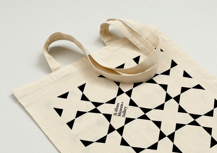
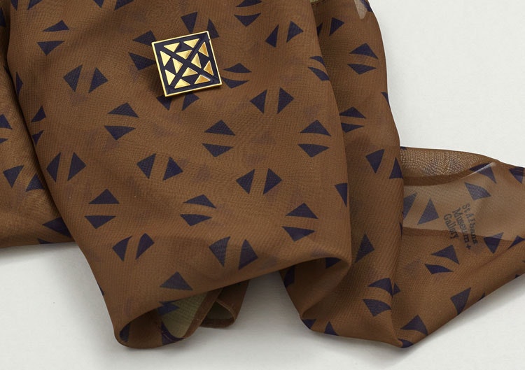
A range of patterns based on the logo design has been created for use across gallery merchandise.
“We wanted each item to feel unique,” Sutherland says. “We even designed beer bottles for special museum ale, made by local brewers Farr.”
The core colour palette used throughout branding is indigo and gold, which is a “richer” version of colours inspired by the St Albans’ crest’s blue and yellow.
The brand strategy, formulated by Jane Wentworth Associates, centres around “exchanging ideas and building understanding”.
“Drawing on St Albans’ powerful history as a place to meet and debate, [Jane Wentworth Associates] set up to bring communities together, foster the exchange of ideas and inspire civic pride.”
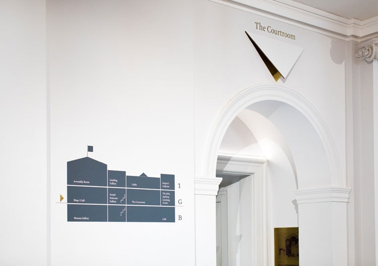
This idea of communication and meeting is conveyed through the branding as the triangles “point to and create a central, focal space for culture in the city and beyond”, says Sutherland. The triangles’ ability to grow and shrink looks to represent different conversations going on and different cultural contexts.
It was important to imbue a sense of the local community into the brand strategy as the new museum looks to transform what was a “jewel-in-the-crown” local space into a national “focal point for culture”, says councillor Annie Brewster, former mayor of St Albans.
“We are a relatively small city but we pack a huge historical punch – and now we can show off our heritage to the world,” she says.
The branding project took Studio Sutherland a year to complete. The new look has now rolled out across marketing and print materials, the website and social media, interiors, wayfinding and signage, and merchandise.
The St Albans Museum and Gallery opened on 8 June. For more information, head here.


- Design disciplines in this article
- Industries in this article
- Brands in this article


