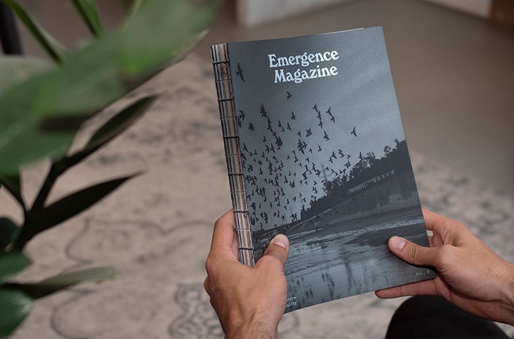
For fans of 1960s counterculture-leaning print design, Emergence magazine’s logo and masthead will likely conjure up a couple of reference points. In the context of a publication that “explores the threads connecting ecology, culture, and spirituality”, its use of typeface Windsor distinctly recalls the Whole Earth Catalog, a late 60s publication merging techie-style product reviews and utopian, outdoorsy visions of alterative living that has since become a cult design classic.
Likewise, the roundel logo lockup of a lower-case ‘e’ above a lowercase ‘m’ feels reminiscent of another bastion of the radical press, the International Times, with its distinctive lower case ‘it’ logo.
But for all its hints of the past, Emergence is very much a publication of now, with its eyes set on the horizon of the future. Starting out in 2018, the magazine was born in an interesting time for publishing: the dust had settled from industry-wide transitions from print to online, yet many publications were still floundering when it came to how to best tell stories (and make money from doing so).
Creative storytelling
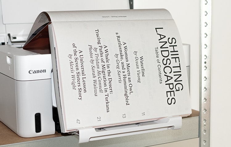
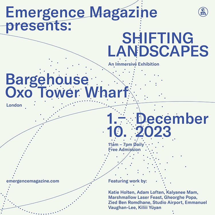
As such, it’s refreshing when you see a publication like Emergence that doesn’t just replicate tried and tested formats; but pushes editorial far beyond the printed word to find the most powerful means of communicating. Whether in print, online, or via Emergence’s podcast, it’s always about finding the best vehicle for a story. That might be a more traditional reported piece, but it’s just as likely to be a specially commissioned video, a photo series, or even a poem. Now, it’s also an exhibition: until 10 December, Emergence’s show Shifting Landscapes (also the title of its print mag’s fourth issue) spans the Bargehouse space at London’s OXO Tower Wharf.
Studio Airport has been Emergence’s creative partner since the magazine’s inception, having previously worked with its founder and executive editor Emmanuel Vaughan-Lee on a 2015 interactive documentary project, Beyond Prison.
Based in Utrecht, The Netherlands, Studio Airport relished the chance to work on Emergence: going far beyond the usual confines of a magazine art direction/design role, the studio’s specialism in the intersection of graphic design and moving image means that it not only designs content, but commissions and creates it, too.
At first, Studio Airport would meet with Emergence’s California-based editorial team once or twice a year to discuss the forthcoming editorial calendar, and propose their own story ideas, as well as suggesting possible contributors such as photographers, directors and illustrators.
The studio’s collaboration with Emergence hinges on interactivity – bringing a story to life in the most visceral way possible – so the studio will find itself working directly with cinematographers to ensure they get the additional shots and assets needed to bring that extra layer of interactivity to the film. “It’s lots of art direction and creative routeing about where we want the magazine to go in general,” says Studio Airport cofounder Bram Broerse. “Once a year we also work on a bigger story from scratch, which we either work on ourselves or in partnership with other collaborators.”
For the first two years the magazine was online-only, but publishing according to a quarterly schedule with an annual print mag that acted as a ‘best of’ compilation of the year’s online stories. Now, it’s the other way round, with stories debuting in the print mag and gradually being subsequently seeded out online.
“We wanted to make the printed magazine even more special,” Broerse explains. “And although the whole collaboration with Emergence magazine is about translating stories from different media, something like making an adaptive film into a couple of spreads in a book is completely different to making a poem interactive. They all translate in different ways, so we’re constantly testing things and trying out different formats and media to see how we can stretch those boundaries.”
Communicating a feeling
The future-facing approach to content means the main design language, by contrast, can be rooted in a slightly nostalgia-inducing style. In part, this was inspired by US National Park signage that Broerse and his Studio Airport partner Maurits Wouters spotted while driving from LA to the Bay Area. “The signs all had this aesthetic that resonated with us: we felt ‘okay, this is what we’re creating’. We didn’t do what the magazine would be at that time, but we knew it had something to do with bringing people closer to nature and reconnecting with it.”
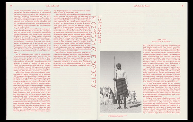
The National Park signs directly went on to inform Emergence’s typographic choices: alongside Windsor, the site and print mag use Bradford by Lineto and Grilli Type’s GT America. They’re calming, traditional-leaning fonts, once again underscoring Emergence’s merging of nature and tech, past and future. “I think it’s in our studio’s DNA to dive into different times and form languages, and trying to understand how different type settings can communicate a feeling, as well as just being used for straightforward communication,” says Broerse.
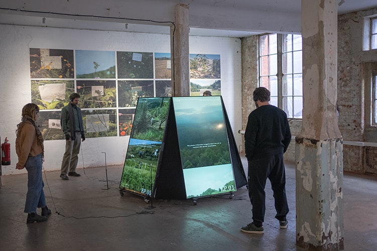
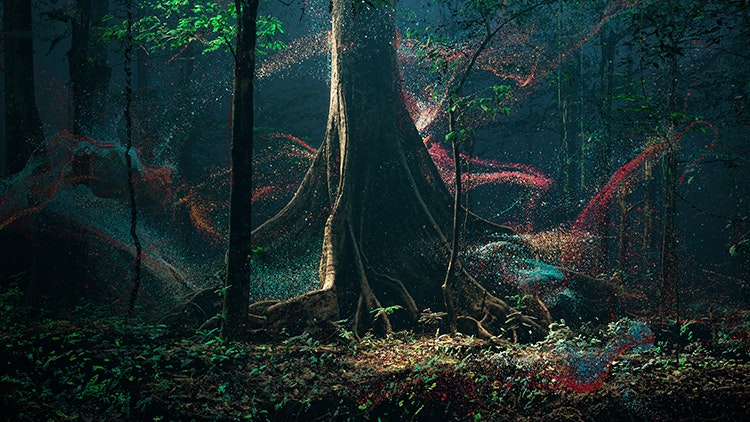
As well as designing the graphics for Emergence’s current incarnation in a physical space – its second exhibition, with the first in Melbourne around four years ago – Studio Airport has also created one of the pieces in the show, titled Pollinators of Slovenia.
Different type settings can communicate a feeling, as well as just being used for straightforward communication
London’s Shifting Landscapes takes in around nine VR-based pieces that are translated from films or photo essays. One of the highlights is an installation called Breathing with the Forest by experiential art collective Marshmallow Laser Feast, which Studio Airport had worked with on the exhibition design for its superb Observations on Being, a piece which spanned a vast cemetery in Coventry as part of its City of Culture programme.
Approaching space as magazine spread
So as designers, how do you go about translating the brand language and design approach of a magazine and website to a physical space? The Bargehouse space housing Emergence’s exhibition is a warehouse-like, industrial looking site that spans ten different rooms; which Broerse says was something of a blessing.
“I feel strongly that an exhibition like this would be really challenging to do in a white cube space environment,” he says, explaining that each individual room housed a different work, or “story”, which “you can completely immerse yourself in”.
We really tried to give each room its own identity and its own vibe
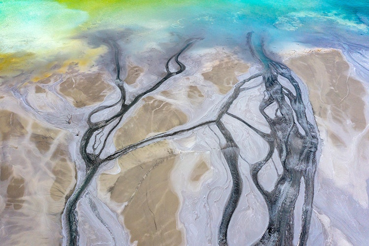
Naturally some spaces work better than others for these often-complex pieces, which combine unusual approaches to presenting moving image (such as multiple screens in almost sculptural configurations), sound design, portraiture and more. The designers had to make “smart choices” due to both the spaces’ varying physical dimensions and budget constraints, says Broerse. “We really tried to give each room its own identity and its own vibe”, he continues.
Studio Airport’s approach was to see each room as a physical magazine spread, so the same considerations around communication, legibility, rhythm, pace, and layout were considered just as if the show was a sequential series of printed pages.
The future of publishing?
In short, it’s about seeing editorial in bold, imaginative ways – taking the centuries-old concept of the magazine into exciting new territories. Today, more than ever, we need such creative approaches to storytelling.
Journalism has never felt more precarious, with countless publishers and media companies shuttering or laying off staff this year alone. It turns out that just copying and pasting from print to online wasn’t the panacea that publishing company fat cats had hoped; and that even digital-first brands can’t rely on outdated models like display ads to survive – just look at Buzzfeed’s closure and the news of Vice Media filing for bankruptcy.
As Broerse’s approach shows, for publications to be worthwhile, they need to be considered creatively – not just doing the same old thing we’ve always done, but telling stories in new ways that forge genuine connections with people. “I’d say print isn’t near death at all, but you have to make something durable that almost outlives us,” says Broerse.
Whether it’s through the images or the writing, eventually it’s about using creativity to resonate with people
“That’s always been the vision with Emergence – a lot of people say it feels more like a book than a magazine. That collaboration has shaped our studio so much: we grow with each year, and that goes both ways – we broaden each others’ horizons. The designs we’re getting signed off now would never have happened five years ago, and the type of stories we publish now are so much more in-depth.”
For any publication to be a success, ultimately it has to give its writers and designers alike the trust, budget, and freedom to use bold, innovative means of communication that it needs to thrive. “[Publications] need to be created with ambition,” says Broerse. “Whether it’s through the images or the writing, eventually it’s about using creativity to resonate with people.”
Shifting Landscapes is at the Bargehouse, OXO Tower Wharf, London, until 10 December

- Design disciplines in this article
- Industries in this article
- Brands in this article


