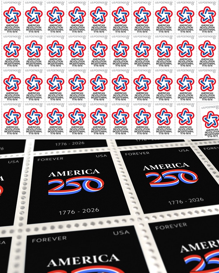
Chermayeff & Geismar & Haviv has created the identity for America250, the nonpartisan organisation responsible for orchestrating the 250th anniversary of the signing of the Declaration of Independence in the United States.
According to C&G&H, America250 aims to “create the most inclusive commemoration in American history” when it takes place on 4 July 2026.
 Chermayeff&Geismar&Haviv was also responsible for designing the symbol for the 200th anniversary, 1976s’ US Bicentennial. The symbol looked to “evoke the spirit and culture of the United States,” according to the agency, using a traditional five-pointed star formed of red, white, and blue ribbon.
This was used across all collateral relating to the countrywide celebrations, from event materials to souvenirs and stamps, and even on the livery for the Viking 2 Mars lander vehicle, which touched down on the Red Planet on 3 September that year to transmit images and soil analyses back to earth.

For the 2026 anniversary symbol, Chermayeff&Geismar&Haviv once again used a ribbon-based mark. The red, white, and blue ribbons “signify commemoration, celebration, and purpose,” according to the New York-based brand design firm.
The number 250 is formed from a single continuous sweep of the three ribbons, “suggesting unity, cooperation, and harmony,” C&G&H continues. Aiming to form a “dynamic, vibrant icon,” this is coupled with “elegant” serif lettering spelling out ‘America’.
Ahead of 2026 semiquincentennial, on 4 July this year America250 launched its nationwide, multi-year public awareness and engagement campaign America’s Invitation. This calls on “all Americans to share their own unique American stories— about their communities, cultures, neighbourhoods and more — and their hopes and dreams for the future”.
People can use the dedicated America250 stories site to submit photos, videos, essays, artwork, songs, and other content. This will be featured on the site, on social media, at commemorative events, and through partner organisations over the next three years and looks to “create a portrait of America at 250 [years-old] to pass down to future generations.”
 The C&G&H-designed identity is used across this campaign and all further events, initiatives and partnerships over the coming years. The consultancy also created a design system for state-specific logo lockups, which can be used to identify events and programs organised by local or state commissions.
The visual identity for America250 will “unite these various activities and campaigns—formal and informal—creating cohesion and giving a stamp of approval,” says the agency.

- Design disciplines in this article
- Industries in this article
- Brands in this article


