London Transport Museum will open a new gallery dedicated to poster art and design on 20 October 2023, with its first exhibition focussing on how London Underground and London Transport commissioned posters from 1908 onwards.
The museum has one of the world’s largest collections of twentieth century graphic art and design, with around 1,000 original poster artworks and over 30,000 posters housed at its Museum Depot in Acton, west London. Its head curator Matt Brosnan says the museum has “long wanted to make more of its fantastic poster and artwork collection”, hence the opening of the Global Poster Gallery.
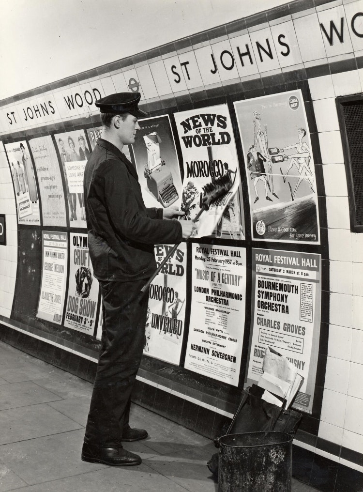
He notes how there have been “no dedicated museums or galleries that looks at poster art”, despite it being “one of the main means of mass communication” in the early 20th century. For several decades – when posters were at their biggest influence – poster design and production was “a mini-industry in itself”, according to Brosnan, although it started to decline in the 1960s and 1970s as digital and photographic methods and TV advertising were introduced.
In its prime, poster design “attracted a huge range of artists and designers, all using techniques in different ways to make compelling images for a mass market”, says Brosnan. He reveals that London Transport Museum plans to hold exhibitions on single artists or groups of artists, who have a “shared ethos” as well as “thematic exhibitions” like its inaugural How to Make a Poster exhibition.
Using artistic works from the museum’s collection together with loans from private, national, and international archives, Brosnan says the gallery’s exhibitions will look to “contextualise the wider story of poster art”.
“A more coordinated brand identity”
How to Make a Poster explores how organisations like London Underground and London Transport commissioned posters and why, as well as the techniques used to create them. Its spans from 1908 – when London Underground first opened – to the present day and is split into thematic sections.
The first section centres around the commissioning process and “why and how posters were commissioned in the first place”, says Brosnan. He puts it down to organisations wanting to “forge a link” between themselves and “high quality art and design”.
For London Underground and TfL in particular, Brosnan believes it was part of a “wider effort” to create “a more coordinated brand identity”, which involved commissioning posters that included the roundel symbol, “all aspects of the architecture of the network and even the vehicles that they used”.
“Tapping into the prevailing trends”
Poster commissioning began in 1908 and is historically associated with Lincolnshire-born Frank Pick, who dug the then-new tube railways out of a financial rut by establishing a series of pictorial posters to encourage travel, before addressing the appearance of stations, signage and branding. By 1912, Pick had been appointed commercial manager, with his continued success setting him up to become vice chairman and chief executive of the newly formed London Passenger Transport Board, better known as London Transport (LT), in 1933.
Transport organisations had previously only used “letter press notices and text-based posters”, says Brosnan, but Pick decided to start commissioning well-known illustrators and artists to come up with pictorial posters.
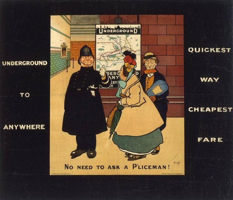
No need to ask a p’liceman was one of the first commissioned designed by commercial artist John Hassle in 1908 as part of a campaign to relieve public apprehension about using the underground system. In that same year, Hassle also produced his best-known work titled Skegness is so Bracing, which is still used on postcards today. It depicts a jolly fisherman skipping down the beach and was produced for the Great Northern Railway Company to promote a special 3-shilling excursion from Kings Cross.
Read more: What the posters of the London Underground tell us
After this initial campaign, the commissioning of posters for the London Underground “snowballed into something much more cohesive” and the organisation acquired a “high reputation” for its poster art and graphic design, Brosnan explains. Pick was conscious of “tapping into the prevailing trends in graphic design”, he says, commissioning “innovative and up and coming artists and designers, like Edward McKnight Kauffer.
Not long after regular commissioning had started, the quality of the poster designs were being recognised in galleries through exhibitions, notably in 1917 and 1928, according to Brosnan. London Transport’s poster commissioning presented an opportunity for “established commercial artists and designers to make a good living”, says Brosnan, adding that it was still more of a struggle for those early in their careers.
Designers of the time
The second section of How to Make a Poster will explore the work of five influential poster designers.
American poster designer Edward McKnight Kauffer completed his first commission for London Underground in 1915 and continued to design them into the Second World War. Brosnan describes his work as being “very influential in the UK” and notes how he also worked across book and textile design.
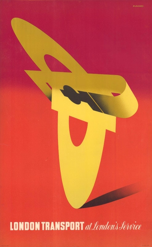
UK poster designer Abram Games came to prominence in the late 1930s, designing many posters for the UK National Government war effort during Second World War, before going on to have a “successful graphic design career” working on commissions for London Transport, says Brosnan. London Transport Museum has loaned some of the tiny thumbnail sketches that Games used to test his designs and displayed them alongside the finished artworks in this section.
Tom Eckersley – another UK designer who worked in a similar period to Games – also features in this section. Brosnan says Eckersley continued to design posters for London Transport right up until the end of the 20th century, adding that his “distinctive style” consisted of paper collage and “flat profile graphics”.
Read more: Abram Games: the war designer who persuaded Britain with his posters
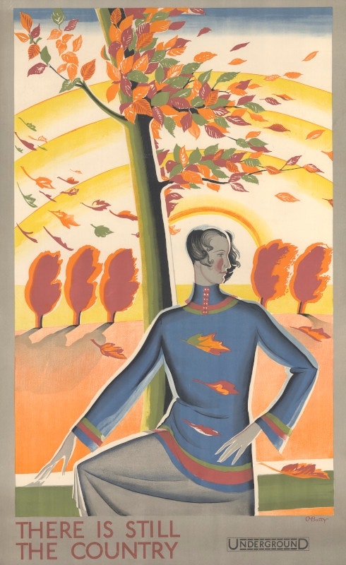
One of “the most prolific female designers” to work for London Transport from the 1920s to the 1940s was Dora M Batty, who style was defined by an “art deco elegance” with her designs often featuring “the fashion of the time”, according to Brosnan.
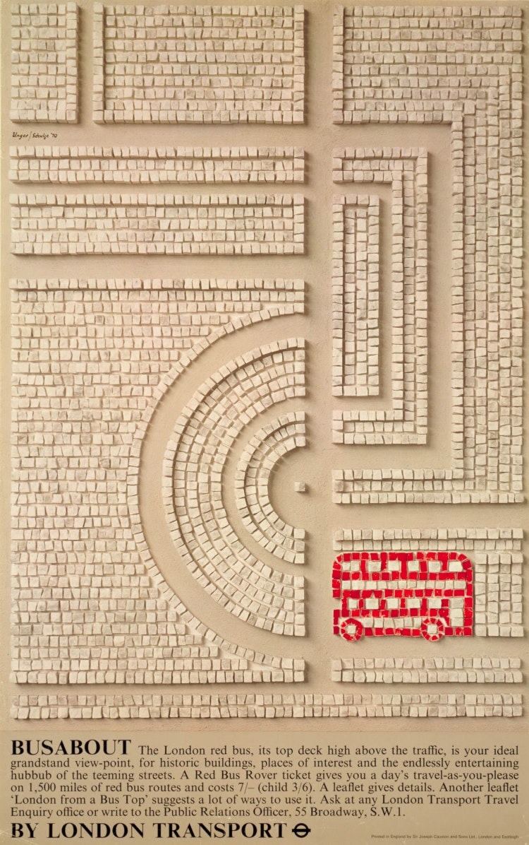
German-born designer Hans Unger used mosaic techniques in his designs, as well as “rich, beautiful, colours”, says Brosnan. Some of Brosnan’s personal favourites displayed in the exhibition are Unger’s mosaic artworks, such as Bus About which features an “iconic stylised London red bus” set against off white mosaic square tiles. Another is mosaic promoting a trip on the underground to see the zoo aquarium, depicting “spectacular tropical fish against a blue background”, he adds.
Brosnan discusses how some of the “most accessible” posters had “hand designed, hand drawn or hand painted typography or lettering”. Notable examples are Power by Kauffer – who Brosnan says used a lot of hand rendered typography in his work – and Sight See London by Games, which features “careful use of lettering”, combining pictorial elements with the lettering which is “rendered and stylised in famous buildings in London”.
“Tools of the trade”
The main part of the exhibition looks at techniques including painting and drawing, water colour, oil paint and gouache, which was preferred for its opacity which allowed for “depth of colour” while also being “quick drying”. Other techniques that feature in the exhibition are collage with paper, card and textiles and printmaking methods like lithography.
On loan from the V&A is a lithographic stone used by Welsh designed Frank William Brangwyn in 1914. The 1.5 metre by 1 metre stone weighs 500kgs and “has never been on public display before” says Brosnan, adding that the object “really helps you to see how autolithography works.” He explains how, much of the time, drawings were done with “a waxy crayon direct onto a huge slab of stone”.
Showcasing “tools of the trade” and the materials that designers used was as important as displaying the finished artworks, says Brosnan. He describes How to Make a Poster is a “very visual exhibition” with lots of posters as well as 3D objects that show “how the designs were realised”.
“The largest public art gallery in London”
In the last section, Brosnan wanted to explore “how posters were displayed and received” as London Underground and Transport “effectively had the largest public art gallery in London” with posters being displayed across “whole network of stations, bus stops and all kinds of architecture”.
Visitors will be invited to choose their favourite designs on touch screens while being encouraged to think about “how it conveys a clear message” as well as its use of “interesting techniques or innovative styles”, says Brosnan.
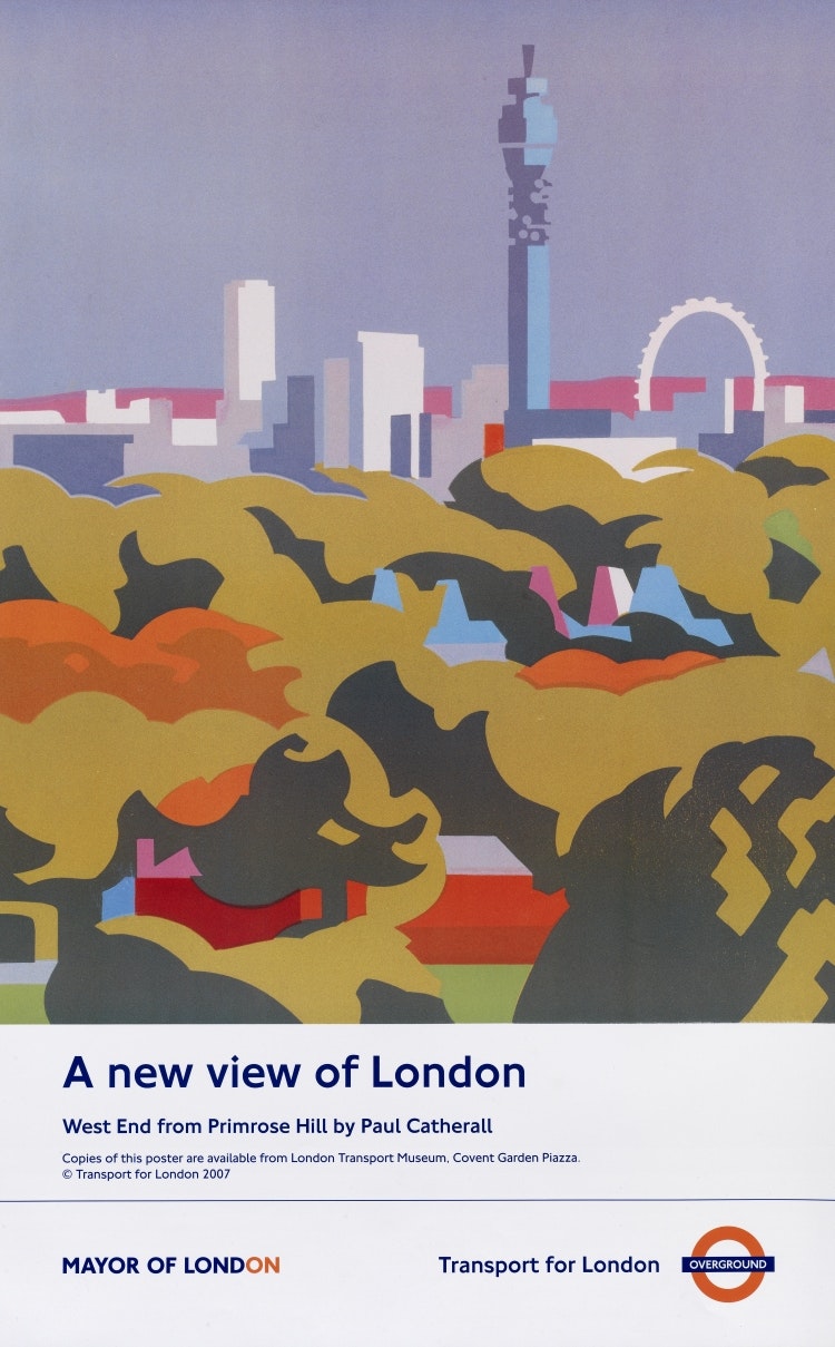
While TfL still commissions posters, Brosnan says it is not at the same scale and describes it as “art for its own sake rather than a wider marketing tool”, as it was in the early days of commissioning.
How to Make a Poster has no confirmed closing date but Brosnan confirms it will be open until at least the spring of 2025.

- Design disciplines in this article
- Industries in this article
- Brands in this article


2 responses to “How London Underground and Transport facilitated the city’s “largest public art gallery””
Good piece and thoroughly recommend a visit to the London Transport Museum Depot in Ealing on one of their open days. On the guided tours you can get to visit their Art and Poster store which includes many of the examples shown in the article which form their amazing collection.
Frank Pick was an early branding visionary. The result of his legacy is still evident. Sadly, the posters produced now are not a patch on all those from the 1960s to its beginning.