Premier League has revealed a brand refresh designed in collaboration with London-based design agency Nomad Studio, which looked to help the top tier English football league take its brand further.
Nomad has been working with Premier League for around six years, says Nomad partner and creative director Callum York, working on “everything from campaigns over racism, sub-brands and activations like ePremier League, and Fantasy Premier League, and when the world went into lockdown, we helped them with messaging around COVID”.
Retaining the essentials of the brand, its elements are instead updated in a form of “everyday iteration” York says. Enabled by the close relationship between Nomad and the internal teams, this ensures that Premier League keeps “moving forwards”, he says.

Premier League’s last major rebrand in 2016 was led by one of Nomad’s founding directors Stuart Watson, while at DesignStudio. The work was also expanded on later that year, with an on-screen graphics system from DixonBaxi.
For this latest update, its brief could be summarised as making the Premier League “bigger, bolder, brighter”, says York.
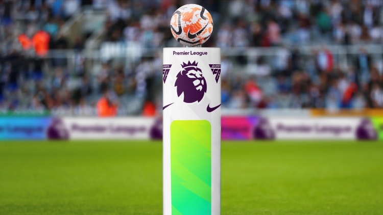
The strategically led focus for the new update is “how Premier League turns up on match day”, including how the brand appears “at the pitch, [around] stadiums, and the broadcast live feed”, York says.
According to the studio there was a desire to make the branding more “iconic”, in the manner of brands such as Apple and Nike, which it argues is a role Premier League has with sports fans, and that it has a hand in “delivering sporting excitement to the world”.
With the brand update, “ultimately we wanted it to be more recognisable”, he says. “How do we get that brand attribution to come to the forefront?”.
Considering the lion logo as the “figurehead” for the brand, Nomad sought to make it a “much more robust asset at the heart of the action”, York says.

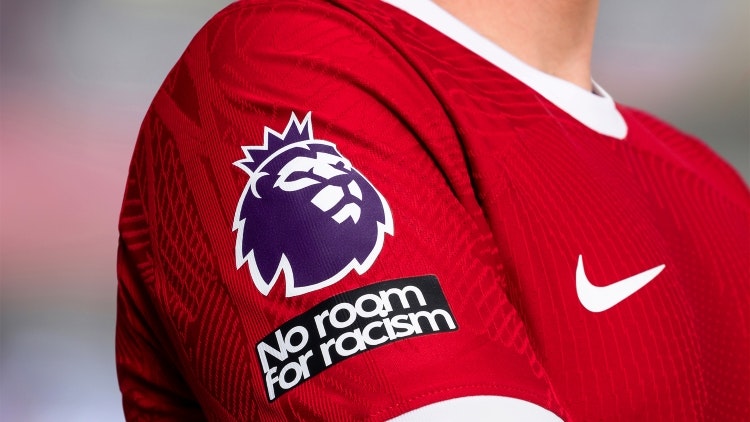
The new branding was first seen at the start of the 2023/2024 season at the Burnley versus Manchester City game on 11 August. Viewers would have been able to spot new sleeve patches featuring the lion “unshackled” and proudly as “large as possible”, York says.
To make the lion icon “fit for purpose” in its new role, the decision was taken to “smash together” two of the previous core brand assets, for use at “key moments”. The older, separate assets will continue to exist “for other parts of the business”, he adds.
These two versions had been designed for use on light and dark backgrounds, but in practice sometimes partners clubs and teams would mix them up, producing weird “ghosting” effects, he says.
Given the amount of IP invested in the existing marks, York adds, it wasn’t simply a case of the white backplate being referenced with a “standard key line around the outside”, but instead required a “lot of crafting and patience” to refine its shape.
The wordmark can also be used decoupled from the lion icon, for ease of use.
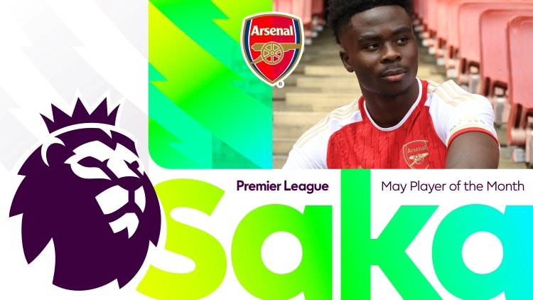
The colour palette has been refined, simplifying its six vibrant tones into gradients “to give just the right amount of stretch while being instantly recognisable to fans everywhere”, says the studio.
Typefaces have been simplified, with two weights of the core typeface used differently to “balance action with information”, the studio says.

Use of the “showstopping” graphic pattern is also given a “more secondary role”, to ensure prominence of Premier League in the messaging, as well as giving individual clubs, “their opportunity to come to the forefront”, York says.
According to York, a challenge with such a “well-loved” brand such as Premier League, is that people are “fully invested”, meaning there is a constant need to “keep on working at it to make sure you stay loved”, he says.
Like small changes to prominent brand logos such as Google’s – whose updates he argues you notice but quickly accept and almost forget – “for us it’s about making sure Premier League constantly feels up to speed”, York says.
Given the size of Premier League’s output and creative teams, from broadcast to community projects, there’s a considerable job in ensuring everything “still feels like it’s part of the same whole”, he adds.

- Design disciplines in this article
- Industries in this article
- Brands in this article


