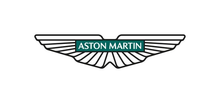
Aston Martin has updated its branding – including a new version of its winged logo redrawn by Peter Saville – as it looks to appeal to a new generation of drivers.
It is the British car brand’s first major overhaul since 2003. The design work also includes a range of social, digital and print assets as well as a campaign video. The principle behind the new work is “Intensity.Driven”.

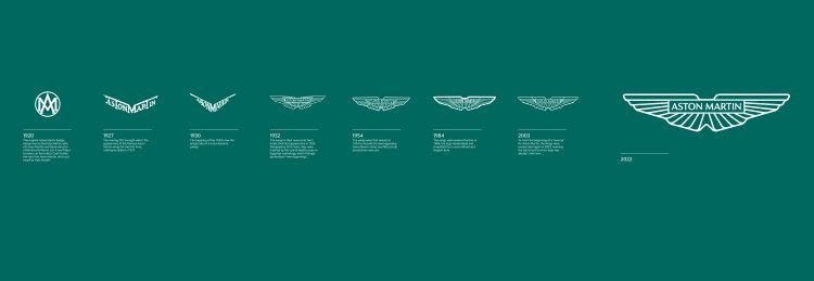
This is only the eighth time that the logo has been updated in Aston Martin’s 109-year history. The winged variation of Aston Martin’s logo was introduced in 1927, where the brand’s name took the shape of wings.
In 1932, a new version – designed by SCH Davis – introduced the wings around a wordmark, taking inspiration from scarab beetles. In mythology, these insects often symbolise new beginnings, according to Aston Martin.

Since 1932, the changes to the logo have been subtle – mostly updates to the wing shapes and a variation on the names included in the mark.
Saville says that the latest update included “subtle but necessary enhancements”. These changes “not only keep forms fresh, but allow for new technologies, situations and applications to be accommodated in the future”, he adds. Many car brands have rebranded in the past few years – often with an eye to digital applications.

The redesign was an intricate process, according to Aston Martin chief creative officer Marek Reichman. “Every millimetre of each line – of each shape within the new wings – are drawn forward from the depths of our 109-year-old Aston Martin creative wellspring,” says Reichman.
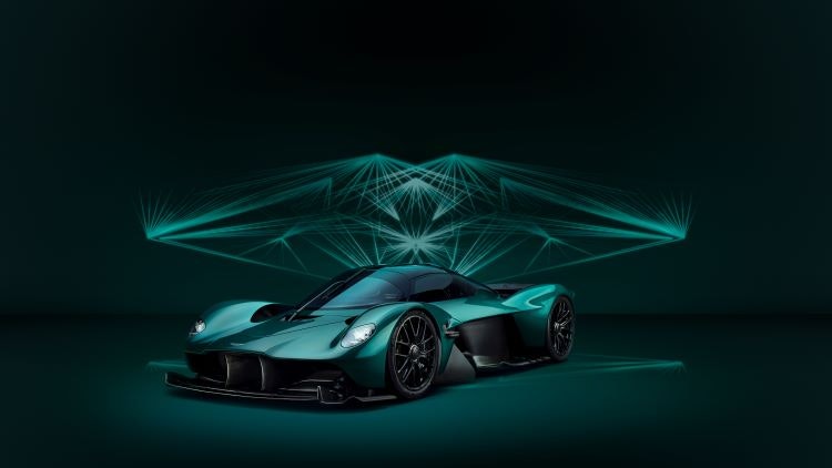
The physical logo – crafted in Birmingham’s jewellery quarter – will be applied to Aston Martin’s next generation of cars. “It’s the first step to the wings taking centre stage on our next generation of ultra-luxury performance sports cars,” he adds.

“We believe this new dimension will capitalise on the growing demand from a new generation of Aston Martin customers”, says the brand’s head of global marketing and communications Renato Bisignani. He adds that 60% of current sales are from first-time cutomers.
“This emotionally led creative direction dials up the bolder, edgier, and more intense characteristics that have always underscored Aston Martin,” says Bisignani.

- Design disciplines in this article
- Industries in this article
- Brands in this article


8 responses to “Peter Saville refines Aston Martin’s winged logo in “edgier” brand update”
“Every millimetre of each line – of each shape within the new wings – are drawn forward from the depths of our 109-year-old Aston Martin creative wellspring.”
Bet that was used at the visual presentation and the invoice presentation.
Lol
Utter drivel, to justify a negligible update to the existing logo.
The accompanying bullsh*t is admirable
Sometimes, designers need to use any tools we have to convince the world that design evolution is actually a good thing.
Reminds me of the Shell logo evolution. Quiet, regular, subtle updates to evolve without fuss but stave off staleness which has often taken hold before you realise it has.
Well, this appears to be a case of the Emperor’s new clothes doesn’t it? So instead of two sets of ‘feathers’ per ‘wing’ – there is only one…
“We believe this new dimension will capitalise on the growing demand from a new generation of Aston Martin customers”… But where’s the digital-friendly consideration?